@jeffe,
When the x-values passed are date-time, labels will be rendered at every interval based on the value of intervalType.
For example: if interval is 1 and intervalType is ‘month’ – labels will be shown at every 1 month. Since the axis behaves linearly across the date range it won’t skip months for which there are no dataPoints.
In your case, since you are trying to display axis label for only dataPoint you can use label instead of x.
Alternatively, you can use scaleBreaks to remove the unnecessary region on x-axis as shown in the code snippet below –
axisX: {
   "valueFormatString":null,
   "title":"Date",
   scaleBreaks: {
     autoCalculate: true,
     collapsibleThreshold: "15%",
     lineThickness: 0,
     spacing: 0
   }
}
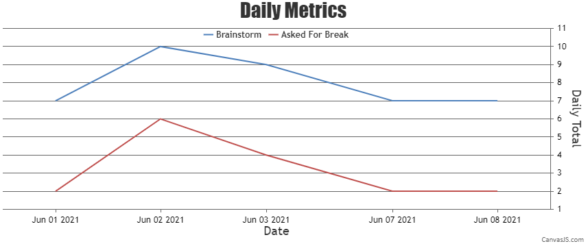
Please take a look at this updated JSFiddle for an example on removing unnecessary region on x-axis using scaleBreak.
___________
Indranil Deo
Team CanvasJS
.