Login to Ask a Question or Reply
Forum Replies Created by Indranil
-
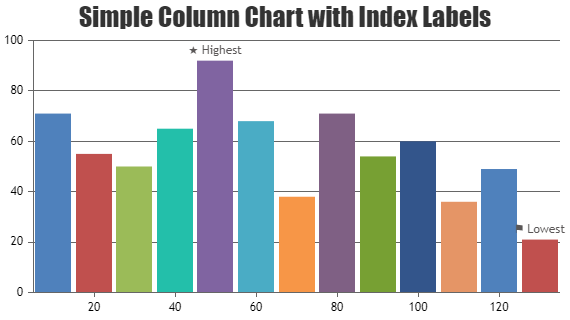
indexLabel is positioned with respect to a dataPoint and not to a specific pixel coordinate. Hence, it’s not possible to fix the indexLabel to a pixel coordinate on zooming and panning.
___________
Indranil Deo
Team CanvasJSChris,
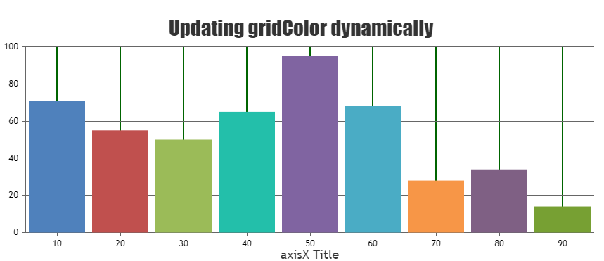
To dynamically update the gridColor please set the gridThickness and gridColor by updating chart options then call the render() as shown in the code snippet below –
chart.options.axisX.gridThickness = 2;
chart.options.axisX.gridColor = "#006400";

chart.render();
To update any axis elements dynamically you can also use the set().
Please take a look at this JSFiddle for a working example on updating the gridColor.
If you are still facing issue, kindly create a JSFiddle with your use-case and share it with us so that we can look into the code & the chart-options, understand the scenario better and help you out.
___________
Indranil Deo
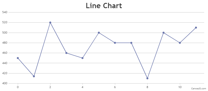
Team CanvasJSIn case of Spline chart, dataPoints are connected by a smooth line. The curve-radius/smoothness of the line is based on the consecutive dataPoints and it’s not possible to control the curve-radius/smoothness as of now.
However, based on your scenario using a Line chart would be an ideal option.
___________
Indranil Deo
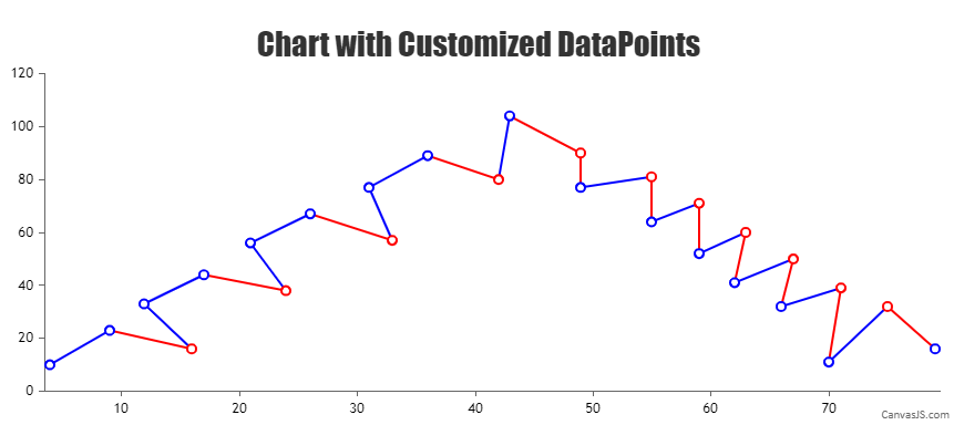
Team CanvasJSCan you please provide some sample data so that we can understand your scenario better and help you out?
Based on the screenshot shared, you can easily achieve the requirement by setting the markerBorderThickness, markerColor, markerBorderColor, and lineColor as shown in the code snippet below –
{
    type: "line",
    markerBorderThickness: 2,
    markerColor: "white",
    dataPoints: [
      {x: 4, y: 10, markerBorderColor: "blue", lineColor: "blue"},
      {x: 9, y: 23, markerBorderColor: "blue", lineColor: "red"},
      {x: 16, y: 16, markerBorderColor: "red", lineColor: "blue"},
      {x: 12, y: 33, markerBorderColor: "blue", lineColor: "blue"},
      {x: 17, y: 44, markerBorderColor: "blue", lineColor: "red"}
    ]
}
Also, please take a look at this JSFiddle for an example on same.
___________
Indranil Deo
Team CanvasJSAxis labels are shown at every interval which is auto-calculated based on parameters like axis minimum, axis maximum, etc. In your case, since the range of Y-Axis is small the labels are shown in decimals. Hence, using the valueFormatString will just round off the labels to the nearest whole number but won’t affect the interval, as a result, the labels might get repeated.
___________
Indranil Deo
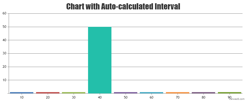
Team CanvasJSBased on your scenario, removing interval property will allow the library to auto-calculate interval according to the range of data. Please take a look at this updated JSFiddle for an example on chart with auto-calculated interval.
___________
Indranil Deo
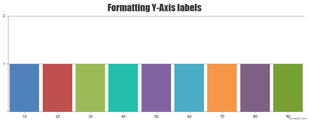
Team CanvasJSYou can use valueFormatString to show the labels as a whole number. Also if you want to display labels only at the whole number position, you can use interval property. Please check the below code snippet –
axisY: {
  valueFormatString: "#",
  interval: 1
},
Kindly check this updated JSFiddle for a working example.
___________
Indranil Deo
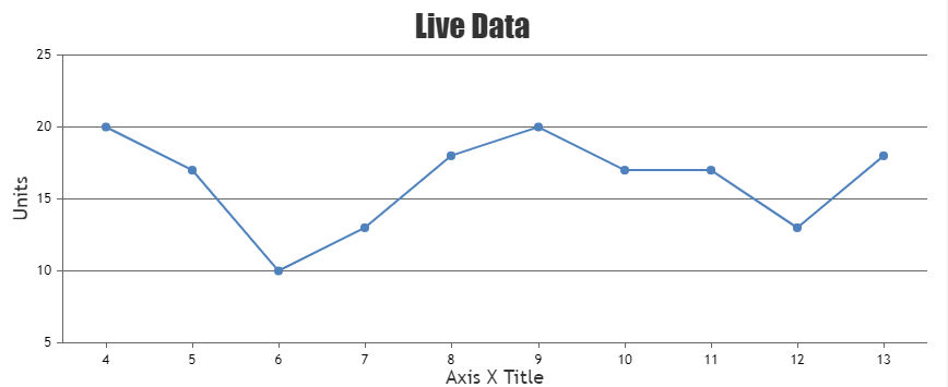
Team CanvasJSPlease take a look at this resource on integrating CanvasJS in VB.Net.
Also, kindly check this documentation page for step-by-step tutorial on rendering dynamic charts.
___________
Indranil Deo
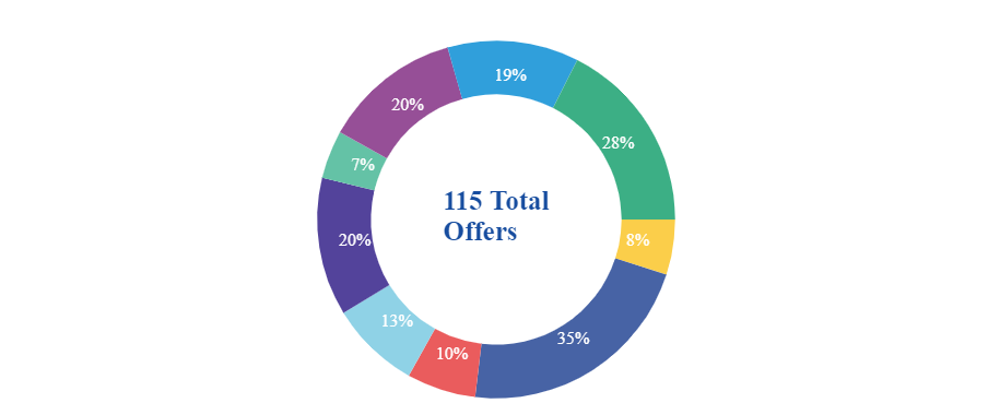
Team CanvasJSBased on the example shared by you, removing the innerRadius property seems to be working fine as it’s wrapping the indexLabel within the sections of doughnut. Please check this updated JSFiddle.
___________
Indranil Deo
Team CanvasJSOn analysis we found the tooltip to be lagging in case of multi-series chart & data is missing towards the edge of the plot-area. We have considered this as a bug and would be fixing it in our future releases.
___________
Indranil Deo
Team CanvasJSJune 23, 2021 at 6:55 pm in reply to: Grouped bar chart(stacked Column), gap between the bars, index Label, legends #347071. Am trying to create a grouped bar chart (stackedColumn), where i have gap between each dataPoint, but in each dataPoint i have 3 bars without gap, is it possible to provide space between each bar in dataPoint ?
Sorry, it is not possible to add gaps between dataPoints in multiseries column chart as of now.
2. Am giving indexLabel for each point in dataPoints, But its getting overlapped on same indexLabel. is it possible to give indexLabel for each point in dataPoints ?
In the JSFiddle i have shared my code, https://jsfiddle.net/1f0wLysj/
Based on the example shared, the axisYType property has been assigned to values “first” and “third”. Whereas, it can only be set to “primary” or “secondary”. Currently on setting the acceptable values to axisYType, the indexLabel are center aligning between the dataPoints which is a known bug and we would be fixing in future versions.
If you are trying to assign each dataSeries to a specific y-axis you can set axisYIndex property to the index of the y-axis the dataSeries should be attached to.
3. Legends:
In the link i have shared, below are the legends am displaying
blue – meals
red – snacks …
But, in my case:
First dataPoint blue tends to meals_1, red tends to snacks_1
Second dataPoint blue tends to meals_2, red tends to snacks_2
What is the best way to display legends for the above requirement ?Legends are assigned to individual dataSeries and not to each dataPoints for column charts as of now.
___________
Indranil Deo
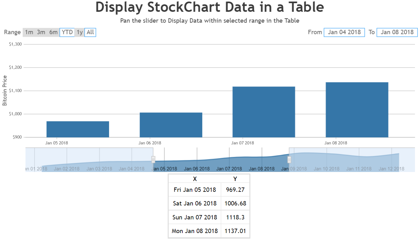
Team CanvasJSYou can set a rangeChanged event handler that would filter out the data present within the selected region of the slider, then use the same data to populate the table as shown below –
updateTableData(e){
  var dpsInViewPort = [];
  for(var i = 0; i < stockChart.charts[0].data[0].dataPoints.length; i++) {
    if(stockChart.charts[0].data[0].dataPoints[i].x.getTime() >= stockChart.navigator.slider.minimum && stockChart.charts[0].data[0].dataPoints[i].x.getTime() < stockChart.navigator.slider.maximum) {
      dpsInViewPort.push({x: stockChart.charts[0].data[0].dataPoints[i].x.toDateString(), y: stockChart.charts[0].data[0].dataPoints[i].y});
    }
  }
  if(e.source === "navigator" || e.source === "inputFields" || e.source === "buttons")
    this.setState({
      tableData: dpsInViewPort
    });
  else{
    if(!this.state.isPopulated)
      this.setState({
        tableData: dpsInViewPort,
        isPopulated: true
      });
  }
}

renderTableHeader() {
  let tableData = this.state.tableData[0];
  let header = [];

  for(var key in tableData) {
    if(tableData.hasOwnProperty(key)) {
      header.push(key);
    }
  }

  return header.map((key, index) => {
    return <th key={index}>{key.toUpperCase()}</th>
  })
}

renderTable() {
  return this.state.tableData.map((tableData, index) => {
    const { x, y } = tableData;
    return (
      <tr key={index}><td>{x}</td><td>{y}</td></tr>
    );
  });
}
.
.
.
.
.
return (
   <div>
     <div>
       {
         this.state.isLoaded &&
         <CanvasJSStockChart containerProps={containerProps} options = {options} onRef={ref => stockChart = ref}
         />
       }
     </div>
     <table id="chartData">
       <tbody>
         <tr>{this.renderTableHeader()}</tr>
         {this.renderTable()}
       </tbody>
     </table>
   </div>
);
Please take a look at this StackBlitz example to display stockChart data in a table.
Also, you can easily hide the chart in StockChart and just use the navigator with the slider functionality by customizing the height property of chart as shown in the code snippet below –
const options = {
  animationEnabled: true,
  exportEnabled: true,
  theme: "light2",
  charts: [{
    height: 1,  //setting height property of the chart
    data: [{
      type: "candlestick",
      dataPoints: stockData
    }]
  }],
  navigator: {
    height: 150,
    slider: {
      minimum: new Date("2018-05-01"),
      maximum: new Date("2018-07-01")
    }
  }
};
Kindly take a look at this StackBlitz for an example with complete code.
___________
Indranil Deo
Team CanvasJSCurrently, the chart component has its own zoom and pan functionality, and cannot consume any events fired from a parent component that could trigger the zoom event.
___________
Indranil Deo
Team CanvasJS