Login to Ask a Question or Reply
You must be logged in to post your query.
Home › Forums › Chart Support › Line Chart Connector Colors
Line Chart Connector Colors
- This topic has 11 replies, 3 voices, and was last updated 4 years, 3 months ago by
Adithya Menon.
Tagged: dynamic line chart
-
July 15, 2021 at 12:06 am #34860
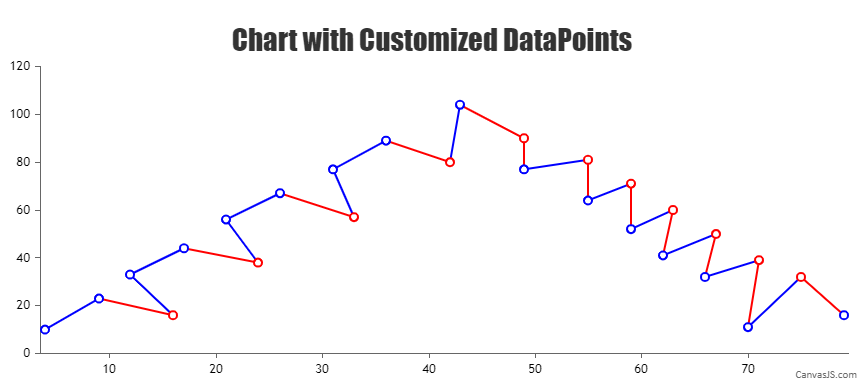
Good day! Tell me a way to create a graph in the attached image. It is necessary that the connecting lines of the points have certain colors. Suppose if points 1 and 2 are connected, then their connecting line is blue, let’s say if points 2 and 1 are connected, then their color is red. Is it possible to make the specified line color for connecting even dots 0-2-4-6-8-0 blue and 0-1-3-5-7-9-0 blue, and for lines 0-9-8-7- 5-3-1-0 and 0-8-6-4-2-0 red.The graph is dynamic. Example
July 16, 2021 at 4:22 am #34870Can you please provide some sample data so that we can understand your scenario better and help you out?
Based on the screenshot shared, you can easily achieve the requirement by setting the markerBorderThickness, markerColor, markerBorderColor, and lineColor as shown in the code snippet below –
{
    type: "line",
    markerBorderThickness: 2,
    markerColor: "white",
    dataPoints: [
      {x: 4, y: 10, markerBorderColor: "blue", lineColor: "blue"},
      {x: 9, y: 23, markerBorderColor: "blue", lineColor: "red"},
      {x: 16, y: 16, markerBorderColor: "red", lineColor: "blue"},
      {x: 12, y: 33, markerBorderColor: "blue", lineColor: "blue"},
      {x: 17, y: 44, markerBorderColor: "blue", lineColor: "red"}
    ]
}
Also, please take a look at this JSFiddle for an example on same.
___________
Indranil Deo
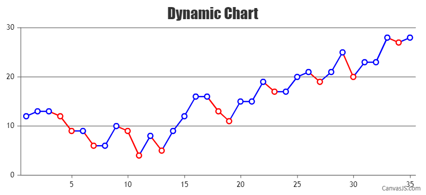
Team CanvasJSMarch 2, 2022 at 7:45 pm #37062Good day! Thank you for your help! I have a question for you, is there a correct example code for applying your advice to a dynamic line chart (or is there a typical example of such a case)?
March 3, 2022 at 8:17 pm #37069To render a dynamic chart, you will have to create a function that checks the dataPoint value before assigning it to the chart options/data and accordingly customize the markerBorderColor and lineColor. The function can be called at regular intervals to add new dataPoint using setInterval() as shown in the code snippet below –
var updateChart = function () {

  yVal = yVal +  Math.round(5 + Math.random() *(-5-5));

  if(dps.length && yVal < dps[dps.length - 1].y)
  {
    dps.push({x: xVal,y: yVal, markerBorderColor: "red"});
    dps[dps.length - 2].lineColor = "red";
  }
  else if(dps.length)
  {
    dps.push({x: xVal, y: yVal, markerBorderColor: "blue"});
    dps[dps.length - 2].lineColor = "blue";
  }
  else
    dps.push({x: xVal, y: yVal, markerBorderColor: "blue"});

  xVal++;
  chart.render();
};
setInterval(function(){updateChart()}, updateInterval);
Please take a look at this documentation page for a step-by-step tutorial to create a dynamic chart that updates dataPoints at regular intervals. Also, take a look at this JSFiddle for a working example.
In case this doesn’t fulfill your requirement, kindly brief us further about the logic based on which the line color is defined.
___________
Indranil Singh Deo
Team CanvasJSMarch 5, 2022 at 9:00 pm #37074Thank you very much for the tip! Once again I am convinced that your team is the best!
After reviewing your example, I want to add some charting logic to suit my needs.
It is required to build a graph according to the conditions:
1. There is input data (random data) – numbers from 0 to 9 – (nominal values)
2. These numbers differ in color (depicted as a segment on a linear dynamic chart, red – down, blue – up)
3. The logic of building and rendering the color of the graph line (When even and odd blue numbers go in a row, then, for example, 0 – 2 – 3 – 4 -…- 9 (increase) – then the segment is blue on the graph. When even numbers go and odd red numbers go in a row, then the segment on the line graph is red.If there are red and blue, then we compare the denomination of the numbers, for example, if 5 (odd blue) – 6 (even blue) – 1 (odd blue) – 6 (even blue) – 2 (even red), then in the above figure it is represented by colored segments “color pressure at face value” and according to the characteristics of the digit (even or odd).In other words, a sinusoidal curve is displayed on the Cartesian plane, which is built according to algorithm (even numbers in the blue zone (above zero) will be higher than odd ones, and even ones in the red zone will be lower than odd ones), which is shown in the figure.
I would be grateful if you could help me write a function for this logic.March 7, 2022 at 9:25 am #37076March 8, 2022 at 6:27 pm #37108You can set markerBorderColor & lineColor based on your condition (Comparing current y-value with the previous y-value and checking if it’s even or odd) to achieve this. Please find the code-snippet below –
var updateChart = function () {

  yVal = yVal +  Math.round(5 + Math.random() *(-5-5));

  if(dps.length && yVal < dps[dps.length - 1].y)
  {
    //Setting markerBorderColor and lineColor for each specific dataPoint
    color = (yVal % 2 === 0 ? "red" : "blue");
    dps.push({x: xVal, y: yVal, markerBorderColor: color});
    dps[dps.length - 2].lineColor = color;
  }
  else if(dps.length)
  {
    //Setting markerBorderColor and lineColor for each specific dataPoint
    color = (yVal % 2 === 0 ? "blue" : "red");
    dps.push({x: xVal, y: yVal, markerBorderColor: color});
    dps[dps.length - 2].lineColor = color;
  }
  else
    dps.push({x: xVal, y: yVal, markerBorderColor: "blue"});

  xVal++;
  chart.render();
}
Please take a look at this JSFiddle for the complete code.
___________
Indranil Singh Deo
Team CanvasJSApril 23, 2022 at 1:34 am #37540Good afternoon dear friends! I ask for your help in the matter. Purpose: Display a tabular view of the graph, the figure shows an example.
April 23, 2022 at 1:45 am #37548Can’t link to picture
April 23, 2022 at 1:46 am #37550drive.google.com/file/d/1EE86nQzuITCZRgiW4bP0xdHH5JuNg8-K/view?usp=sharing
April 25, 2022 at 9:45 am #37534Good afternoon dear friends! I ask for your help in the matter. Purpose: Display a tabular view of the graph, the figure shows an example.
April 25, 2022 at 6:22 pm #37573Considering this thread as duplicate of Tabular presentation of graph data and hence closing the same.
—-
Adithya Menon
Team CanvasJS
Tagged: dynamic line chart
You must be logged in to reply to this topic.