Login to Ask a Question or Reply
Forum Replies Created by Vishwas R
-
Thanks for sharing jsfiddle. We are looking into the issue and get back to you at the earliest.
—
Vishwas R
Team CanvasJSDebbie,
Can you please share a pictorial representation or jsfiddle with your requirements so that we can understand it better and help you out?
—
Vishwas R
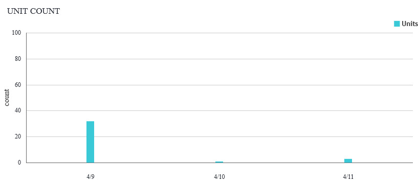
Team CanvasJSApril 17, 2018 at 10:26 am in reply to: X-axis labels are not aligned vertical with the data points #20356You can use one of the valid JavaScript date-time formats. When you use
x: new Date(2018,04,09),, 4 corresponds to May where as when you usex: new Date(“2018-04-09”),, 4 corresponds to April. Because of change in month, you may observe label properly positioned to the dataPoint in one case and not positioned in another case. As of now we don’t have option to control the starting point of the axis labels, however you can try axis interval and intervalType to fit into your requirement. If that doesn’t help you out, kindly create jsfiddle with your requirement so that we can understand it better and help you out?—
Vishwas R
Team CanvasJS@jwk,
Can you please check browser console for error
Uncaught SyntaxError: Unexpected token ) - csvtest-update.htm:72. It seems like there is some mismatch of brackets in your code.If you are facing any other issue, kindly create jsfiddle or share static html/php files over onedrive/google-drive so that we can understand your code better and help you out?
—
Vishwas R
Team CanvasJSApril 16, 2018 at 6:05 pm in reply to: X-axis labels are not aligned vertical with the data points #20345Axis labels are not rendered for every dataPoint instead its rendered at every interval. However if you like to show label for every dataPoint, you can use label property instead of x-value. Please take a look at this updated JSFiddle.
—
Vishwas R
Team CanvasJSApril 16, 2018 at 2:20 pm in reply to: X-axis labels are not aligned vertical with the data points #20337Can you kindly create jsfiddle reproducing the issue you are facing so that we can look into it and help you out?
—
Vishwas R
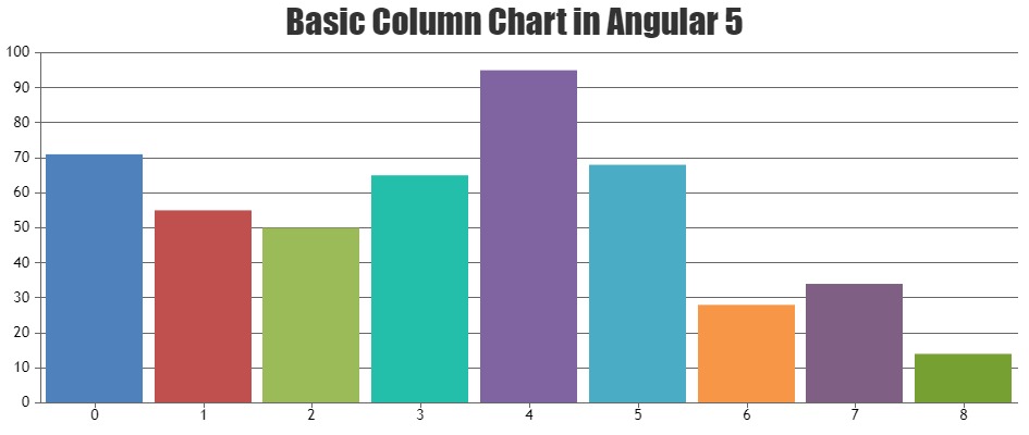
Team CanvasJSIt seems to be working fine using import module. Please download the Sample Project of CanvasJS Charts integrated with Angular 5 CLI. Also take a look at Angular Charts Gallery for few more examples.
—
Vishwas R
Team CanvasJSSorry for the inconvenience caused. Our sales team is looking into it and get in touch with you soon. For any sales related queries, please contact sales@canvasjs.com
—
Vishwas R
Team CanvasJSPlease take a look at JSP Gallery which has a wide range of examples showing how to render CanvasJS charts within JSP along with source-code. Also you can try downloading JSP Sample Project from download page, which you can run locally and try.
If these doesn’t help you fulfill your requirement, can you please create a sample project with the issue you are facing and share the onedrive/google-drive link, so that we can look into your code and understand the issue better and help you resolve that?
—
Vishwas R
Team CanvasJSCan you kindly share sample project along with sample database (over onedrive or google-drive), so that we can understand your code and scenario better and help you out?
—
Vishwas R
Team CanvasJSRyan,
Thanks for reporting. We’ll look into the issue and fix it in future releases.
—
Vishwas R
Team CanvasJSIndex-label is placed to the center of the bar, but minimum and maximum of axisX is making it look like its placed to the bottom of the bar. Please take a look at this updated pen.
—
Vishwas R
Team CanvasJSMeraj Ahmed,
You can set axis maximum based on the maximum of sum of dataPoints from all dataSeries. Please take a look at this updated jsfiddle.
—
Vishwas R
Team CanvasJSMeraj Ahmed,
IndexLabel of first dataPoint is placed inside as there is no space to position it outside the column. Increasing axisY maximum to a value greater than larger dataPoint value will make space for indexLabel to render it outside column. Please take a look at this updated jsfiddle.
—
Vishwas R
Team CanvasJS