Login to Ask a Question or Reply
Forum Replies Created by Vishwas R
-
You can format x-values that appears in toolTip & indexLabels to your desired format using xValueFormatString. Please take a look at this page for list of supported formats. In your case, setting xValueFormatString to “hh:mm” should work fine. If this doesn’t solve your requirement can you kindly create a jsfiddle with sample data so that we can understand your code better and help you out?
—
Vishwas R
Team CanvasJSMarch 31, 2018 at 10:27 pm in reply to: legendMarkerType hidden when many points rendered on line chart #20180legendMarkerType falls back to markerType set in the dataSeries. Setting markerType / legendMarkerType to ‘none’ would be the reason in this scenario. Can you kindly create jsfiddle with sample data, so that we can understand your code better and help you out?
—
Vishwas R
Team CanvasJSCan you kindly create jsfiddle with sample data, so that we can understand your code better and help you out?
—
Vishwas R
Team CanvasJSDo you mean aligning axisX of multiple bar charts? If so, you can achieve that by setting axis margin. Please take a look at this jsfiddle.
If this doesn’t fulfill your requirement, kindly create a jsfiddle or share pictorial representation of your requirement so that we can understand it better and help you out.
—
Vishwas R
Team CanvasJSWe have observed some flickering issue in iOS while scrolling the page by tapping on chart, but works fine across desktop browsers and android. We will resolve this issue in future releases.
—
Vishwas R
Team CanvasJSOn rangeChanging, you can find the maximum y-value within the range and set axisY maximum to that value. Please take a look at this jsfiddle.
—
Vishwas R
Team CanvasJSNaveen,
You can control number of labels by setting interval property. You can try setting interval to 1 along with intervalType to day in your case.
The date seems to be repeated as you are showing just date, where the labels are displayed at every 6hours, when the chart width is morethan 1000px. Please check this updated jsfiddle. Setting interval and intervalType should work fine in this case.
—
Vishwas R
Team CanvasJSFor security reasons, browsers restrict cross-origin requests. Serving JSON file from local webserver and making an AJAX call to it or serving it from CORS enabled JSON hosting service like myjson.com should work fine. Please take a look at this JSFiddle.
Also can you please check the Browser Console if there are any errors. Also kindly create JSFiddle reproducing the issue so that we can look into it and help you out.
—
Vishwas R
Team CanvasJSThe php service returns dataPoints, with x-values that are not valid JavaScript Date object. So parsing it and then passing it to chart-options should work fine in your case. Please take a look at this jsfiddle.
—
Vishwas R
Team CanvasJSMarch 12, 2018 at 10:31 am in reply to: Live Data with timestamp in axisX, bug overlapping label #19891You can update intervalType and interval based on the zoomed-range. Please take a look at this updated jsfiddle. You can further customize it according to your requirements and the zoomed-range.
—
Vishwas R
Team CanvasJSMarch 8, 2018 at 9:53 pm in reply to: Live Data with timestamp in axisX, bug overlapping label #19866You can change the intervalType manually based on zoom-level with the help of rangeChanging event handler. Please take a look at this jsfiddle.
—
Vishwas R
Team CanvasJSMarch 8, 2018 at 6:42 pm in reply to: Live Data with timestamp in axisX, bug overlapping label #19859Labels are overlapping as you are setting interval to 1 and intervalType to ‘second’, which means labels should be shown at every 1 second interval. Removing that should work fine in your case. Please take a look at this updated jsfiddle. Also you seem to be using v1.7.0, please update to the latest version 2.0.1, which has more chart-types and features. You can download the latest version from download-page and let us know your feedback.
—
Vishwas R
Team CanvasJSWe don’t have official npm package as of now. However you can add CanvasJS Charts / StockCharts to your React/Angular/Vue.js app easily. Please follow the below instructions for the same.
1. Save CanvasJS script in your project source folder (src or src/assets or src/lib)
2. Import the script to your app (Please note to mention file path properly, if you have saved library in different folder like src/assets or src/lib)
For Charts:import * as CanvasJS from './canvasjs.min';
For StockCharts:import * as CanvasJS from './canvasjs.stock.min';If you have license, you can download the commercial version of CanvasJS from My Account.
—
Vishwas R
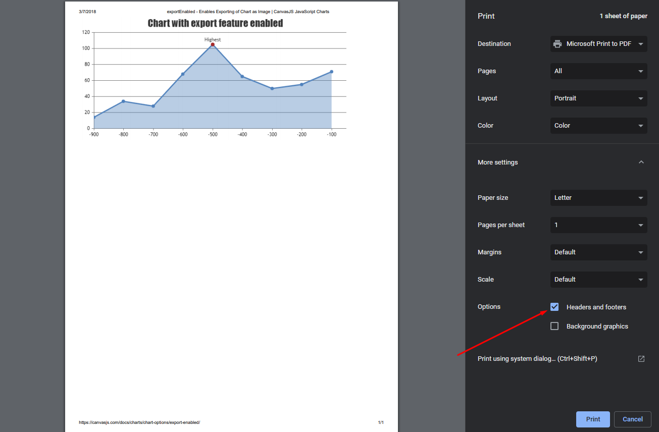
Team CanvasJSMohit Talwar,
You can disable headers and footers like url, date, page-number, etc in ‘Page Setup’ option in any browser. Please refer this article on how to disable headers & footers in different browsers.
—
Vishwas R
Team CanvasJS