Login to Ask a Question or Reply
Forum Replies Created by Vishwas R
-
@priyanshiagrawalsmprgmail-com,
You can place a div with gradient as background of plotarea and set it’s width & height with respect to the width & height of axisX & axisY bounds. Please take a look at this JSFiddle for an example on the same.
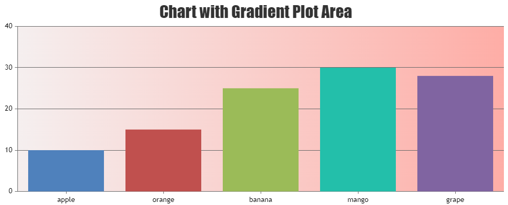
—
Vishwas R
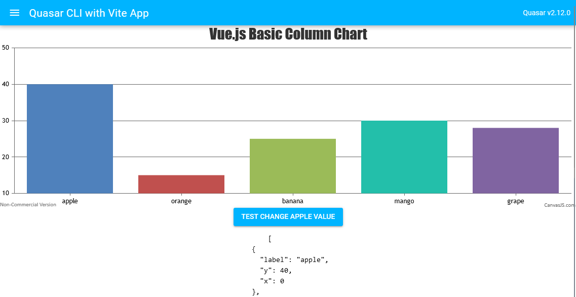
Team CanvasJSJune 14, 2023 at 6:38 pm in reply to: How to re-render when the dataPoints value changed in vuejs? #43066Updating datapoint value via chart option and re-rendering the chart seems to be working fine. To do so, you need to get the reference to the chart by passing the call-back function like
@chart-ref="chartRef"to the component. Please refer to the code-snippet below.// Getting Chart Reference <CanvasJSChart :options="options" @chart-ref="chartRef" /> chartRef(chart) { this.chart = chart; } // Updating Datapoint value this.chart.options.data[0].dataPoints.filter( (item) => (item.label == 'apple') )[0].y = 40; this.chart.render();Please take a look at this updated Stackblitz for complete code.
—
Vishwas R
Team CanvasJSJune 12, 2023 at 11:18 am in reply to: vuejs. ‘Chart’ is not exported by ‘src/assets/canvasjs.min.js’ #43027We have added CanvasJS Vue Charts package to NPM registry. Kindly check out the NPM package & let us know if that fixes the issue you are facing.
However, if you still like to use Vue component, kindly create separate chunks for CanvasJS during build and it should work fine in this case. Please find the vite-configuration below.
export default defineConfig({
  plugins: [vue()],
  build: {
    rollupOptions: {
      output: {
        manualChunks: {
          canvasjs: ['./src/assets/CanvasJSVueComponent.vue', './src/assets/canvasjs.min.js'],
        },
      }
    }
  }
})
Kindly download the latest version of CanvasJS from our download page & let us know your feedback.
—
Vishwas R
Team CanvasJSYou can use datapoint / dataseries click event-handler to change the color of the datapoint on clicking them. Please refer to the code-snippet below.
click: function(e) {
  e.chart.options.data[e.dataSeriesIndex].dataPoints[e.dataPointIndex].color = "red";
  e.chart.render();
}
Please take a look at this updated JSFiddle for working code.
—
Vishwas R
Team CanvasJSJune 1, 2023 at 6:44 pm in reply to: Error giving when changing JSON file name to other JSON file #42927The issue seems to be happening only when you use Test_json.json as you are using variable ‘Demo_json’ in template (index.html – line no 93). Changing it to Test_json while working with Test_json.json file seems to be working fine. Please take a look at this updated sample project.
—
Vishwas R
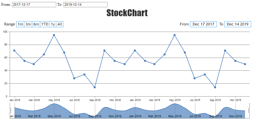
Team CanvasJSLing JS,
You can update the range of the StockChart based on the changes made in the datepickers outside the chart by updating the values of inputFields. Please take a look at this JSFiddle for an example on the same.
—
Vishwas R
Team CanvasJSCan you kindly create sample project reproducing the issue you are facing & share it with us over the Google-Drive or Onedrive so that we can run it locally to understand the scenario better and help you out?
—
Vishwas R
Team CanvasJSCan you kindly create JSFiddle with your use-case & share it with us so that we can look into code / chart-options being used, understand the scenario better and help you out?
—
Vishwas R
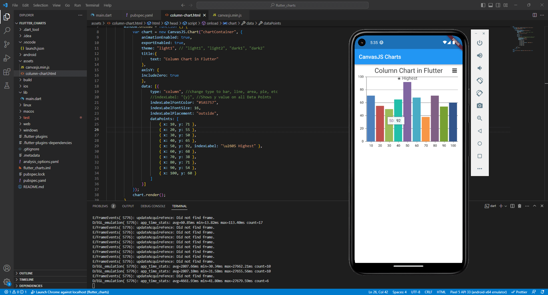
Team CanvasJSJoseph Simonds,
You can use WebView to add charts in mobile apps. Please refer to this tutorial for more information on adding WebView in Flutter. Also, take a look at this sample project that shows how to add CanvasJS Charts in Flutter app using WebViewController.
—
Vishwas R
Team CanvasJSMay 3, 2023 at 5:06 pm in reply to: vuejs. ‘Chart’ is not exported by ‘src/assets/canvasjs.min.js’ #42589Thanks for bringing this issue to our notice. We will look into this & fix it soon.
—
Vishwas R
Team CanvasJSCanvasJS supports exporting chart as an image or to print it. To export chart rendered within a page along with table, you can use html2canvas & jsPDF as shown in the code-snippet below.
html2canvas(document.querySelector("#container")).then(canvas => {
  var dataURL = canvas.toDataURL();
  var pdf = new jsPDF();
  pdf.addImage(dataURL, 'JPEG', 20, 20, 170, 120); //addImage(image, format, x-coordinate, y-coordinate, width, height)
  pdf.save("Chart with Table.pdf");
});
Please take a look at this JSFiddle for a working example.
—
Vishwas R
Team CanvasJSBox & Whisker Charts accept y-value as an array of 5 values [Minimum, Quartile-1, Quartile-2, Quartile-3, Maximum], where quartile 2 can be mean or median as per your requirements. Passing array of 5 values as datapoint y-value seems to be working fine.
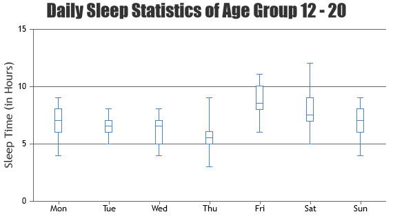
If your facing some other issue, kindly create JSFiddle reproducing the issue you are facing and share it with us so that we can look into the chart-options being used, understand the scenario better and help you resolve.
—
Vishwas R
Team CanvasJSPlease take a look at this Gallery Page for a demo on React Dynamic Line Chart. It seems to be working fine irrespective of chart type.
If you are still facing the issue, kindly create sample project reproducing the issue and share it with us over Google-Drive or Onedrive so that we can run it locally to understand the scenario better and help you resolve.
—
Vishwas R
Team CanvasJSThanks for your feedback. We will look into it in future. As of now, you can refer to documentation page for complete list of options available and try out live examples.
—
Vishwas R
Team CanvasJSI would like to put the labels inside the rectangles of the diagram, that is, instead of them being written below each rectangle – they will be written inside it vertically.
You can show text within the bar / next to bar using indexLabels. You can show indexlabel either inside or outside the bar by setting indexLabelPlacement property.

When I enter full data some of the left labels disappear (perhaps because there is no space for them) how can they be shown anyway?
Axis labels are shown at every interval, which is auto-calculated based on parameters like axis minimum, axis maximum, etc. In your case, you can show labels for every datapoints by setting
interval: 1. Please take a look at this updated JSFiddle for working code.—
Vishwas R
Team CanvasJS