Login to Ask a Question or Reply
Forum Replies Created by Vishwas R
-
You seem to have replaced App.jsx code with Chart.jsx code in the Stackblitz link that you have shared. Either you can use stripline in this case as shown in the previous reply or you can use range-area chart instead of stripline. The advantage of using range-area chart in this scenario includes letting library to show tooltip, mouse-events & showing series in legend. Please take a look at this JSFiddle for an example of the same.
—
Vishwas R
Team CanvasJSTooltip for stripline is not available as of now. In the current case of zooming / panning, the solution shared earlier can be improved further by checking if the current-mouse coordinate is within the plotarea bounds or not along with existing conditions as shown in the code-snippet below.
xPos >= stripLine.chart.plotArea.x1 && xPos <= stripLine.chart.plotArea.x2 && yPos >= stripLine.chart.plotArea.y1 && yPos <= stripLine.chart.plotArea.y2Please take a look at this updated Stackblitz for working code.
—
Vishwas R
Team CanvasJSChecking if the startValue & endValue lies within the axis range should work fine in this case. Please find the code-snippet for the same below.
stripLine.startValue < stripLine.chart.axisX[0].viewportMaximum && stripLine.endValue > stripLine.chart.axisX[0].viewportMinimumPlease take a look at this updated Stackblitz for working code.
—
Vishwas R
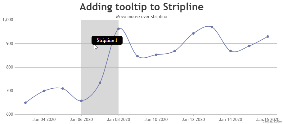
Team CanvasJSYou can add tooltip to Stripline based on length of dataseries as shown in the code-snippet below.
if (chart.data && chart.data.length > 0) {
  addTooltipToStripline(chart.axisX[0].stripLines[0], 'Stripline 1');
}
Please take a look at this updated Stackblitz for complete code.
—
Vishwas R
Team CanvasJSOne of our representatives from sales team will get in touch with you soon. For more information on licensing please contact sales@canvasjs.com
—
Vishwas R
Team CanvasJSDatapoint click event is not getting fired as image placed on top of datapoint captures the event. Bypassing pointer-events & toggling display property between “none” and “block” on datapoint click should work fine in this case.
Please take a look at this updated JSFiddle for a working example of the same.
—
Vishwas R
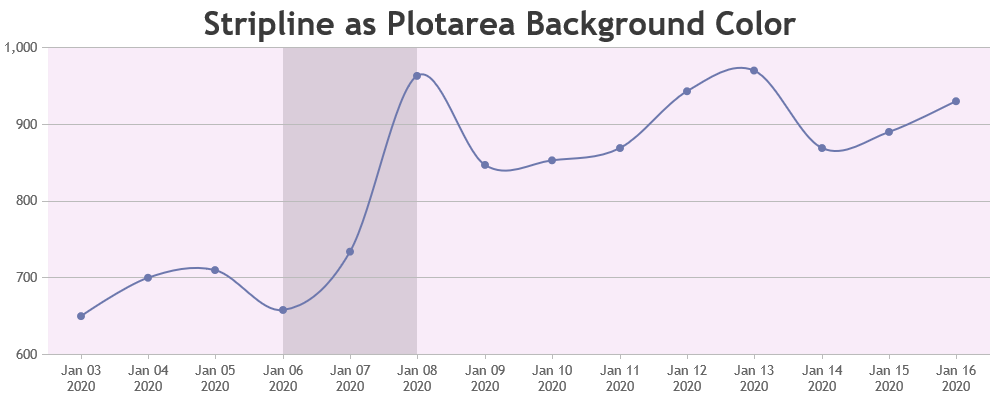
Team CanvasJSYou can get the axis properties like minimum, maximum, etc. in useEffect hook as show in the code-snippet below.
useEffect(() => {
  chart.axisX[0].addTo('stripLines', {
    startValue: chart.axisX[0].get('minimum'),
    endValue: chart.axisX[0].get('maximum'),
    color: 'rgba(221, 160, 221, 0.1)',
  });
}, []);
You can add stripline as plotarea background once you have access to axis range properties. Please take a look at this Stackblitz for an example of the same.
—
Vishwas R
Team CanvasJSPlease take a look at this Stackblitz link for an example on adding tooltip to Stripline in React, same as JSFiddle shared earlier.
—
Vishwas R
Team CanvasJSLegends for striplines are not available as of now. However, you can add a dummy dataseries to show legend for stripline as shown in this updated JSFiddle.
If you are looking for something else, can you kindly fork the JSFiddle and share it with us so that we understand your scenario better & help you out?
—
Vishwas R
Team CanvasJSShowing tooltip to stripline is not available as an inbuilt feature as of now. However, you can show tooltip with few lines of code by adding a div on mouse-move as shown in the code-snippet below.
chart.container.addEventListener("mousemove", function(e) {
  var xPos = e.pageX - this.offsetLeft,
      yPos = e.pageY - this.offsetTop,
      bounds = stripLine.bounds,
      index = stripLine._index;

  if((bounds.x1 <= xPos && xPos <= bounds.x2) && (bounds.y1 <= yPos && yPos <= bounds.y2)) {
    if(document.getElementById("striplineTooltip" + index)) {
      document.getElementById("striplineTooltip" + index).style.display = "block";
      document.getElementById("striplineTooltip" + index).style.left = xPos + "px";
      document.getElementById("striplineTooltip" + index).style.top = yPos + "px";
    }
    else {
      var tooltip = document.createElement("div");
      tooltip.setAttribute("id", "striplineTooltip" + index);
      tooltip.setAttribute("class", "tooltip");
      tooltip.innerHTML = "<div class='tooltiptext'>" + toolTipContent + "</div>";
      this.appendChild(tooltip);
    }
  }
  else {
    if(document.getElementById("striplineTooltip" + index)) {
      document.getElementById("striplineTooltip" + index).style.display = "none";
    }
  }
});
Please take a look at this JSFiddle for a working example on the same.
—
Vishwas R
Team CanvasJSMark,
Thanks for your continued interest in CanvasJS. One of our representative from sales-team will get in touch with you soon over email. For any other sales related queries feel free to inbox us at sales@canvasjs.com
—
Vishwas R
Team CanvasJSTo ensure axis grids are displayed, you need to pass an empty dataseries & specify the chart type (like “line” or “column”, defaults to “column”) along with grid-options. You need to explicitly pass empty dataseries as axis is not present in chart-types like pie, doughnut, funnel & pyramid. Hence, the axis elements passed in options are not considered when chart-type is unknown – when data is an empty array. Changing
data:[]todata:[{}]should work fine in your case. Please take a look at this JSFiddle for an example of the same.
—
Vishwas R
Team CanvasJSJuly 2, 2024 at 5:57 pm in reply to: Import issue: Module ‘”angular-charts”‘ has no exported member ‘CanvasJS’ #45405You are getting this warning because angular-charts package uses CommonJS/AMD modules. You can suppress the warning by adding it to allowedCommonJsDependencies under build options in your angular.json file, as shown below:
"build": {
    "options": {
        "allowedCommonJsDependencies": [
            "@canvasjs/angular-charts"
        ],
        ...
    },
    ...
}
Please refer to this angular documentation for more information.
—
Vishwas R
Team CanvasJSJune 12, 2024 at 4:56 pm in reply to: Click on the legend to hide signal is not working on brave #45269Looks like brave is blocking getImageData() function which is used for hit detection. Hide / Unhide Dataseries on Legend click should work fine when you disable “Block Fingerprinting” in Brave Shields. Please refer the below links for more information.
https://community.brave.com/t/getimagedata-does-not-work-in-brave/43292
https://community.brave.com/t/in-iframe-canvas-api-getimagedata-returns-empty-in-brave-browser/119128
https://community.brave.com/t/htmlcanvaselement-todataurl-always-returns-empty-string/105010—
Vishwas R
Team CanvasJSJune 3, 2024 at 5:45 pm in reply to: Implemente gridstack on react canvas js chart for dashboards #45228Re-rendering the chart on resizing the grid should work fine in this case. You can re-render the chart either on resize or resizestop events. Please find the code-snippet below.
grid.on("resizestop", function(resizestop) {
    chart.render();
});
Please take a look at this updated pen for complete code.
Also, you seem to be using third-party CanvasJS React Charts package. We recommend you to use Official CanvasJS React Charts package.
—
Vishwas R
Team CanvasJS