Login to Ask a Question or Reply
Forum Replies Created by Vishwas R
-
CanvasJS Chart just renders the data that you pass in chart-options. And in case of line charts, it draws a continuous line to connect all the non-null datapoints present in a dataseries. A gap / discontinuity in the line can be observed only when there is a null datapoint with the dataseries. You can set connectNullData to true to make it continuous by connecting line between non-null data.
If this doesn’t solve in your scenario, kindly reproduce the scenario either in JSFiddle with dummy data & share it with us (or a sample project & share over Google-Drive/Onedrive) so that we can run it locally to debug & understand it better and help you out.
—
Vishwas R
Team CanvasJSZoom / Pan & Reset buttons will be shown when you enable zooming in the chart. If you like to enable zooming, show the buttons but disable them, you can set HTML button’s disabled property to true. Please find the code-snippet below.
var buttons = document.getElementsByClassName("canvasjs-chart-toolbar")[0].children;
for(var i = 0; i < buttons.length; i++) {
  buttons[i].disabled = true
}
However, if you like to enable zooming but hide the buttons, you can set
display: none !important;to canvasjs-chart-toolbar class. Please take a look at this JSFiddle for an example.—
Vishwas R
Team CanvasJSY-axis scaling seems to work fine, i.e. Y-axis range (minimum & maximum) gets adjusted as per the y-values present in the viewport.
Can you kindly create JSFiddle reproducing the issue you are facing & share it with us so that we can look into the chart-options being used, understand the scenario better and help you out?
—
Vishwas R
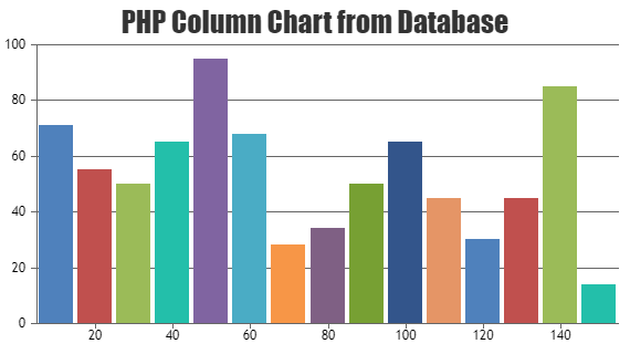
Team CanvasJSPlease take a look at this gallery page for an example on rendering PHP chart with data from database. You can use multi-series chart in your case. Please take a look at this sample project for an example on rendering multi-series chart with data from database.
—
Vishwas R
Team CanvasJSI would suggest you to generate datapoints in the back-end and keep all other chart-options in the front-end itself. Please take a look at this gallery page for an example on rendering chart with data from database.
If you are unable to achieve it or if you encounter any issue while achieving the same, kindly create sample project with sample data & share it with us over Google-Drive or Onedrive so that we can run it locally at our end to understand the scenario better and help you out.
—
Vishwas R
Team CanvasJSAugust 3, 2022 at 6:15 pm in reply to: Bar chart – problem when there is only one row and interval 1 #38824Pavel Hulmak,
Extra labels +1 & -1 are shown as interval is set manually. Based on the interval & some other factors, axis range is calculated & hence the extra labels are added in this case. You can overcome this by either not setting interval when there are less datapoints or by manually setting axis range. Please take a look at this updated JSFiddle.
—
Vishwas R
Team CanvasJSData in the chart seems to move back & froth as CanvasJS renders chart with the data in the order you pass in the options without sorting. Passing data in ascending order of x-values or sorting it based on x-values before rendering the chart seems to work fine in this case. Please find the code-snippet for sorting datapoints in ascending order of x-values below.
for(var i = 0; i < chart.options.data.length; i++) {
	chart.options.data[i].dataPoints.sort(compareDataPointXAscend);
}

function compareDataPointXAscend(dataPoint1, dataPoint2) {
	return dataPoint1.x - dataPoint2.x;
}
Please take a look at this updated JSFiddle for complete code.
—
Vishwas R
Team CanvasJS@franckinou,
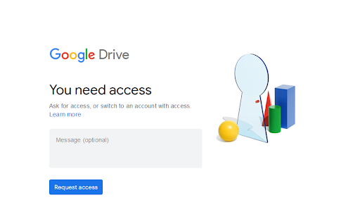
It seems the sample provided by you is restricted and requires permission. Can you please make the sample public so that we can download it to run locally at our to understand the scenario better and help you out?
—
Vishwas R
Team CanvasJSGlad to know that the issue is solved.
In general, invoice will be automatically shared over mail once you purchase any license. You can also download the same anytime from My Account page under ‘Orders’ tab. For more license / sales related queries please contact sales@canvasjs.com.
—
Vishwas R
Team CanvasJSSorry, controlling the first label on the axes & showing labels at every interval as per position of first label is not available, as of now. Minimum & maximum will set the axis range & not the position from where the axis labeling should start. However, you can disable axis labels & use striplines to achieve this. Below is the code-snippet that shows adding striplines with labels to y-axis.
function addStripLines(chart) {
  for (var i = chart.axisY[0].minimum; i <= chart.axisY[0].maximum; i += chart.axisY[0].interval) {
    chart.options.axisY.stripLines.push({
      value: i,
      label: i,
      labelPlacement: "outside",
      labelFontColor:"black",
      labelBackgroundColor: "transparent",
      color: chart.axisY[0].gridColor
    });
  }
  chart.render()
}
Please take a look at this updated JSFiddle for complete code.
—
Vishwas R
Team CanvasJS@fg,
You can use Range Charts like Range Column Chart, Range Area Chart, etc. in this scenario. Please check out gallery for more examples along with source code.
—
Vishwas R
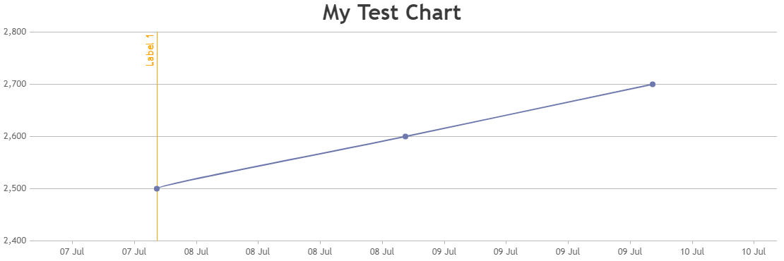
Team CanvasJSYou can perform AJAX request to fetch stripline values & render chart. Please check the code-snippet below.
/* Index.cshtml.cs */
public JsonResult OnGetStriplineData()
{
	List<StripLine> stripLines = new List<StripLine>();

	DateTime currentTime = DateTime.Now;
	DateTime sTime = new DateTime(1970, 1, 1, 0, 0, 0, DateTimeKind.Utc);

	stripLines.Add(new StripLine((long)(currentTime - sTime).TotalMilliseconds, "Label 1"));
	JsonSerializerSettings _jsonSetting = new JsonSerializerSettings() { NullValueHandling = NullValueHandling.Ignore };

	return new JsonResult(JsonConvert.SerializeObject(stripLines, _jsonSetting));
}

/* Index.cshtml */
$.ajax({
	type: "GET",
	url: "/?handler=StriplineData",
	contentType: "application/json",
	dataType: "json",
	success: function (response) {
		chart.options.axisX.stripLines = JSON.parse(response);
		chart.render();
	},
	failure: function (response) {
		console.log(response);
	}
});
Please take a look at this updated sample project for complete code.
—
Vishwas R
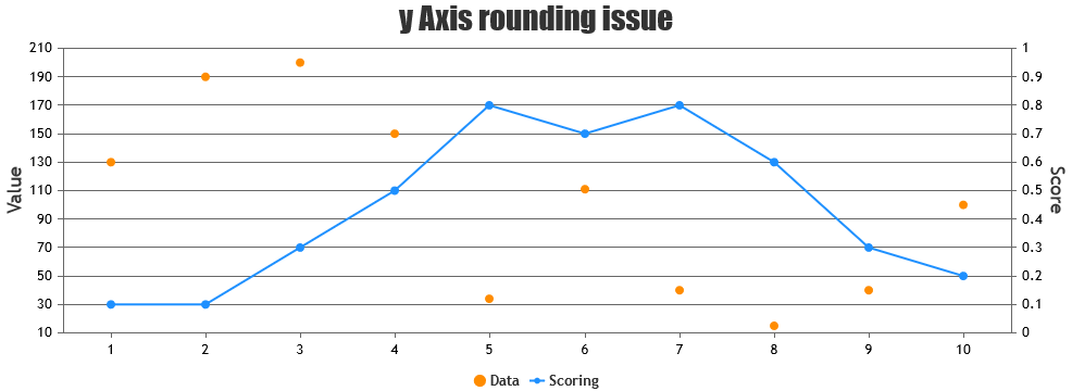
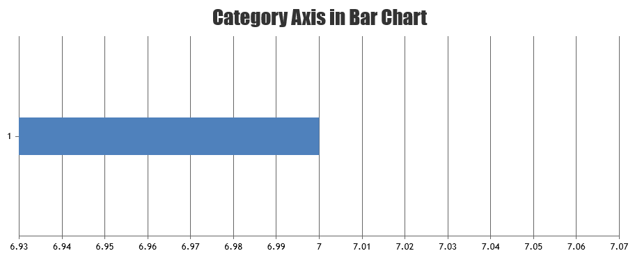
Team CanvasJSIn case of numeric axis chart, labels will be shown at every interval of the axis. Because of this, it’s showing 1 & -1. If there is just one datapoint and your requirement is to show label just for datapoint, you can use category axis (use label instead of x-value). Please take a look at this JSFiddle for an example.
Considering this as duplicate of Single data row barcharts showing 1, -1 rows, hence closing the same.
—
Vishwas R
Team CanvasJS