Login to Ask a Question or Reply
Forum Replies Created by Thangaraj Raman
-
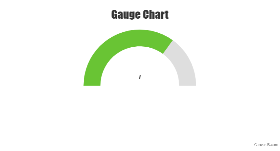
We don’t have a gauge chart as of now but a semi-doughnut chart can be used to achieve the same. Please follow the steps below for creating a gauge chart using a doughnut chart.
First, we need to create an object that will store all the necessary data that is needed to be shown on the gauge chart. The code snippet below shows an example of that object:
var gauge = {
  title:{text: "Gauge Chart"},
  data: { y: 7 }, //gauge value
  maximum: 10
};
In the second step, we will initialize the chart object and populate its dataPoints considering the fact that only half of the doughnut chart is displayed. Please refer to the code snippet below for achieving the same:
var chart = new CanvasJS.Chart("chartContainer");
createGauge(chart);

//Function for gauge
function createGauge(chart){
  //Caluculation of remaining parameters to render gauge with the help of doughnut
  gauge.unoccupied = {
    y: gauge.maximum - gauge.data.y,
    color: "#DEDEDE",
    toolTipContent: null,
    highlightEnabled: false,
    click : function (){ gauge.unoccupied.exploded = true; }
  }
  gauge.data.click = function (){ gauge.data.exploded = true; };
  if(!gauge.data.color)
    gauge.data.color = "#69C434";
  gauge.valueText = {text: gauge.data.y.toString(), verticalAlign :"center"};

  var data = {
    type: "doughnut",
    dataPoints: [
      {
        y: gauge.maximum,
        color: "transparent",
        toolTipContent: null
      },
      gauge.data,
      gauge.unoccupied
    ],
  };

  if(!chart.options.data)
    chart.options.data = [];
  chart.options.data.push(data);

  if(gauge.title){
    chart.options.title = gauge.title;
  }

  //For showing value
  if(!chart.options.subtitles)
    chart.options.subtitles = [];
  chart.options.subtitles.push(gauge.valueText);

  chart.render();
}
Please take a look at this JSFiddle for a working example with sample code.
—
Thangaraj Raman
Team CanvasJSJuly 13, 2023 at 6:27 pm in reply to: Dynamically render a chart by selecting a region of another chart #43332You can achieve your requirement by zooming into a particular region of the chart. To enable zooming in the chart, you will have to set zoomEnabled to
true.—
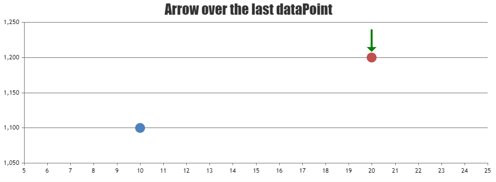
Thangaraj Raman
Team CanvasJSYou can show an arrow over the last datapoint, by drawing out an arrow over the chart canvas with id
.canvasjs-chart-canvas.Please check this JSFiddle for a working example.
—
Thangaraj Raman
Team CanvasJSThe datapoint object only accepts x and y values as of now. Your JSON can be in this format –
{“x”:1687209355000,”y1″:10,”y2″:40}, however, you will have to parse the JSON data in the format accepted by CanvasJS and then pass them as datapoints to the chart. Please check the code snippet below:for(var i = 0; i < jsonData.length; i++) { chart.options.data[0].dataPoints.push({x: jsonData[i].x, y: jsonData[i].y1}) chart.options.data[1].dataPoints.push({x: jsonData[i].x, y: jsonData[i].y2}) }—
Thangaraj Raman
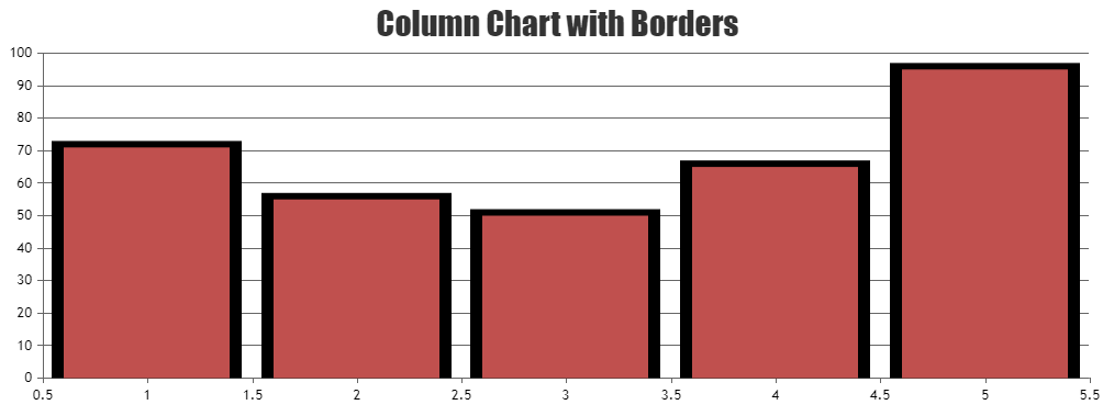
Team CanvasJSAdding a border to the columns is not possible as of now. However, you can use an error chart in combination with a column chart and set whiskerThickness to 0 and stemThickness to a value slightly greater than the dataPointWidth to create a border around the columns.
Please check this JSFiddle for a working example.
—
Thangaraj Raman
Team CanvasJSYou can change the color of a slice in the pie chart after it is rendered by updating the color of the corresponding datapoint in the chart options as shown in the code snippet below:
chart.options.data[0].dataPoints[3].color = "red";
chart.render();
Please take a look at this documentation page for step-by-step tutorial on updating chart options.
—
Thangaraj Raman
Team CanvasJSIt is not possible to fix the x-axis to the top of the stockchart while scrolling through other charts in a stockchart as of now. However, you can position an overlayed canvas on top of the first chart and copy the x-axis to the overlayed canvas to achieve your requirement.
Please check this updated JSFiddle for a working example.
—
Thangaraj Raman
Team CanvasJSIt is not possible to show the same chart in multiple places. However, you can create 2 different charts and pass the same set of chart options to them to achieve your requirement. Please take a look at this documentation page for a step-by-step tutorial on rendering multiple charts in a page.
Please check this JSFiddle for a working example.
—
Thangaraj Raman
Team CanvasJSBy default, the chart avoids clipping labels on either end of the plot area through auto-labeling. In your case, the labels are getting clipped since you are setting viewportMinimum. You can overcome this by either not setting viewportMinimum or by setting viewportMinimum to a value smaller than the required viewport minimum.
—
Thangaraj Raman
Team CanvasJSEach dataseries can have its own yValueFormatString since it is set at the dataseries level.
You can use the toolTipContent property at the datapoint level to show custom information in the tooltip as shown in this updated JSFiddle.
—
Thangaraj Raman
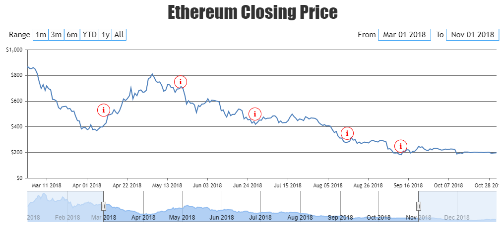
Team CanvasJSTo render the equivalent of an info icon, you can add a scatter dataseries to the chart, and set an appropriate index label. The scatter points’ tooltip can be used to show any additional information as per your requirement.
Please check this JSFiddle for a working example.
—
Thangaraj Raman
Team CanvasJSYou can use an area chart and set fillOpacity to a minute value like 0.3 or 0.4 to reduce the transparency of the shaded area. To visualize the airplane image, you can position an image over the last datapoint to achieve your requirement.
Please check this JSFiddle for a working example.
—
Thangaraj Raman
Team CanvasJS