Login to Ask a Question or Reply
You must be logged in to post your query.
Home › Forums › Chart Support › Axis X combines label with x value bug
Axis X combines label with x value bug
- This topic has 3 replies, 2 voices, and was last updated 3 years, 3 months ago by
Thangaraj Raman.
Tagged: axisx labels
-
April 7, 2023 at 3:35 pm #42447
Hello,
Not sure if is a bug or some property i did not know how to enable. But when i create a linear chart and i use for
dataPoints : {
x : number;
y : number;
label : string;
}
I expect that on axisX only labels should exist, but no. It makes a combination of some labels and some x value numbers thrown in there like this example : https://jsfiddle.net/5Ld648eg/1/var y = 0; var data = []; var dataSeries = { type: "line" }; var dataPoints = []; dataPoints.push({ y: 3000, label: '2014-05-06 12:02 PM' // x: '2014-05-06 12:02 PM' }); dataPoints.push({ x: 10, y: 3100, label: '2014-06-06 12:02 PM' //x: '2014-06-06 12:02 PM' }); dataPoints.push({ x: 14, y: 3500, label: '2014-07-06 12:02 PM' //x: '2014-07-06 12:02 PM' }); dataPoints.push({ x: 26, y: 4000, label: '2014-08-06 12:02 PM' //x: '2014-08-06 12:02 PM' }); dataSeries.dataPoints = dataPoints; data.push(dataSeries); //Better to construct options first and then pass it as a parameter var options = { zoomEnabled: true, title: { text: "Try Zooming - Panning" }, axisX: { labelAngle: -60, }, axisY: { includeZero: false }, data: data // random data }; var chart = new CanvasJS.Chart("chartContainer", options); chart.render();April 10, 2023 at 6:35 pm #42463April 12, 2023 at 10:08 am #42474Thank you for the answer, yeah it works only with label and y value. But I want to create a different type of graph.
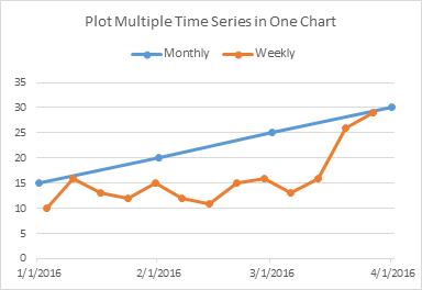
Usually the multi-series line chart looks like this : https://canvasjs.com/docs/charts/basics-of-creating-html5-chart/multi-series-charts/
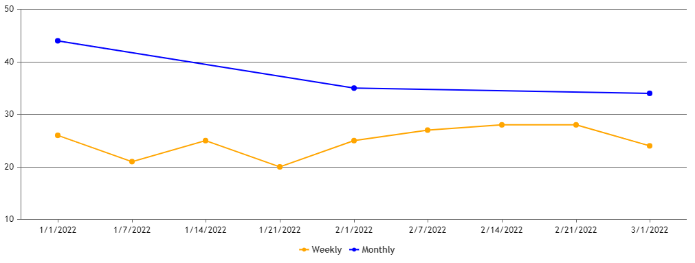
(where all the lines have points in front of the same label).But i want somethink like this :
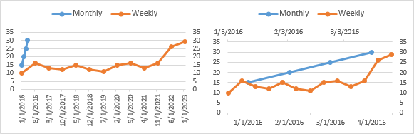
Like where the points should not be coordinated to the lines, but rather points in lines can alternate. That’s why I can push the points how i want by adding the X value(I really want labels on X axis to be strings, not numbers). If i don;t add x, the canvas js will force the points placement to be perpendicular and in match with the other points.
So do you have any other suggestions? or maybe i should use a new type of graph… Because right now seems like more of a bug, because it can’t interpret x value and label. I think a good behaviour(but is just my opinion), when a user adds x,y and label, x & y -should be for drawing purpose, and label strictly for displaying under the ox line.
April 12, 2023 at 6:25 pm #42480
Tagged: axisx labels
You must be logged in to reply to this topic.