Login to Ask a Question or Reply
Forum Replies Created by Suyash Singh
-
We are unable to get your exact requirement. Are you looking for something like this?
Candlestick chart accepts an array of 4 y-values. Please check your CSV and the dataPoints you are passing to chart. We observed that you are providing just 1 y-value. Please check this tutorial for creating chart from CSV and also refer candlestick charts for more info on candlestick charts and its dataPoints.
If you still face any issue, kindly create a jsfiddle reproducing the same so that we can help you in better way.
—
Suyash Singh
Team CanvasJSMarch 30, 2017 at 1:36 pm in reply to: can line chart – a coloured snake based on dataVariable #14704Y-Values in candlestick chart is an array of 4 values, but in your code you seem to be passing just one y-value, providing an array of 4 values will work in your case. In case if you are still facing any issue, kindly create a jsfiddle so that we can look into it and help you better.
valueFormatString formats the axis labels. In your case you will have to use xValueFormatString, yValueFormatString to format indexLabel or toolTip.
___
Suyash Singh
Team CanvasJS-
This reply was modified 9 years, 4 months ago by
Suyash Singh. Reason: typo
Thank you for your interest in CanvasJS.
Here is an example of showing the average on axis labels. For this you need to find the average of dataPoints and set it to axis label using chart options before rendering the chart.
—
Suyash Singh
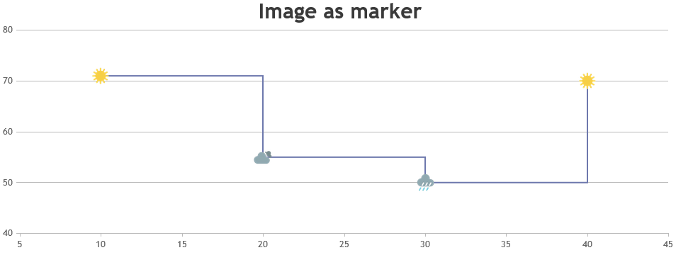
Team CanvasJSFor dynamic data, updating the position of image after adding new dataPoint has to be handled. Please take a look at below code snippet for the same.
var updateChart = function () {
  yVal = yVal + Math.round(5 + Math.random() * (-5 - 5));
  dps.push({ x: xVal,y: yVal });
  xVal++;
  if (dps.length > 10)
  {
    dps.shift();
  }
  chart.render();
  addMarkerImage(chart);
};

function addMarkerImage(chart) {
  var data = chart.options.data[0];
  for(var i = 0; i < data.dataPoints.length; i++) {
    customMarkers.push($("<img>").attr("src", data.markerImageUrl)
                       .css("display", "none")
                       .css("height", 20)
                       .css("width", 20)
                       .appendTo($("#chartContainer>.canvasjs-chart-container"))
                      );
    positionMarkerImage(customMarkers[i], i);
  }
}

function positionMarkerImage(customMarker, index){
  var pixelX = chart.axisX[0].convertValueToPixel(chart.options.data[0].dataPoints[index].x);
  var pixelY = chart.axisY[0].convertValueToPixel(chart.options.data[0].dataPoints[index].y);

  customMarker.css({"position": "absolute",
                    "display": "block",
                    "top": pixelY - customMarker.height()/2,
                    "left": pixelX - customMarker.width()/2
                   });
}

var updateId = setInterval(function () { updateChart();}, updateInterval);
Please refer to this JSFiddle for complete code.
Regarding your query about the Trial Version, our sales team have already mailed you and they will be assisting you further with your requirements.
—
Suyash Singh
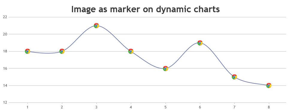
Team CanvasJSMarch 23, 2017 at 10:31 am in reply to: Overlapping Index Label Even When Placement is Outside #14654As of now markers can have only five possible values – “circle”, “square”, “triangle” , “cross” & “none”. However, you can position images in place of markers by adding few lines of code. Please checkout the code snippet below for the same.
addMarkerImages(chart);

function addMarkerImages(chart){
  for(var i = 0; i < chart.data[0].dataPoints.length; i++){
    customMarkers.push($("<img>").attr("src", chart.data[0].dataPoints[i].markerImageUrl)
                       .css("display", "none")
                       .css("height", 30)
                       .css("width", 30)
                       .appendTo($("#chartContainer>.canvasjs-chart-container"))
                      );
    positionMarkerImage(customMarkers[i], i);
  }
}

function positionMarkerImage(customMarker, index){
  var pixelX = chart.axisX[0].convertValueToPixel(chart.options.data[0].dataPoints[index].x);
  var pixelY = chart.axisY[0].convertValueToPixel(chart.options.data[0].dataPoints[index].y);

  customMarker.css({"position": "absolute",
                    "display": "block",
                    "top": pixelY - customMarker.height()/2,
                    "left": pixelX - customMarker.width()/2
                   });
}
Also, please take a look at this JSFiddle for a complete code. For further insight, please refer this how to section for positioning images over chart.
—
Suyash Singh
Team CanvasJSDinesh,
Sorry, this feature is not available as of now.
___
Suyash Singh
Team CanvasJSWe are unable to reproduce the issue at our end. Can you kindly create jsfiddle reproducing the issue, so that we can look into it and help you out.
___
Suyash Singh
Team CanvasJSThe dataPoints you pass to the chart must be an array of objects and not a string.
var ChartVal = document.getElementById("txtMyVal").value; // StringFirst you need to parse the string you get from your input field to a valid JSON and then parse the JSON to get the object which you can pass to the chart. For converting the string to valid JSON, you can enclose the values y, label, legendText in quotes in the input field. Please check this jsfiddle.
—–
Suyash Singh
Team CanvasJS -
This reply was modified 9 years, 4 months ago by