Login to Ask a Question or Reply
Forum Replies Created by Suyash Singh
-
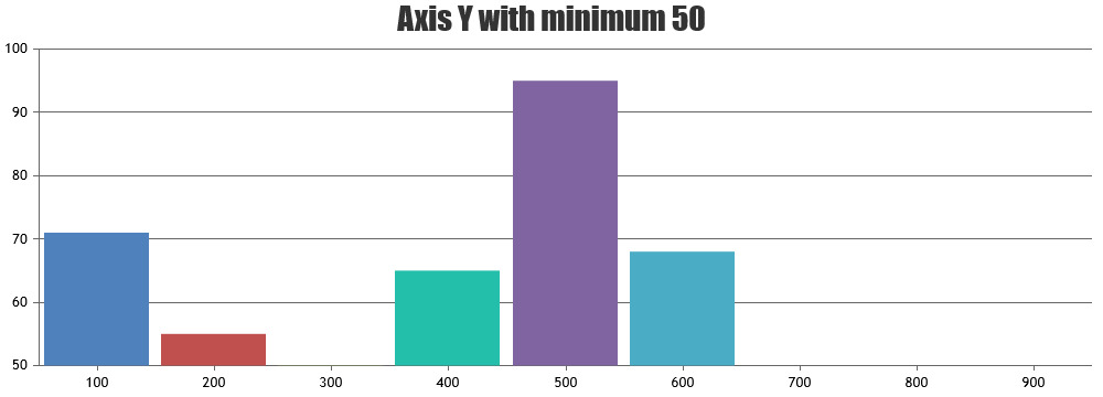
You can increase/decrease the number of dataPoints within the axis range as per your requirements and it should work fine.
var range = Math.round(e.axisX[0].viewportMaximum - e.axisX[0].viewportMinimum);___
Suyash Singh
Team CanvasJSFebruary 8, 2018 at 10:37 am in reply to: Zoom does not update Y Axis – Box and Whisker and Candlestick graphs #19380Thanks for reporting. We are looking into it and will fix it in the future releases.
___
Suyash Singh
Team CanvasJSWe are still looking into the issue. We observed that the issue seems to happen only when animation is enabled. You can try disabling animation as of now and that should work fine.
___
Suyash Singh
Team CanvasJSFebruary 6, 2018 at 2:11 pm in reply to: combining candlestick chart and line chart (moving average line) #19331Please take a look at yValueFormatString for formatting y-values in the toolTip. Also, kindly refer axisX.minimum for setting a minimum value and axisX.interval for customizing the interval at which the axis labels are shown.
___
Suyash Singh
Team CanvasJSFebruary 5, 2018 at 6:47 pm in reply to: CrossHair Line not show on mobile when move the line #19323Sorry, it is not possible as of now. But we will re-consider this behavior for the future versions.
___
Suyash Singh
Team CanvasJSFebruary 5, 2018 at 5:27 pm in reply to: CrossHair Line not show on mobile when move the line #19321It is an intended behavior that the crosshair disappears on drag as it might create confusion when zoom/pan is enabled in the chart. But we will reconsider this behavior in the future versions.
—
Suyash Singh
Team CanvasJSThe issue seems to have occurred since the latest chrome update but works fine across every other browser. We are looking into it and will get back to you at the earliest.
___
Suyash SinghIt is an intended behavior that the crosshair disappears on drag as it might create confusion when zoom/pan is enabled in the chart. But we will reconsider this behavior in the future versions.
—
Suyash Singh
Team CanvasJS@Wojciech,
Changing
chart.axisX[0].stripLines.push(stripLines);tochart.options.axisX[0].stripLines.push(stripLines);should work fine in your case. Also, you can use addTo method to add stripLines dynamically.___
Suyash Singh
Team CanvasJSYou can have OHLC and Column data-series with different ranges in the same chart by using Multiple Y Axis. Please take a look at the following links:
1. Creating charts with multiple y-axis.
2. axisYIndex, which is the property that lets you choose to which Y axis the dataSeries should be attached.___
Suyash Singh
Team CanvasJSAarya,
You can either keep the data-points in the same sequence in all the data-series as in this
jsfiddle, or add x values in all the data-points as in this example.___
Suyash Singh
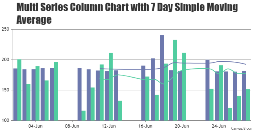
Team CanvasJSFebruary 2, 2018 at 11:36 am in reply to: combining candlestick chart and line chart (moving average line) #19285You can loop through each of the column series and create a corresponding series representing the Simple Moving Average as shown in the code snippet below –
// Pass all the data-series to render SMA
for(var i = 0; i < numberOfDataSeries; i++) {
    renderSimpleMovingAverage(chart.options.data[i], 7);
}

chart.render();

function renderSimpleMovingAverage(dataSeries, smaPeriod) {
    if(dataSeries.dataPoints.length <= smaPeriod) return;
    else {
    	// Add a new line series for Moving Averages
	chart.options.data.push({
            type: "spline",
            markerSize: 0,
	    color: dataSeries.color,
	    name: dataSeries.name + " SMA",
	    yValueFormatString: "#,##0.00",
	    dataPoints: []
	});

	var total;
	for(var i = smaPeriod; i < dataSeries.dataPoints.length; i++) {
	    total = 0;
	    for(var j = (i - smaPeriod); j < i; j++) {
	    total += dataSeries.dataPoints[j].y;
	    }
	    chart.options.data[chart.options.data.length - 1].dataPoints.push({
	    	x: dataSeries.dataPoints[i].x,
		y: total / smaPeriod
	    });
	}
    }
}
Please take a look at this JSFiddle.
___
Suyash Singh
Team CanvasJSFebruary 2, 2018 at 10:31 am in reply to: Create a chart for use of number of RDS users & groups #19283In JavaScript month starts from 0 instead of 1. So
new Date(2018, 2, 1)would be Mar 02 2018(as February 2018 has 28 days). Please take a look at this link on JavaScript Dates for more info.___
Suyash Singh
Team CanvasJS