Login to Ask a Question or Reply
Forum Replies Created by Sunil Urs
-
Hi,
Thanks for reporting. We’ll have a look into the issue and get back at the earliest.
—
Sunil UrsJanuary 30, 2015 at 8:17 pm in reply to: legendMarkerType hidden when many points rendered on line chart #8109Robert,
By default, the chart tries to decide if markers should be shown or not based on the number of dataPoints available.
You can override this behavior by setting markerSize as shown in this jsfiddle.
—
Sunil UrsWajeeha,
1- All the marker type has color filled shapes. We need a circle marker type that either has no color filled i.e edged circle or we can change the inner color of the circle. image link: http://screencast.com/t/snOfeQ7Z
We have just implemented this feature. Shortly we will send you an internal build over email.
2- I need line marker type with adjustable line length. image link: http://screencast.com/t/a48Pr20A7U
Sorry, line markers are not available yet.
3- I also need a way to align legends vertically rather then legends in a row. image link: http://screencast.com/t/xkSDDx9Q
As of now you can do the same by setting verticalAlign to “center” and horizontalAlign to “right”
—
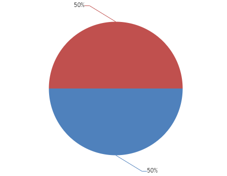
Sunil UrsRahul,
Latest version of library comes with this feature. You can show percentage using #percent keyword. Here is a JSFiddle for the same.
—
Sunil UrsDeesu,
This feature is not available yet. At the same time it would require significant amount of code to implement the same because it affects various other parts of the chart – toolTip, Event Handling, etc – there is no one place where it can be changed.
—
Sunil UrsPaulineg,
Thanks for reporting. This issue has been in the latest version – 1.6.0 Beta. Please download the same and let us know if its working as expected at your end.
—
Sunil Urslivenitup603,
Thanks for reporting. This issue has been in the latest version – 1.6.0 Beta. Please download the same and let us know if its working as expected at your end.
—
Sunil UrsTim,
This feature is not available yet. But as a workaround you can create different series for each color and get the same result.
—
Sunil UrsWahab,
What is the issue that you are facing here? Also can you please create jsfiddle with some dummy values so that we can have a look?
—
Sunil UrsYes, you can achieve the same by setting color property of dataPoints.
—
Sunil UrsAmit,
Yes, it is possible to update the chart. Please refer to this section for the same.
Thanks for reporting the issue. We’ll have a look and get back at the earliest.
—
Sunil UrsPlease recheck. “11/21” is at 5th position in both the Series. But “11/25” is at 8th position in first series and 7th position in the second series.
—
Sunil UrsSwapnil,
Not yet. But we should have a solution by the end of this week.
—
Sunil Urs