Login to Ask a Question or Reply
Forum Replies Created by Ranjitha R
-
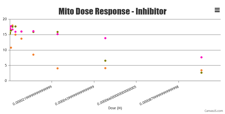
Yes, Exactly I’m referring the distance between the X-Axis label. In case of logarithmic, we will have an equal space distance. Am I correct?. The distance between the first and second x-axis & second and third x-axis differs. I would like to know the reason for it.
In logarithmic axis, the interval doesn’t increase in equal increments, instead, each interval is increased by a factor of the base of the logarithm. Hence, the axis labels are placed at irregular intervals.
We have an issue with the minimum x-axis value where the values will be like 0.00000017578124999999998. We have given the x-axis minimum and maximum value with the interval also. But the question here is why the minimum values are not shown in the graph i.e. x-axis?
Sorry, controlling the first label on the axes is not available as of now. minimum property only sets the starting range of the axis and not the first label on axis.
Also, I would like to know if you have any round function for the values? if Yes, let me know how to get rid of them.
Axis labels are not shown for dataPoint but at every interval of the axis. Hence, the labels might not show the exact value as that of the dataPoint. But if you would like to add more decimal places to the labels you can do so by using the following
valueFormatString: "0.#####################"for x-axis. Please check this documentation page for more information on valueFormatString and the available formats.Also, kindly check this updated JSFiddle for a working example.
—
Ranjitha R
Team CanvasJSBased on the code shared by you, it seems like you have not set the animationEnabled property. Setting
animationEnabled: trueshould work fine in your case—
Ranjitha R
Team CanvasJSAre you referring to the distance between the axis labels? The axis labels in case of logarithmic axis is not equidistant as in regular axis – this is the default behavior of logarithmic axis.
If you are referring to markers, can you kindly brief us more on the same, so that we can understand the scenario better and help you out?
—
Ranjitha R
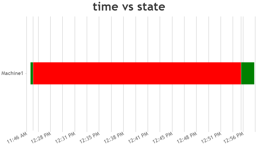
Team CanvasJSIt seems like you are passing timestamp in seconds whereas JavaScript uses milliseconds as timestamp. Hence you need to multiply the Unix timestamp by 1000 to convert it to JavaScript timestamp. You can add scaleBreaks to remove unnecessary regions with few lines of code as shown in the below code snippet.
 scaleBreaks: {
      customBreaks: [{
        startValue: 1631341054000,
        endValue: 1631343358000,
        spacing: 0,
        type :"straight",
      },
      {
        startValue: 1631345066000,
        endValue: 1631345183000,
        spacing: 0,
        type :"straight",
        }],
    },
Also take a look at this updated JSFiddle for complete code.
—
Ranjitha R
Team CanvasJSYou can use striplines to draw a vertical or horizontal lines at a specific position on the axis. You can also add label to the same to show some text to it.
—
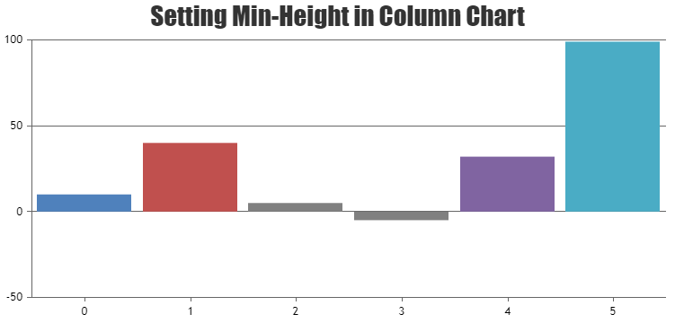
Ranjitha R
Team CanvasJSOctober 6, 2021 at 9:10 am in reply to: When the magnitude between values are too high not all the columns appear #35945Sorry, It is not possible to set minimum height of the column. However you can set minimum height to the columns with few lines of code as shown in the below code snippet
function setMinValue() {
  var data = chart.options.data;
  for(var i = 0; i < data.length; i++) {
    for(var j =0; j < data[i].dataPoints.length; j++) {
    var yValue = data[i].dataPoints[j].y;
      if(yValue <= minValue && yValue >= -minValue) {
        data[i].dataPoints[j].color = "gray";
        data[i].dataPoints[j].y = yValue < 0 ? -minValue : minValue;
        data[i].dataPoints[j].toolTipContent = ("{x}: " + yValue);
      }
    }
  }
}
Also take a look at this JSFiddle for complete code.
—
Ranjitha R
Team CanvasJS-
This reply was modified 4 years, 9 months ago by
Ranjitha R.
Marcel,
Sorry, it’s not possible to align all axis labels to the left extreme of the chart as of now.
—
Ranjitha R
Team CanvasJSCan you please create a sample project reproducing the issue you are facing and share it with us over Google-Drive or OneDrive along with the OS & browser details so that we can look into the code, understand the scenario better and help you out?
—
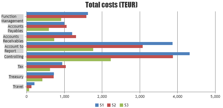
Ranjitha R
Team CanvasJSSetting labelTextAlign property allows you to align the text within particular label to left / center / right according to the line that has maximum width out of all the lines that are wrapped. In your example, label ‘Function Management’ and ‘Accounts Receivables’ is getting wrapped once its width crosses labelMaxWidth. Please take a look at this updated JSFiddle which highlights the region according to which axis labels are aligned to make it more clear about this use-case.
—
Ranjitha R
Team CanvasJSThanks for your suggestion. We will look into this feature in our future versions.
—
Ranjitha R
Team CanvasJSSivaranjani
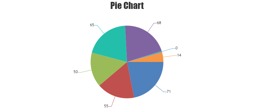
It’s not possible to show slice with a minimum space in pie-chart when the datapoint value is 0. However you can either show indexlabel to the section or add a defined value as minimum value to it as shown in below code-snippet.
function setMinValue() {
  var data = chart.options.data;
  for(var i = 0; i < data.length; i++) {
    for(var j = 0; j < data[i].dataPoints.length; j++) {
      var yValue = data[i].dataPoints[j].y;

      if(yValue <= minValue && yValue >= -minValue) {
        data[i].dataPoints[j].y = yValue < 0 ? yValue : minValue;
        data[i].dataPoints[j].toolTipContent = yValue.toString();
        data[i].dataPoints[j].indexLabel = yValue.toString();
      }
    }
  }
}
Please take a look at this JSFiddle for complete code.
Volker Voß
You can prevent the chart to reserve space for the hidden axes by setting negative values to the axis margin as shown in this below code snippet
axisY: {
  margin: -5
 },
Also take a look at this updatedJSFiddle for complete code.
—
Ranjitha R
Team CanvasJSNeha Mahajan,
It’s not possible to show all 40 legends within the space allocated for legend within the chart. Scrollbar within legend is not available as of now. However, you can create custom legends (DOM) with scrollbar as shown in this JSFiddle.
—
Ranjitha R
Team CanvasJS -
This reply was modified 4 years, 9 months ago by