Login to Ask a Question or Reply
Forum Replies Created by Ranjitha R
-
Can you please create a JSFiddle reproducing the issue you are facing and share it with us so that we can look into the code, understand the scenario better and help you out?
—-
Ranjitha R
Team CanvasJSFebruary 18, 2022 at 6:15 pm in reply to: Marker image on multiple datapoints with multiple lines #36987Based on the image shared by you, it seems like you have not added the hexToCSSFilter package in your code. Adding hex-to-css-filter.js package should work fine in your case.
—
Ranjitha R
Team CanvasJSFebruary 16, 2022 at 6:46 pm in reply to: Marker image on multiple datapoints with multiple lines #36956Changing the color of SVG image can be done by applying filter property. You can use hexToCSSFilter package to do so. You can set the color of the SVG images to the color of particular dataseries as shown in the code snippet below.
for (var j = 0; j < chart.data[i].dataPoints.length; j++) {
      customMarkers[i].push($("<img>").attr("src", chart.data[i].dataPoints[j].markerImageUrl)
                            .css("display", "none")
                            .css("height", 5)
                            .css("width", 5)
                            .css("filter", hexToCSSFilter(chart.data[i].color))
                            .appendTo($("#chartContainer>.canvasjs-chart-container"))
                           );
      positionMarkerImage(customMarkers[i][j], i, j);
    }
Also, check out this JSFiddle for working sample.
Ranjitha R
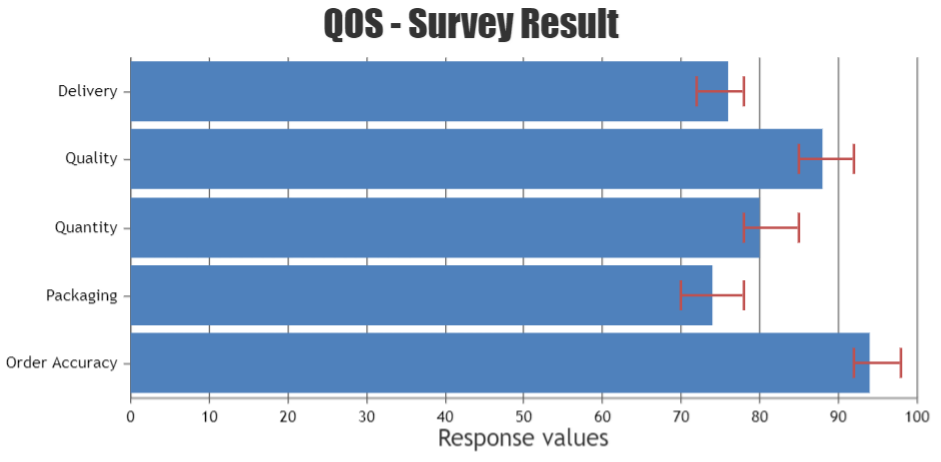
Team CanvasJSYou can combine error chart either with column chart(vertical) or bar chart(horizontal). Combining column & bar together in a chart is not possible as of now. Hence it’s not possible to have error chart across both vertical & horizontal in the same chart yet.
If you could brief us more about your requirements, we can analyze the scenario better & suggest you appropriately.
—-
Ranjitha R
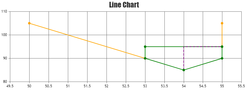
Team CanvasJSYou can use multi-series line chart to achieve your requirement. You can further customize the dash-type, color of the line using color and lineDashType properties and you can enable grids by setting gridThickness. Please take a look at this JSFiddle for working sample.
—–
Ranjitha R
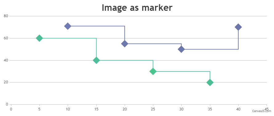
Team CanvasJSFebruary 1, 2022 at 6:59 pm in reply to: Marker image on multiple datapoints with multiple lines #36852You can position the image relative to viewport of the chart using rangeChanged event that would trigger whenever the chart range is changed by zooming/panning. Please find the code-snippet below.
 if(chart.data[dsIndex].dataPoints[dpIndex].x > chart.axisX[0].viewportMinimum && chart.data[dsIndex].dataPoints[dpIndex].x < chart.axisX[0].viewportMaximum) {
    customMarker.css({display: "block"})
  }
  else {
    customMarker.css({display: "none"})
  }
Also, take a look at this JSFiddle for complete working sample.
—-
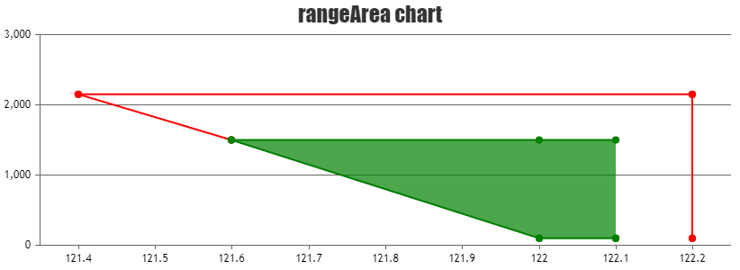
Ranjitha R
Team CanvasJSYou can plot more than one dataseries to display the multi-series range-area chart. Please find the code-snippet below.
data: [
  {
    type: "rangeArea",
    color: "red",
    dataPoints: [
      { x: 122.2, y: [100,100]},
      { x: 122.2, y: [2150,2150]},
      { x: 121.4, y: [2150,2150]},
      { x: 121.6, y: [1500,1500]},
    ]
  },
  {
    type: "rangeArea",
    color: "green",
    dataPoints: [
      { x: 122.1, y: [100,1500]},
      { x: 122,   y: [100,1500]},
      { x: 121.6, y: [1500,1500]},
      { x: 122,   y: [100,100]},
      { x: 122.1, y: [100,100]},
    ]
  }]
Also, Please take a look at this JSFiddle for working sample.
—-
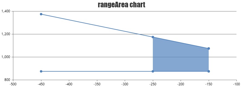
Ranjitha R
Team CanvasJSYou can use range-area chart to fill certain region of the series with a background color. Please find the code-snippet below.
data: [
      {
        type: "rangeArea",
        dataPoints: [
          { x: -150, y: [875,1075]},
          { x: -450, y: [875, 1375]},
          { x: -150, y: [875, 1075]},
          { x: -250, y: [875, 1175]}
        ]
      }]
Also, please take a look at this JSFiddle for working example.
—-
Ranjitha R
Team CanvasJSJanuary 25, 2022 at 6:52 pm in reply to: Marker image on multiple datapoints with multiple lines #36752In case of multi-series chart, you can loop through dataseries and pass dataseries index as well to position the image over the chart. Please find the code-snippet below.
function addMarkerImages(chart) {
  for(var i = 0; i < chart.data.length; i++) {
    customMarkers[i] = [];
    for (var j = 0; j < chart.data[i].dataPoints.length; j++) {
      customMarkers[i].push($("<img>").attr("src", chart.data[i].dataPoints[j].markerImageUrl)
                            .css("display", "none")
                            .css("height", 30)
                            .css("width", 30)
                            .appendTo($("#chartContainer>.canvasjs-chart-container"))
                           );
      positionMarkerImage(customMarkers[i][j], i, j);
    }
  }
}
Also, check out this JSFiddle for complete working sample.

—-
Ranjitha R
Team CanvasJSYou can set chart’s width & height dynamically by keeping plot-area width & height to be a constant value by manually calculating with the help of axis bounds. Please find the code-snippet below.
  var axisXBounds = chart.axisX[chart.axisX.length - 1].get("bounds");
  var axisYBounds = chart.axisY[chart.axisY.length - 1].get("bounds");

  var plotAreaWidth = 300;
  var plotAreaHeight = 300;

  var chartWidth = axisXBounds.x1 + plotAreaWidth;
  var chartHeight = chart.height - (axisYBounds.y2) + axisYBounds.y1 + plotAreaHeight;

  chart.set("width", chartWidth, false);
  chart.set("height", chartHeight);
Please take a look at this JSFiddle for a working example.
—-
Ranjitha R
Team CanvasJSLegends will be shown for each dataSeries and having multiple legends of individual dataSeries is not available as of now. As you like to add extra legends than the number of dataSeries, you can add dummy dataSeries of scatter or line chart-type & enable legends of those series by setting showInLegend property to true. Please check out the below code-snippet showing the same.
{
    type: "scatter",
    showInLegend: true,
    dataPoints: [{}]
}
—
Ranjitha R
Team CanvasJSIt is possible to position image over column/bar chart with the help of convertValueToPixel method. Please take a look at this JSFiddle for working example.
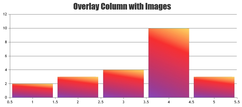
Also, kindly check this documentation page for step-to-step tutorial on positioning image on top of chart.
—
Ranjitha R
Team CanvasJSCan you please fork/save the JSFiddle reproducing the issue and then share the link with us so that we can look into your code, understand the scenario better and help you out?
—
Ranjitha R
Team CanvasJSTeva,
Can you please create a JSFiddle reproducing the issue you are facing and share it with us so that we can look into the code, understand the scenario better and help you out?
—
Ranjitha R
Team CanvasJS