Login to Ask a Question or Reply
Forum Replies Created by Manoj Mohan
-
April 10, 2024 at 6:50 pm in reply to: stockcharts and charts do not work in vue or nuxt or even in npm runkit #44934
CanvasJS is a client-side library that requires browser environment and APIs to run. You should prevent running CanvasJS in the server environment. To do so in Nuxt app, you can use
.clientsuffix to your component containing CanvasJS Chart. Please checkout this StackBlitz example for an example on integrating CanvasJS Charts in Nuxt app.
Also, check out this documentation page of nuxt to know more about client side component.
—-
Manoj Mohan
Team CanvasJSIn this example, we are reading data from /static/btc-usd-weekly-2021.json file. In your case, you can store the Nifty 200 data in a JSON format and pass it as datapoints to the chart.
—
Manoj Mohan
Team CanvasJS@jtr,
Please take a look at this Gallery Page for an example on rendering chart with data from JSON in PHP. If you are still facing issue, kindly create a sample project reproducing the issue you are facing & share it with us so that we can look into the code, understand the scenario better and help you out.
—
Manoj Mohan
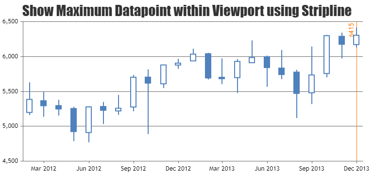
Team CanvasJSYou can use rangeChanged event to get to know the datapoint with maximum value within viewport on zooming/panning. Please take a look at this JSFiddle for an example on showing maximum datapoint within viewport using stripline.
—-
Manoj Mohan
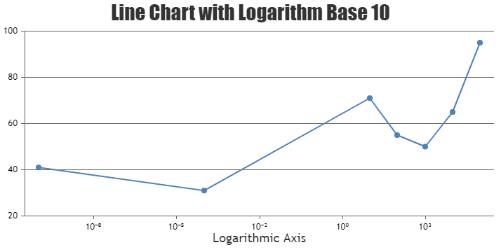
Team CanvasJSYou can show axis labels in exponential form with the help of unicode characters as mentioned in this thread. Please take a look at this JSFiddle for an example.
—-
Manoj Mohan
Team CanvasJS[Update]
We have released CanvasJS Angular Charts v1.1.0 to make our charts work with Angular Universal(SSR) apps. Please refer to the release blog for more information.
—-
Manoj Mohan
Team CanvasJSJE,
[Update]
We have released CanvasJS Angular Charts v1.1.0 to make our charts work with Angular Universal(SSR) apps. Please refer to the release blog for more information.
—-
Manoj Mohan
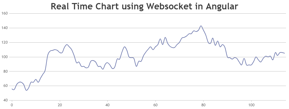
Team CanvasJSYou can create a websocket service in Angular app which establishes connection with your C-program and receives data. The received data should be parsed to the format accepted by CanvasJS to update the chart. Please check the code-snippet below that shows how to parse the data received from the websocket.
.
ngOnInit(): void {
  this.websocketService.connect();
  this.websocketService.messageReceived.subscribe((message: string) => {
    // message passed from the socket is in format { "value": 10 }. Parse to dataPoint format as per value returned from the socket service.
    let data = JSON.parse(message);
    this.dataPoints.push({
      y: data.value
    });
    this.chart.render();
  })
}
.
You can download the working sample from here. Also, refer to this article for more information on creating websocket service in Angular.
—-
Manoj Mohan
Team CanvasJSCanvasJS is a client-side library that requires browser environment and APIs to run. You should prevent running CanvasJS in the server environment by importing chart component only when document object is present. Please take a look at the code-snippet below.
/*canvasjs.angular.component.ts*/
.
.
if(typeof document === 'object' && !!document)
    var CanvasJS = require('../../node_modules/@canvasjs/charts');
.
.
/*app.component.ts*/
export class AppComponent {
  isDOMPresent:Boolean = typeof document === "object" && !!document;
  .
  .
}
/*app.component.html*/
<div>
  <canvasjs-chart  *ngIf="isDOMPresent" [options]="chartOptions" [styles]="{width: '100%', height:'360px'}"></canvasjs-chart>
</div>
Kindly download the working sample project that shows how to add CanvasJS Angular Chart component in Angular v17 (SSR) from here.
—-
Manoj Mohan
Team CanvasJSSorry, rendering CanvasJS Chart as SVG is not possible as of now.
—-
Manoj Mohan
Team CanvasJSParsing data received from the post request & passing it to chart-option before rendering it should work fine in your case. You are trying to perform another request inside the success of AJAX request, which is redundant. Please take a look at the code-snippet below.
$.ajax({
  url : 'chart.php',
  type : 'POST',
  data : {startDate:startDate,endDate:endDate},
  success : function(data) {
    var chart = new CanvasJS.Chart("chartContainer", {
      data: [
        {

          indexLabel: " {y}",
          indexLabelFontSize: 16,

          dataPoints: data
        }
      ]
    });

    chart.render();

  }
});
If you are still facing the issue, kindly create sample project reproducing the issue and share it with us over Google-Drive or Onedrive along with sample data so that we can look into your code, run it locally at our end to understand the scenario better and help you out.
—-
Manoj Mohan
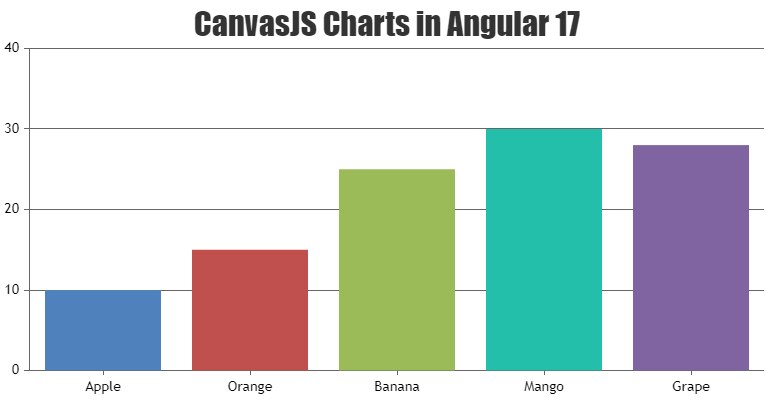
Team CanvasJSIn Angular 17, by default components are generated as standalone application. You can import
CanvasJSAngularChartsModulemodule into your standalone component as shown in the code snippet below.import { CanvasJSAngularChartsModule } from '@canvasjs/angular-charts'; @Component({ selector: 'app-root', standalone: true, imports: [CanvasJSAngularChartsModule], template: ` <div> <canvasjs-chart [options]="chartOptions"></canvasjs-chart> </div> `, })Also, check out this StackBlitz sample for integrating CanvasJS Charts in Angular 17.
If you are still facing the issue, kindly create sample project reproducing the issue and share it with us over Google-Drive or Onedrive along with sample data so that we can look into your code, run it locally at our end to understand the scenario better and help you out.
—-
Manoj Mohan
Team CanvasJSgetJSON function is used to load/get the JSON from the URL not to send the data to PHP page. If you want to pass the date selected from calendar and fetch the data based on it, you need to perform post or get request using $.ajax to an API created in PHP which receives the date and return the data. You can then fetch the data received from the API using $.getJSON and pass it on the chart options to render the chart.
If you are still facing the issue, kindly create sample project reproducing the issue and share it with us over Google-Drive or Onedrive along with sample data so that we can look into your code, run it locally at our end to understand the scenario better and help you out.
—-
Manoj Mohan
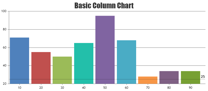
Team CanvasJSDecember 20, 2023 at 6:34 pm in reply to: Stripline label is overlaping with bars of a bar chart #44380You can place the stripline labels outside the plotarea, so that it doesn’t overlap any columns. However, if you like to place it inside itself and like to move it away from the columns, you can increase the viewportMaximum of axisX. Please take a look at this updated JSFiddle for an example.
—-
Manoj Mohan
Team CanvasJS