Login to Ask a Question or Reply
Forum Replies Created by Manoj Mohan
-
There are couple of issues in the JSFiddle that you have shared
1. You are passing label2 and y2 instead of label and y in dataPoins2 array. Please replace
$dataPoints2[] = array("label2"=>$row['Status'], "y2"=>$row['Total']);with$dataPoints2[] = array("label"=>$row['Status'], "y"=>$row['Total']);2. In the JSFiddle shared above, you have used multiple window.onload event handler where as there can be only one window.onload event handler in a page. You need to move all slider related functions and chart related code (initialize/updating chart options) inside the window.onload event handler. Also, instead of creating chart on switching the slider every time, you can create the chart instance once and update chart options/data based on slider index. Please take a look at the code snippet below for the same.
window.onload = function() {
  var dataPoints1 = <?php echo json_encode($dataPoints, JSON_NUMERIC_CHECK); ?>,
      dataPoints2 = <?php echo json_encode($dataPoints2, JSON_NUMERIC_CHECK); ?>;

  var chart = new CanvasJS.Chart("chartContainer", {
    animationEnabled: true,
    legend:{
      verticalAlign: "bottom",
      horizontalAlign: "center"
    },
    data: [{
      indexLabel: "{label} ({y} people)",
      yValueFormatString: "#,##0.\"\"",
      indexLabelFontSize: 17,
      indexLabelFontFamily: "Garamond",
      indexLabelFontColor: "black",
      indexLabelLineColor: "black",
      indexLabelPlacement: "outside",
      type: "pie",
      showInLegend: true,
      legendText: "{label}",
      dataPoints: dataPoints1
    }]
  });
  chart.render();

  var slideIndex = 1;
  showSlides(slideIndex);

  function showSlides(n) {
    var i;
    var slides = document.getElementsByClassName("mySlides");
    var dots = document.getElementsByClassName("dot");
    if (n > slides.length) {slideIndex = 1}
    if (n < 1) {slideIndex = slides.length}
    for (i = 0; i < slides.length; i++) {
      slides[i].style.display = "none";
    }
    for (i = 0; i < dots.length; i++) {
      dots[i].className = dots[i].className.replace(" active", "");
    }
    slides[slideIndex-1].style.display = "block";
    dots[slideIndex-1].className += " active";

    if(slideIndex == 1) {
      chart.options.dataPoints = dataPoints1;
    } else {
      chart.options.dataPoints = dataPoints2;
    }
    chart.render();

  }
}
Please refer to this StackOverflow thread for more information on adding multiple functions to the window.onload event handler.
If you are still facing issue, kindly create sample project reproducing the issue you are facing and share it with us over Google-Drive or Onedrive along with sample data so that we can run it locally at our end to understand the scenario better and help you out.
—-
Manoj Mohan
Team CanvasJS[Update]
We have released v3.2.12 GA with this bug fix, please check out release blog for more information. Please download the latest version from our download page and let us know your feedback.
—-
Manoj Mohan
Team CanvasJSMarch 23, 2021 at 7:51 pm in reply to: Is it possible to create time in box chart using bubble and rectangle box? #33649Thamizharasan,
Can you kindly brief us your requirement along with some example or pictorial representation so that we can understand your scenario better and help you out?
—-
Manoj Mohan
Team CanvasJSrangeChanged event handler for stockchart are called whenever any individual chart’s range is changed by zooming/panning as well as on changing range using navigator and slider. rangeChanged event handler of individual charts are called on zooming/panning the particular chart. Also, rangeChanged event of individual charts will be called first and then of stockchart when there is a change in the range of individual charts.
You can check out this JSFiddle to check how rangeChanged event handler is called for individual charts and stockcharts.
—-
Manoj Mohan
Team CanvasJSOne of our representatives will get in touch with you over email :)
—-
Manoj Mohan
Team CanvasJSIt seems to be happening due to programmatically zooming and resetting the charts. We will look into it further. However, you can hide toolbar on resizing the window or on hiding dataSeries by adding below function
toggleToolBarDisplaywhich displays and hides the toolbar. The functiontoggleToolBarDisplayhides the toolbar whenever chart is in reset state.function toggleToolBarDisplay() { var toolBar = document.getElementsByClassName("canvasjs-chart-toolbar"); for(var i=0; i<toolBar.length; i++) { toolBar[i].style.display = resetFlag ? "none" : "block"; } }Also, Please take a look at this JSFiddle for complete code.
—-
Manoj Mohan
Team CanvasJS[Update]
@kondor0,We have released v3.2.11 GA with this bug fix, please check out release blog for more information. Please download the latest version from our download page and let us know your feedback.
—
Manoj Mohan
Team CanvasJSIf you looking to set the minimum and maximum value of x-axis of individual chart with date-time axis, you can achieve it by setting the minimum and maximum property of axisX in charts. Please check out the below code snipppet for same.
{
	.
	.
	charts: [{
		axisX: {
			minimum: new Date(2018, 00, 01, 09, 30),
			maximum: new Date(2018, 03, 01, 09, 30)
		},
		.
		.
	}]
}
Setting the minimum and maximum of slider sets the range of all charts and synchronise them. Please check out the below code snippet for the same.
{
	.
	.
	navigator: [
		slider: {
			minimum: new Date(2018, 00, 01, 09, 30),
			maximum: new Date(2018, 03, 01, 09, 30)
		},
		.
		.
	]
}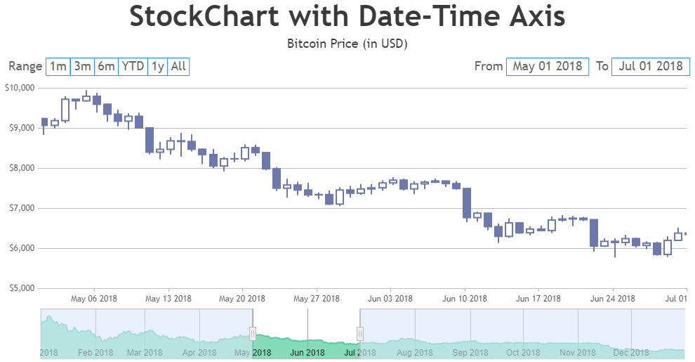
To specify hour component, you can pass the datetime value along with time component like new Date(2018, 00, 01, 09, 30) to minimum and maximum values. For more information on passing time component within date-time values, please refer to this MDN documentation.
—–
Manoj Mohan
Team CanvasJSThanks for reporting the use-case.
I’m guessing it’s because I may have a multi-line label. But, wondering what I can do to get around it. Heck, if I can add line break characters I would be happy to do that.
Sorry, it is not possible to add line break characters in indexLabel as of now.
Note, on the JSFiddle, the first column shows when the chart is 0 and the text is a few pixels in the line. The second column shows a 3-line label and the last line is in the column area.
We will reconsider this behaviour in our future releases.
—-
Manoj Mohan
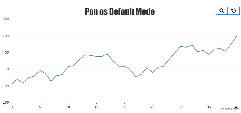
Team CanvasJSGlad that you figured it out. Also, you can enable pan mode as default option by simulating the click event on pan button as shown in this code snippet.
var parentElement = document.getElementsByClassName("canvasjs-chart-toolbar");
var childElement = document.getElementsByTagName("button");
if(childElement[0].getAttribute("state") === "pan"){
  childElement[0].click();
}
Please take a look at this JSFiddle for an example on chart with pan functionality as default mode.
—-
Manoj Mohan
Team CanvasJSPerformance of the chart seems to be proper. Can you kindly create JSFiddle reproducing the issue you are facing and share it with us so that we can understand your scenario better and help you out?
—-
Manoj Mohan
Team CanvasJSSorry, replacing axis labels with an image or drawing shapes in place of labels is not possible as of now. However you can use unicode characters which is supported along with text. Please take a look at this Gallery Page for an example on adding unicode in indexlabel, which also works fine with other elements like axis label, legend text, chart-title, etc. Please refer to this Wikipedia page for list of unicode characters.
—-
Manoj Mohan
Team CanvasJSrangeChanging and rangeChanged events seems to be working fine and are getting triggered even on zooming / panning the chart. Can you kindly create JSFiddle reproducing the issue you are facing and share it with us so that we can understand your scenario better and help you out?
—-
Manoj Mohan
Team CanvasJS