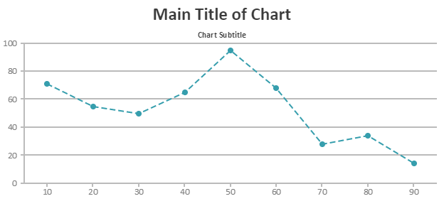
Today we are releasing v1.7 with lot of new features which should give you finer control over chart. This is a major version which supports custom formatter functions which was one of most requested features till now. With custom formatter functions you can format labels on axis according to your requirement. Apart from this we have also implemented Subtitles, line dash type properties, etc.
Do try out our current version and let us know your feedback. Below is a summary of this release.
Enhancements / New Features
Static Methods for Formatting Numbers & DateTime values
- CanvasJS.formatNumber(number, [formatString], [culture])
- CanvasJS.formatDate(date, [formatString], [culture])
Subtitles
- New Element using which you can render any number of Subtitles inside the chart. Supports all features that are present in Title except that subtitle is smaller in size by default.
Title
- Control over Wrapping behaviour using wrap & maxWidth properties
- Ability to show title inside PlotArea using dockInsidePlotArea property. This gives more space for the rendered chart
Legend
- Custom Formatter Function to format legend item’s text – itemTextFormatter
- Ability to reverse the order of legend items using reversed property
- Text wrapping using itemWrap & itemMaxWidth property.
- Ability to align multiple rows of legend items using itemWidth property.
- maxWidth & maxHeight property
- Ability to show legend inside PlotArea using dockInsidePlotArea property. This gives more space for the rendered chart
ToolTip
- Custom Formatter Function to format toolTip’s content – contentFormatter.
- Ability to reverse the order of toolTip items using reversed property.
- Background and Border properties – backgroundColor, borderColor, borderThickness, cornerRadius.
- Font Properties – fontColor, fontFamily, fontSize, fontWeight, fontStyle.
Axis
- Now you can customize Line Dash type using lineDashType & gridDashType
- Custom Formatter function to format axis labels – labelFormatter
StripLine
- Ability to show stripLine above dataPoints using showOnTop property.
- Custom Formatter Function to format stripLine’s label – labelFormatter.
- opacity property
- lineDashType property
DataSeries
- lineDashType property which allows you to draw different types of lines like dashed, dotted, etc.
- indexLabelLineDashType to control indexLabeLine’s dash type.
- Custom Formatter function to format indexLabels – indexLabelFormatter.
- Ability to wrap indexLabels in all chart types using indexLabelWrap & indexLabelMaxWidth properties.
- indexLabelBackgroundColor for all chart types.
- Ability to disable dataPoint highlighting on mouseover using highlightEnabled property.
- Keywords support in legendText.
DataPoints
- Ability to wrap indexLabels in all chart types using indexLabelWrap & indexLabelMaxWidth properties.
- indexLabelLineDashType to control indexLabeLine’s dash type.
- Custom Formatter function to format indexLabels – indexLabelFormatter.
- indexLabelBackgroundColor for all chart types.
- Ability to disable specific dataPoint highlighting on mouseover using highlightEnabled property.
- showInLegend which allows you to selectively display/hide dataPoints inside legend.
- Keywords support in legendText.
Change in Behaviour
- Title’s Margin is now applied only towards the PlotArea.
- If labelFontColor is not mentioned in stripLine, it takes the value from stripLine’s color property.
- In toolTip we have differentiated between content string and content formatter function. Earlier you could assign either a string or function to content property. Now string need to assigned to content property and formatter function to contentFormatter.
- indexLabels are centered vertically when placed inside column/bar charts. Earliest it used to be towards the end.
- indexLabels are shown inside column/bar by default for stacked charts.
Bug Fixes
- In few cases menu button was overlapping the title.
- Setting toolTip’s shared property used to throw error in Pie & Doughnut Chart.
- In few specific cases Column/Bar width was not getting calculated properly in multi-series chart if there was only one dataPoint in each series.
- When there was only one dataPoint with dateTime value for x, axis used to show label as 000ms.
Do download the latest version from our download page and let us know your feedback
Thank You,
Anjali Jain
Team CanvasJS
2 Comments

good am using js for http://webdeveloperbareilly.in
Pingback: CanvasJS 1.7.0 goes GA - CanvasJS