Login to Ask a Question or Reply
Forum Replies Created by Vishwas R
-
We observe that both formats are working fine.
{ x: new Date("Sun 02 03 2013 22:04:09"), y: 26},
{ x: new Date("Sun Feb 03 2013 22:04:09"), y: 26}
Here is the screenshot of the same.
Can you please create a jsfiddle with the issue, so that we can look into it and resolve.Teresa,
You can use dataPointWidth to increase/decrease the width of dataPoint (column in your case) which is nothing but reducing/increasing the gap between columns.
Sorry, as of now Bar chart Cannot be combined with any other chart types except Bar and Stacked Bar charts.
Sorry we don’t have this feature as of now. We had considered it, but found intervals were not proper. For example, if minimum is 0, maximum is 80 and user likes to have 7 ticks in that range, interval comes out to be 11.42857142857143 (~11.43), which is not convenient to the user. But we’ll reconsider this feature in future releases.
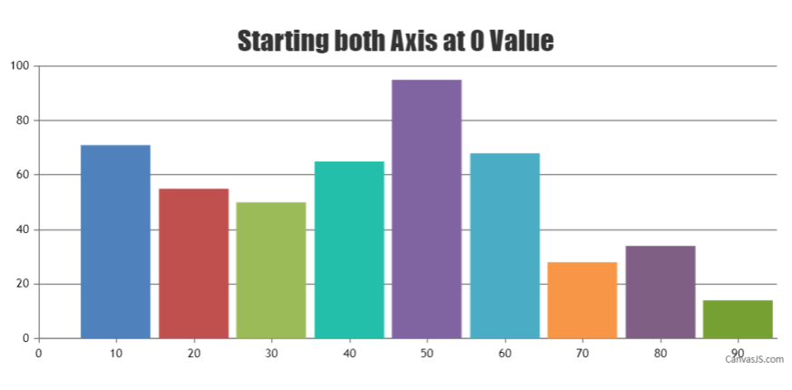
As of now, you can manually calculate interval to achieve the same. For Example, if the minimum is 0, maximum is 90 and if you like to show 8 number of ticks, you can set interval to 11.25.
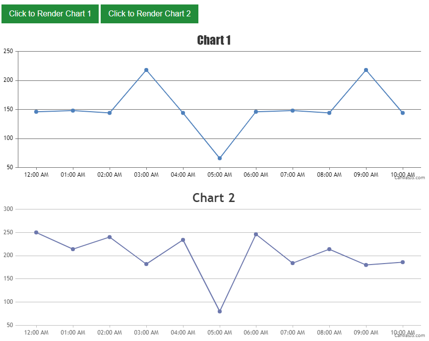
Please refer to this JSFiddle for an example on rendering multiple dynamic charts in bootstrap tabs using bootstrap
shown.bs.tabtab events.
Also, we checked the charts with multiple mobile devices and it seems to be working fine. Can you kindly create a JSFiddle reproducing the issue, so that we can look into the issue and help you out. Along with it, please provide the following information: Mobile Device, OS and its version, Browser and version.
—-
Vishwas RHeavyThumper,
You have to initialize the chart on shown.bs.collapse event in bootstrap. Here is an example.
Praveen,
Here are solutions to have same charts in morethan one div by passing same chart-options. Check these solution 1 and solution 2.
It seems to be working fine in all stable versions of Microsoft Edge. We observed that Microsoft Edge v38 is available in Windows 10 preview release, which is not stable. So we recommend you to use latest stable version and check if it works fine.
Callam,
We have just released v1.8.1 GA. Kindly download the latest version and let us know your feedback. Refer to the release blog for more information.
—
Vishwas R
Team CanvasJSDanny,
We have just released v1.8.1 GA. Kindly download the latest version and let us know your feedback. Refer to the release blog for more information.
Arjun,
Here is an example for pie/doughnut charts without indexLabels. If your requirement is not to show legends, you can set showInLegend to false (defaults to false),if you have set it to true. Please check out the code-snippet below.
 data: [
    {
      type: "pie",
      showInLegend: true,
      toolTipContent: "{legendText}",
      dataPoints: [
        {  y: 36, legendText: "apple" },
        {  y: 17, legendText: "mango" },
        {  y: 16, legendText: "orange" },
        {  y: 9, legendText: "butter fruit" },
        {  y: 8, legnedText: "grapes" },
        {  y: 7, legendText: "melons" },
        {  y: 7, legendText: "pineapple"}

      ]
    }
  ]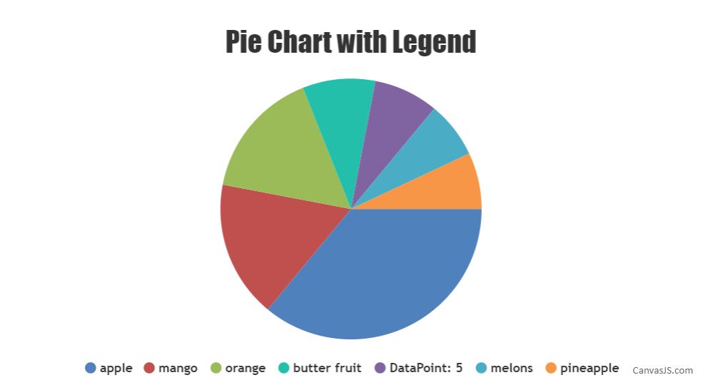
If this doesn’t fulfill your requirement, pictorial representation would help us to understand and help you out.
—
Vishwas R
Team CanvasJSCallam,
Can you please try using this latest build and let us know if it worked.
—
Vishwas R
Team CanvasJS