Login to Ask a Question or Reply
Forum Replies Created by Manoj Mohan
-
You can save the chart in the server side and store it in required location using headless browsers like Chrome Headless Browser, BrowserShot, SlimerJS etc. Also, you can use puppeteer (headless Chrome Node.js API) to achieve your requirement. Please take a look at this sample project for an example on saving the chart using puppeteer API.
—-
Manoj Mohan
Team CanvasJSOctober 3, 2022 at 11:21 am in reply to: Tooltip showing both the values when clicking on legend buttons #39258We have just released CanvasJS Charts v3.7 with a few bug fixes related to tooltip & it’s content. Please refer to the release blog for more information. Do download the latest version from our download page and let us know your feedback.
—-
Manoj Mohan
Team CanvasJSWe have just released CanvasJS Charts v3.7 with a few bug fixes related to tooltip & it’s content. Please refer to the release blog for more information. Do download the latest version from our download page and let us know your feedback.
____
Manoj Mohan
Team CanvasJSCan you kindly create a sample project reproducing the issue you are facing and share it with us over Google-Drive or Onedrive along with sample data so that we can look into your code, run it locally at our end to understand the scenario better and help you out?
From what we have observed, sometimes things get delayed mostly when we are not able to reproduce the issue at our end or not able to understand the exact requirements or due to the variation in chart-options being used by you and us. Because of these reasons we expect you so share sample project along with sample data(dummy data) which helps us run it locally at our end to understand the use case and help you resolve.
—-
Manoj Mohan
Team CanvasJSYou can add CanvasJS chart to your react native application using webview component as shown in this sample project. It is not possible to integrate chart via native code as of now.
—-
Manoj Mohan
Team CanvasJSCan you kindly create sample project reproducing the issue you are facing & share it with us over Google-Drive or Onedrive so that we can run it locally at our end to understand the scenario better and help you out?
At the same time, kindly check if you are using one of the standard date-formats if your data includes date-time values. Some of the browsers handles date-time even if you pass date in wrong format whereas some browsers don’t.
—-
Manoj Mohan
Team CanvasJSjQuery script seems to be working fine without any issue. If you are still facing issue, kindly try including the script from the official jQuery CDN or from cdnjs.
—-
Manoj Mohan
Team CanvasJSCanvasJS doesn’t provide CDN for jquery scripts. To include jquery in your project, you can either host jquery in your server or load it from official jQuery CDN or from cdnjs.
—-
Manoj Mohan
Team CanvasJSSeptember 12, 2022 at 6:58 pm in reply to: In scan mode Narrator is incorrectly announcing image on interactive graphs pres #39105CanvasJS charts plots all the chart-elements on HTML5 canvas element, which is considered as an image by the narrator. Hence it’s not possible to have accessibility for individual datapoint as of now. However, you can pass aria-label field to the entire chart to achieve accessibility. Please take a look at this JSFiddle for an example on the same.
Also, please refer to this forum thread for more information.
—-
Manoj Mohan
Team CanvasJSConsidering this as the duplicate of toggle legend crash with axisX2 and hence, closing the same.
—-
Manoj Mohan
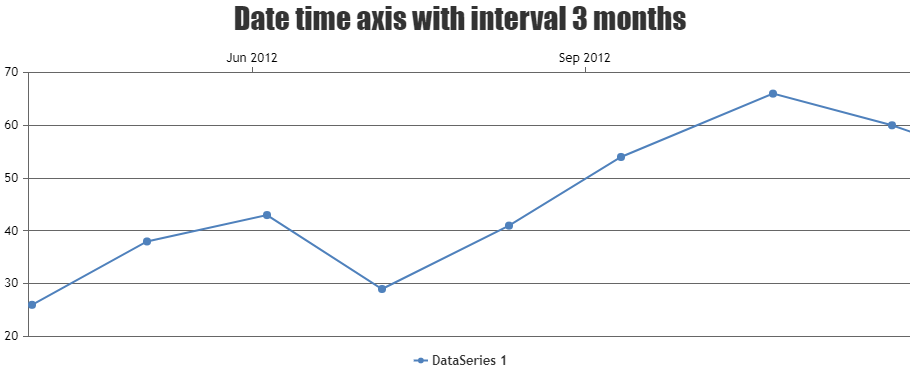
Team CanvasJSIt seems like issue is happening when you are setting interval on datetime axis and none of the dataseries is visible. To overcome this issue, you can unset the interval when the dataseries is not visible and vice-vera when dataseries is visible as shown in the below code snippet.
itemclick: function (e) {
    if (typeof (e.dataSeries.visible) === "undefined" || e.dataSeries.visible) {
        e.chart.options.axisX2.interval = undefined;
        e.dataSeries.visible = false;
    } else {
        e.chart.options.axisX2.interval = 3;
        e.dataSeries.visible = true;
    }

    e.chart.render();
}
Also, check out this updated JSFiddle for complete working code.

—-
Manoj Mohan
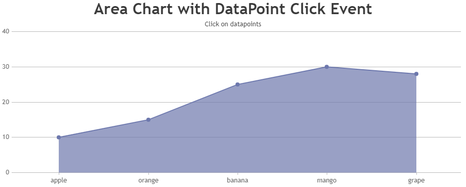
Team CanvasJSYou can set a flag on rangeChanging and rangeChanged event handler and check the flag before executing the functionality of click event handler as shown in the code snippet below.
let chartRangeChanging = false
.
.
rangeChanging: () => { chartRangeChanging = true },
rangeChanged: () => { chartRangeChanging = false },
.
.
function handleClick() {
  if (currentViewedDps.length != 0 && !chartRangeChanging)
    alert(
      'DataPoint with { label: ' +
      currentViewedDps[0].label +
      ', y: ' +
      currentViewedDps[0].y +
      '} is clicked'
    );
}
.
.
Please take a look at this updated Stackblitz example for complete working code.
—-
Manoj Mohan
Team CanvasJSTo show datapoint information on clicking part of area chart as well, you can bind a click event on chart container and with the help of tooltip updated event, you can display the information about datapoint when clicked. Please take at the below code snippet for the same.
let currentViewedDps = [];
.
toolTip: {
  updated: function (e) {
    currentViewedDps = [];
    e.entries.forEach((entry) => {
      currentViewedDps.push(entry.dataPoint);
    });
  },
    hidden: function (e) {
      currentViewedDps = [];
    },
}
.
.
useEffect(() => {
  if (chart != null) {
    chart.container.addEventListener('click', handleClick);
    return function () {
      chart.container.removeEventListener('click', handleClick);
    };
  }
});
.
.
Also, check out this StackBlitz project for complete code.

—-
Manoj Mohan
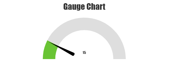
Team CanvasJSYou can easily add needle to gauge chart as explained briefly in this thread. As briefed in the thread, adding a div and customizing it’s style to position it on top of chart should work in your case.
/*HTML*/
<div class="speedometer-needle" #needle></div>

/* CSS */
.speedometer-needle {
  position: absolute;
  width: 30px;
  height: 30px;
  border-radius: 50%;
  background: transparent;
  top: 50%;
  left: 50%;
  transition: 0.3s ease-in-out;
  transform: translate(-50%, 0%) rotate(0deg);
  margin: 8px 0 0;
}

.speedometer-needle:before {
  content: '';
  position: absolute;
  border-radius: 5px;
  border: 6px solid transparent;
  border-right: 100px solid #000;
  left: -130px;
  top: 10px;
  width: 0;
  height: 0;
}

/* To position the needle above chart based on value */
this.renderer.setStyle(
      this.needle.nativeElement,
      'transform',
      'translate(-50%, 0%) rotate(' +
        parseInt(this.gauge.valueText.text) * (180 / this.gauge.maximum) +
        'deg)'
);
Please take a look at this Stackblitz project for complete working code.

—-
Manoj Mohan
Team CanvasJSCan you kindly create sample project reproducing the issue you are facing & share it with us over Google-Drive or Onedrive so that we can run it locally at our end to understand the scenario better and help you out?
At the same time, kindly check if you are using one of the standard date-formats if your data includes date-time. Some of the browsers handles date-time even if you pass date in wrong format whereas some browsers don’t.
—-
Manoj Mohan
Team CanvasJS