Login to Ask a Question or Reply
You must be logged in to post your query.
Home › Forums › Chart Support › Speedometer chart
Speedometer chart
- This topic has 5 replies, 2 voices, and was last updated 4 years, 5 months ago by
Thangaraj Raman.
Tagged: canvas speedometer
-
February 5, 2019 at 5:46 am #24210
Hi.
Can canvas is do speedometers? Customer has asked to change it to speedeometer for a graph of marks out of 10.
Thanks-
This topic was modified 7 years, 5 months ago by
amityweb.
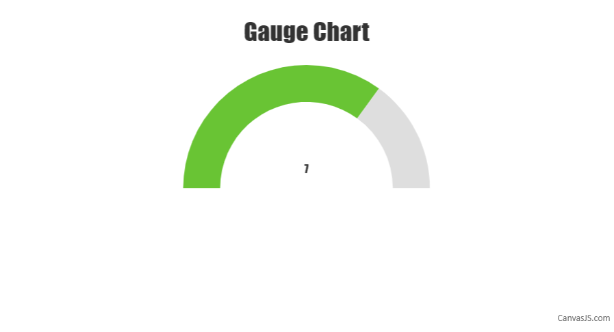
February 5, 2019 at 8:21 pm #24220Sorry, we don’t have a gauge chart as of now but a semi doughnut chart can be used to create it. Please below the steps below for creating a gauge chart using a doughnut chart.
First, we need to create an object that will store all the necessary data that is needed to be shown on the gauge chart. The code snippet below shows an example of that object:
var gauge = {
  title:{text: "Gauge Chart"},
  data: { y: 7 }, //gauge value
  maximum: 10
};
In the second step, we will initialize the chart object and populate its dataPoints considering the fact that only half of the doughnut chart be displayed. Please refer to the code snippet below for achieving the same:
var chart = new CanvasJS.Chart("chartContainer");
createGauge(chart);

//Function for gauge
function createGauge(chart){
  //Caluculation of remaining parameters to render gauge with the help of doughnut
  gauge.unoccupied = {
    y: gauge.maximum - gauge.data.y ,
    color: "#DEDEDE",
    toolTipContent: null,
    highlightEnabled: false,
    click : function (){ gauge.unoccupied.exploded = true; }
  }
  gauge.data.click = function (){ gauge.data.exploded = true; };
  if(!gauge.data.color)
    gauge.data.color = "#69C434";
  gauge.valueText = {text: gauge.data.y.toString(), verticalAlign :"center"};

  var data = {
    type: "doughnut",
    dataPoints: [
      {
        y: gauge.maximum ,
        color: "transparent",
        toolTipContent: null
      },
      gauge.data,
      gauge.unoccupied
    ],
  };

  if(!chart.options.data)
    chart.options.data = [];
  chart.options.data.push(data);

  if(gauge.title){
    chart.options.title = gauge.title;
  }

  //For showing value
  if(!chart.options.subtitles)
    chart.options.subtitles = [];
  chart.options.subtitles.push(gauge.valueText);

  chart.render();
}
You can also refer to take a look at this JSFiddle for a working example with sample code.
—
Shashi Ranjan
Team CanvasJSNovember 13, 2019 at 6:59 pm #27390We create an speedometer with the following link suggestion that use CanjasJS.
https://codepen.io/PowerTower/pen/GQONjyWhats we did:
1) We Created diferentes areas but the color is the same “white”, once is our background-color:
data: [
{
type: ‘doughnut’,
dataPoints: [
{
y: 1,
color: ‘white’
},
{
y: 1,
color: ‘white’
}
,
{
y: 1,
color: ‘white’
}
]
Basicaly we use de structure of diferentes color for separate areas, However all color we use “white” that is ou background-color. So the color is never shown.2) We removed the center informaton number.
3) We adjusted the pointer position and size.
4) We add a background-img in at the div
If you want to see the result, check the link: https://silossoft.com.br/canvasjs-gauge-speedometer.jpg
I hope this could help someone else
November 18, 2019 at 5:58 pm #27432Hi Carlos,
That’s nice work. It will definitely help many others.
Thanks for taking the efforts and posting in this community forum.
–
Sandeep
Team CanvasJSFebruary 20, 2022 at 12:46 pm #36993Hi Carlos,
How we can set maximum value limit of needle on the example to 10, it is now 100.
-
This reply was modified 4 years, 5 months ago by
m.usman.
February 21, 2022 at 7:56 pm #37003You can customize a DIV using CSS to visualize the needle as shown in the code snippet below –
HTML
<div class="speedometer__needle js-needle"></div>CSS
.speedometer__needle {
  position: absolute;
  width: 30px;
  height: 30px;
  border-radius: 50%;
  background: transparent;
  top: 72%;
  left: 50%;
  transition: .3s ease-in-out;
To position the needle at a specific point you can use CSS transform property. Please check the code snippet below –
$( '.js-needle' ).css({
  'transform' : 'translate(-50%, -50%) rotate('+  (tickValue * 18.0) + 'deg)'
});
Please check this JSFiddle for a working example which meets your requirement.

—
Thangaraj Raman
Team CanvasJS-
This reply was modified 4 years, 5 months ago by
-
This topic was modified 7 years, 5 months ago by
Tagged: canvas speedometer
You must be logged in to reply to this topic.