Login to Ask a Question or Reply
Forum Replies Created by Anjali
-
widgy,
You can format numbers and date time values before they appear on Axis-X using its valueFormatString property. Here is an example on how you can use axisX valueFormatString property:
axisX: {
  valueFormatString: "DD/MMM/YYYY HH:mm:ss",
}
Please note that the xValueFormatString property is used for formatting x-values in indexLabel and toolTip.
I thought that would have changed the label as well since it says “Defines how x axis values must be formatted before they appear on the indexLabel or toolTip.
That was a typo and we have fixed the same. Thank you for reporting :)
__
Anjali[Update]
Now we have a Tutorial on Creating Charts from JSON Data in our documentation.
willibald,
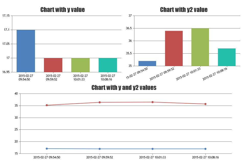
After getting Json result, create a HTML page that does AJAX request and fetch the data. After getting the data, it will render a Chart.
Below is the sample code:
<html>
<head>
<script type="text/javascript" src="https://canvasjs.com/assets/script/jquery-1.11.1.min.js"></script>
<script type="text/javascript" src="https://cdn.canvasjs.com/canvasjs.min.js"></script>
<script type="text/javascript">
 $(document).ready(function () {

	var dataPointsTemp = [];
	var dataPointsHumidity = [];

// Ajax request for getting JSON data

	$.getJSON("data.json", function(data) {
		for( var i = 0; i < data.length; i++) {
			dataPointsTemp.push({ label: data[i].label, y: data[i].y });
			dataPointsHumidity.push({ label: data[i].label, y: data[i].y2 });
		}

		// Chart with label + y values

		var chart = new CanvasJS.Chart("chartContainer1",
		{
			title:{
				text: "Chart with y value"
			},
			data: [
			{
				dataPoints: dataPointsTemp
			}]
		});
		chart.render();

		// Chart with label + y2 values

		var chart = new CanvasJS.Chart("chartContainer2",
		{
			title:{
				text: "Chart with y2 value"
			},
			data: [
			{
				dataPoints: dataPointsHumidity
			}]
		});
		chart.render();

		// Chart with label + y and y2 values or multiSeries Chart

		var chart = new CanvasJS.Chart("multiChart",
		{
			title:{
				text: "Chart with y and y2 values"
			},
			data: [
			{
				type: "line",
				dataPoints: dataPointsTemp
			},
			{
				type: "line",
				dataPoints: dataPointsHumidity
			}
			]
		});
		chart.render();
	});
});
</script>
<style>
	.chart {
		display: inline-block;
	}
</style>
</head>
<body>
<div id="chartContainer1" class="chart" style="width: 50%; height: 300px;></div>
<div id="chartContainer2" class="chart" style="width: 45%; height: 300px;></div>
<div id="multiChart" style="width: 80%; height: 300px;margin:auto;></div>
</body>
</html>
__
Anjali[update]
We have just released v1.9.5 Beta which supports Secondary X Axis and Multiple X / Y Axis. Please refer to the release blog for more information.
hmokdad,
Yes, only two y-axis is possible.
__
Anjali[update]
We have just released v1.9.5 Beta which supports Secondary X Axis and Multiple X / Y Axis. Please refer to the release blog for more information.
hmokdad,
Yes, canvasJS supports multiple y-axis. But As of now, only primary and secondary y-axis are supported. Here is an example.
__
Anjalimelitica,
Looks like you forgot to save the fiddle. Can you please update the same so that we can have a look.
__
Anjaliwidgy,
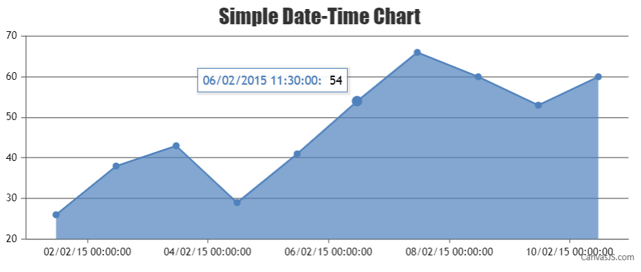
You can use xValueFormatString property of dataSeries to define how x-values must be formatted before they appear on the indexLabel or toolTip. You can format numbers and date time values using this property. For example if you set xValueFormatString as
xValueFormatString: "DD/MMM/YYYY HH:mm:ss"then the x-value appearing in the toolTip will be formatted as shown in the image below.
Please refer to this JSFiddle for a working example with code.
__
Anjalisharvari,
1) In case you meant reversing the x axis, then its not possible. But in case you were looking for a rangebar chart type, then here it is.
2) Sorry, it is not possible to set fixed height for rangeBar charts because when the number of dataPoints increase, we cannot fit/display all of them without reducing their height.
__
Anjalidwpark,
1) Please use labelMaxWidth property of axis for the same.
2) This isn’t possible as the axis needs to position itself based on the label’s length. But you can set labelMaxWidth so that axis is not pushed over a certain limit (labelMaxWidth).
_
Anjaliwajeeha,
Without looking into the code it is hard to guess the problem. Can you please create a jsfiddle with your sample data. So we can have a look.
__
Anjaliswapnil,
We don’t have plans to implement gauges in near future.
__
Anjaliwidgy,
This feature is not available yet.
__
Anjalimsiv,
As of now, it is not possible to disable highlighting of dataPoints. As a workaround, you can set markerType to null and it won’t get highlighted.
___
Anjali