Login to Ask a Question or Reply
Forum Replies Created by Vishwas R
-
November 11, 2022 at 9:27 am in reply to: Grouped bar chart(stacked Column), gap between the bars, index Label, legends #39530
@mm,
Sorry for the inconvenience caused. We will fix it in our upcoming versions and we will keep you posted once the bug is fixed.
—
Vishwas R
Team CanvasJS@rck,
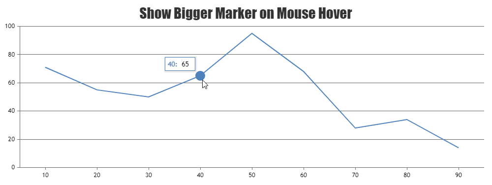
Unfortunately, it’s not possible to have custom marker-size on hover as of now.
—
Vishwas R
Team CanvasJS@rck,
By default marker borders are disabled & are not shown around the marker. Setting markerBorderThickness to a value greater than 0 will add border to the marker & makes it look bigger. Please take a look at this JSFiddle for an example on hiding markers by default but showing a bigger marker on mouse hover.
—
Vishwas R
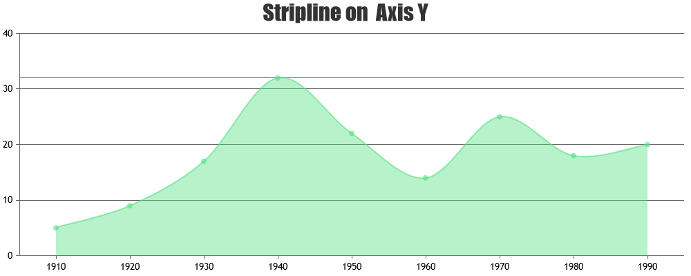
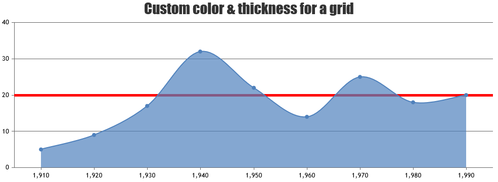
Team CanvasJSGridlines are drawn at every interval of the axis. Color & thickness of all the grids can be changed using gridColor & gridThickness properties respectively. As addressed earlier, you can use stripline at a particular value to show different thickness & color of a grid. Please take a look at this JSFiddle for an example.
—
Vishwas R
Team CanvasJSWith a few lines of JavaScript code, you can retain the size of the exported image with the help of devicePixelRatio. Take a look at the code-snippet given below.
chart.set("width", 1200 * (1 / window.devicePixelRatio), false);
chart.set("height", 1800 * (1 / window.devicePixelRatio));
chart.exportChart({ format: "jpg" });
Please refer to this Stackoverflow thread for more information on handling device / browser scaling in JavaScript.
—
Vishwas R
Team CanvasJSBased on the screenshot that you have shared, it seems like you have either set browser zoom or the scale option under display settings to 125%. In such cases, chart also gets zoomed as per your settings & exports at that particular resolution. Exporting at 100% browser & display scale settings seem to export chart at defined width & height.
However, if you like to keep browser / display scale settings at 125%, you will have to set width & height to 960×1440, so that you can export image at 1200×1800 pixels (125% of 960×1440 pixels).
—
Vishwas R
Team CanvasJSThe solution shared by @thangaraj-raman demonstrates exporting chart with width set to 1800px & height to 1200px. You can customize the width & height of the chart as per your requirements like 1200×1800 or 1920×1080, etc. by changing the value passed in set method as shown below.
chart.set("width", 1200, false);
chart.set("height", 1800);
chart.exportChart({ format: "jpg" });
Please refer to documentation page for more customization options available along with examples that you can try out live.
—
Vishwas R
Team CanvasJSOctober 3, 2022 at 11:23 am in reply to: Controls the number of tooltips according to the number of availble – legends #39259We have just released CanvasJS Charts v3.7 with a few bug fixes related to tooltip & it’s content. Please refer to the release blog for more information. Do download the latest version from our download page and let us know your feedback.
—
Vishwas R
Team CanvaJSYou can use xValueFormatString to format the x-value shown in tooltip & indexlabels. In your case, setting
xValueFormatString: "HH:mm"should show just time in tooltip. Please refer to this documentation page for more information & live-example.—
Vishwas R
Team CanvasJSAndy,
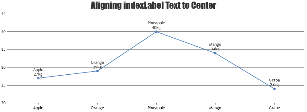
The text shown in the indexlabel is getting aligned either to the left, right or center & the indexLabelTextAlign property seems to be working fine as shared in the screenshot. If you are trying to place indexlabel to the left of the marker, that’s not possible as of now. Indexlabels are placed to the center of the marker but the text within the indexlabel can be aligned to the left / right / center whenever the text is wrapped into multiple lines.
—
Vishwas R
Team CanvasJSThe JSFiddle shared seems to be working fine without any error. Based on the error that you are getting, you might be passing it as ‘custombreaks’ instead of ‘customBreaks’. All the chart properties are case-sensitive. Hence passing it as customBreaks should work fine. Please refer documentation page for more information & live-examples.
If you are still facing issue, kindly create JSFiddle reproducing the issue you are facing & share it with us. From what we have observed, sometimes things get delayed mostly when we are not able to reproduce the issue at our end or not able to understand the exact requirements or due to the variation in chart-options being used by you and us. Because of these reasons we expect you so share JSFiddle along with sample data which helps us run it at our end to understand the use case and help you resolve.
—
Vishwas R
Team CanvasJSAndy,
Setting indexLabelTextAlign property seems to be working fine across all the chart types including line, column, pie, etc.
Can you kindly create JSFiddle with your use-case so that we can understand the scenario better and help you out?
—
Vishwas R
Team CanvasJSAs addressed by @adithya-menon in the original thread, you can either use area or range-area charts to create polygon shapes. Please refer to this JSFiddle for an example on drawing hexagon using area chart.
—
Vishwas R
Team CanvasJS