Home Forums Chart Support Axis rounding iusse

Axis rounding iusse

Viewing 2 posts - 1 through 2 (of 2 total)
  • #38555

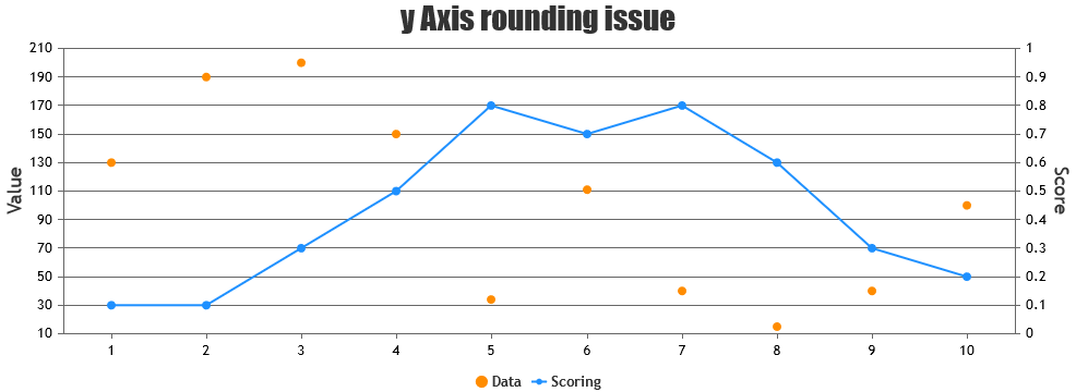
    Issue: The divisions lines are not set as expected, when setting interval, maximum and minimum manually. This is a problem when using multiple axis where the division lines should line up.

    For the example the interval is 20, the minimum is 10 and the maximum is 210.

    Expected result: The division lines are placed at 10, 30, 50, etc.

    Actual result: The division lines are at 10, 20, 40, etc.

    You can check out the JSFiddle here: https://jsfiddle.net/auofLtk6/48/

    window.onload = function () {
        var chart = new CanvasJS.Chart("chartContainer",{              
            title:{
                text: "y Axis rounding issue"
            },
            axisY: {
                title: "Value",
          interval: 20,
          minimum: 10,
          maximum: 210,
            },
            axisY2: {
                title: "Score",
          interval: 0.1,
          minimum: 0,
          maximum: 1
            },
        data: [
        {
            type: "scatter",
        color: "DarkOrange",
            showInLegend: true,
            name: "Data",
            dataPoints: [
                { x: 1, y: 130 },
                { x: 2, y: 190 },
                { x: 3, y: 200 },
                { x: 4, y: 150 },
                { x: 5, y: 34 },
                { x: 6, y: 111 },
                { x: 7, y: 40 },
          { x: 8, y: 15 },
                { x: 9, y: 40 },
                { x: 10, y: 100 }
            ]
        },
        {
            type: "line",
        color: "DodgerBlue",
            showInLegend: true,                  
            axisYType: "secondary",
            name: "Scoring",
            dataPoints: [
                { x: 1, y: 0.1 },
                { x: 2, y: 0.1 },
                { x: 3, y: 0.3 },
                { x: 4, y: 0.5 },
                { x: 5, y: 0.8 },
                { x: 6, y: 0.7 },
                { x: 7, y: 0.8 },
                { x: 8, y: 0.6 },
                { x: 9, y: 0.3 },
          { x: 10, y: 0.2 }
            ]
        },
        ]
        });
        chart.render();
    }
    #38698

    @festo,

    Sorry, controlling the first label on the axes & showing labels at every interval as per position of first label is not available, as of now. Minimum & maximum will set the axis range & not the position from where the axis labeling should start. However, you can disable axis labels & use striplines to achieve this. Below is the code-snippet that shows adding striplines with labels to y-axis.

    function addStripLines(chart) {
      for (var i = chart.axisY[0].minimum; i <= chart.axisY[0].maximum; i += chart.axisY[0].interval) {
        chart.options.axisY.stripLines.push({
          value: i, 
          label: i, 
          labelPlacement: "outside", 
          labelFontColor:"black", 
          labelBackgroundColor: "transparent",
          color: chart.axisY[0].gridColor 
        });
      }
      chart.render()
    }

    Please take a look at this updated JSFiddle for complete code.

    Using Stripline Labels as Y-Axis Labels


    Vishwas R
    Team CanvasJS

Viewing 2 posts - 1 through 2 (of 2 total)

You must be logged in to reply to this topic.