Login to Ask a Question or Reply

Forum Replies Created by Vishwas R
-
The JSFiddle that you have shared seems to be working fine across browsers including Chrome, Firefox, Opera, Edge and IE. Here is the screenshot of the same.

Can you kindly share the OS details and Browser details like browser name, version, etc so that we can try the same at our end.
—
Vishwas R
Team CanvasJSDecember 17, 2018 at 11:54 am in reply to: Alternative to error chart for pie and stacked bar charts #23753Guilherme,
Its not possible to combine Pie, Doughnut, Funnel and Pyramid charts with any other chart-type with axis. Kindly share a pictorial representation of your requirements so that we can understand your use-case better and could try some work-around.
—
Vishwas R
Team CanvasJSYou can add as many charts as you require in a page. To add another chart, you can simply create a container to the chart and render it. Please take a look at this updated JSFiddle. Please take a look at documentation on Rendering Multiple Charts in a Page for step-to-step tutorial on the same.
—
Vishwas R
Team CanvasJSGuilherme,
Axis labels will be shown at every interval – which is auto-calculated based on parameters like axis minimum, axis maximum, etc. You can change interval to show all labels. In case of date-time axis, set intervalType along with interval according to your requirements.
If you are still facing any issue, kindly create JSFiddle reproducing the issue you are facing and share it with us so that we can look into your code, understand the use-case better and help you out.
—
Vishwas R
Team CanvasJSGuilherme,
Axis labels will be shown at every interval – which is auto-calculated based on parameters like axis minimum, axis maximum, etc. You can change interval to show all labels. In case of date-time axis, set intervalType along with interval according to your requirements.
If you are still facing any issue, kindly create JSFiddle reproducing the issue you are facing and share it with us so that we can look into your code, understand the use-case better and help you out.
—
Vishwas R
Team CanvasJSTo add new custom break dynamically you can use addTo method as shown in this JSFiddle.
—
Vishwas R
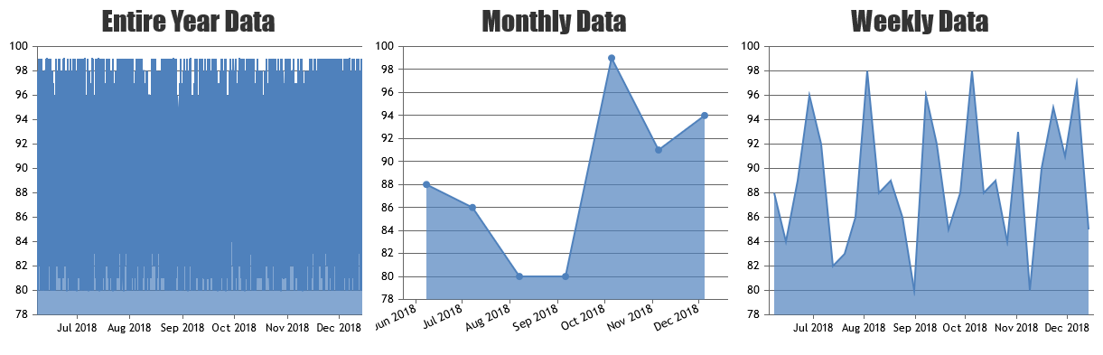
Team CanvasJSYou can read data from database, which gives you entire year data and render it in first chart. And for monthly and weekly data, you can filter data from the existing as shown in this Sample Project.
—
Vishwas R
Team CanvasJSAre you looking for multiple charts in a page? If so please take a look at this tutorial on the same. If this doesn’t fulfill your requirements, kindly brief us more about what do you mean by dynamic array binding (is it rendering multiple charts from a single array that keeps updating after an interval?) so that we can understand your scenario better and help you out.
—
Vishwas R
Team CanvasJSYou can achieve this by combining column chart with error chart as shown in this JSFiddle.
—
Vishwas R
Team CanvasJS
