Login to Ask a Question or Reply
Forum Replies Created by Vishwas R
-
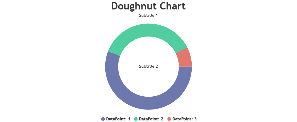
As suggested by @shashiranjan, title & subtitle can be positioned in the center of the pie/doughnut by setting dockInsidePlotArea and verticalAlign properties.
As your requirement includes having a title to the top of the chart, you can use subtitles to be positioned at the center of the chart ( You can add as many subtitles as you want to a chart – so even if you like to have a subtitle at the top of the chart, you can still add another subtitle at the center of the chart). Please find the code-snippet for the same below.
title: {
    text: "Doughnut Chart"
},
subtitles: [{
    text: "Subtitle 1"
}, {
    text: "Subtitle 2",
    verticalAlign: "center",
    dockInsidePlotArea: true
}],
Please take a look at this updated JSFiddle for complete code.
—
Vishwas R
Team CanvasJSThe data doesn’t render, when I run this code. But, when I try to console.log (data.columns[“latitude”]) outside the for-loop, I am able to access the data which I need.
You are consoling data.columns[“latitude”] which is getting consoled whereas while parsing you are considering it as data[i].columns[“latitude”] which should ideally be data.columns[“latitude”][i]. Parsing the data received from JSON accordingly should work fine in this case. Please take a look at this JSFiddle.
—
Vishwas R
Team CanvasJSJanuary 30, 2019 at 6:08 pm in reply to: CanvasJs React – Cannot assign to read only property 'exports' of object #24171@ronaldtakarai @jstaufferbohlereng-com @raluca @badman31 Brian,
We have fixed the issue and will make it public soon. Meanwhile, please use this internal build with the fix and kindly let us know if it works fine.
Please download the React Sample Project with the internal build of CanvasJS from this link.
—
Vishwas R
Team CanvasJSWebkit allowed 448MB of canvas buffer memory earlier whereas they have dropped it to 224MB. Because of this, there was some memory issue with CanvasJS Charts in latest iOS. However we have optimized memory consumption in CanvasJS v2.3 – please checkout release blog for more info. Kindly download latest version of CanvasJS Charts from our download page and let us know your feedback.
If the issue still persists, kindly share sample project over Google-Drive or Onedrive, so that we can look into the issue and help you resolving it.
—
Vishwas R
Team CanvasJSGuilherme,
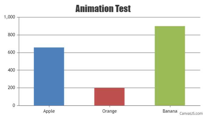
Chart animates only on the first render, as of now. When you use set method, chart re-renders based on the 3rd parameter. During the first render, as there are no dataPoints present, animation wouldn’t be visible. During second render (happened because of set method) animation wouldn’t happen.
To update dataPoints dynamically and to animate chart, you can instantiate the chart, update dataPoints via chart-options and then call chart.render as shown in the code snippet below:
var chart = new CanvasJS.Chart("chartContainer", {
  title: {
    text: "Animation Test"
  },
  animationEnabled: true,
  data: [{
    type: "column",
    dataPoints: []
  }]
});

chart.options.data[0].dataPoints =  [{ label: "Apple", y: 658 },
                                     { label: "Orange", y: 200 },
                                     { label: "Banana", y: 900 }];
chart.render();
Please take a look at this updated JSFiddle for an example with sample code.
—
Vishwas R
Team CanvasJSChetan Kumar,
One of our team-members have contacted you over e-mail. Please check your inbox for the complete list of change-logs from v1.8 to v2.2.
—
Vishwas R
Team CanvasJSTejal,
I have tried the same thing for doubleclick event. But in this case I can not focusout with single click. Can you please suggest solution for this. https://jsfiddle.net/xw3p5k8b/7/
You can attach double-click event to the chart-container as and fire focus-out on single-click as shown in this updated JSFiddle.
My canvas are getting generated dynamically because of which I am not getting the element. In my snippet I am adding a doubleclick event on container itself but I am not getting exact event object and even its not working.
In short I want to attach event on container div itself and I should be able to find out the title of the legend on which I have clicked on.Binding double-click event on window-load should work fine in this case. Please take a look at this updated JSFiddle.
—
Vishwas R
Team CanvasJSDecember 21, 2018 at 2:57 pm in reply to: How to define your own color set for a ReactJS canvas component? #23826Defining custom color-set array using addColorSet method works fine in Vanilla JS, React, Angular, etc. Please take a look at this sample project.
—
Vishwas R
Team CanvasJSYou can find the area of column by multiplying its height (y-value of the dataPoint) and width (width of the dataPoint). Please take a look at this JSFiddle, where area of individual columns are calculated when you click on it.
—
Vishwas R
Team CanvasJSThe issue seems to be with the scope of the variables – chart, please refer this stackoverflow thread for more info on scope of a variable in JavaScript. Please find the working code-snippet below.
var updateInterval = 100;
var chart;
var dps;
$(document).ready(function() {
	$.getJSON("testdata.php", function(result) {
		dps = result;
		chart = new CanvasJS.Chart("chartContainer", {
			title: {
				text: "Test",
			},
			axisY: {
				minimum: 0,
				maximum: 1000
			},
			data: [{
				type: "stackedBar",
				dataPoints: dps
			}]
		});

		chart.render();
	});

	var updateChart = function() {
		$.getJSON("testdata.php", function(result) {
			dps.splice(0, dps.length);
			$.each(result, function(index, value) {
				dps.push(value);
			});
		});

		chart.render();
	};

	setInterval(function() {
		updateChart()
	}, updateInterval);
});
Please take a look at this php file for complete code.
—
Vishwas R
Team CanvasJSThe page seems to show JSON and not HTML content as you are setting header. Removing the header should work fine in your case, please take a look at this updated code. Please checkout our PHP Gallery for more examples, you can also download PHP samples from our download page and try running it locally.
—
Vishwas R
Team CanvasJSDecember 21, 2018 at 2:57 pm in reply to: What causes points on a spline graph to appear by default vs hover? #23822When there are large number of dataPoints, markers are automatically disabled. You can override this by setting markerSize in dataSeries.
—
Vishwas R
Team CanvasJSDecember 20, 2018 at 10:27 am in reply to: stacked area has negative value show opposite with positive value #23808The behavior of stacked-area is by design. We will reconsider this behavior in future releases.
—
Vishwas R
Team CanvasJS