Login to Ask a Question or Reply
Forum Replies Created by Vishwas R
-
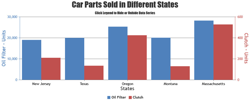
You can use both primary & secondary within the same chart by attaching dataseries to them using axisYType & axisYIndex properties. Please take a look at this gallery page for an example along with source-code on the same.
—
Vishwas R
Team CanvasJSAxis minimum & maximum are auto-calculated based on the range of data being passed to the chart – which you can access using get method after rendering the chart. Or you can manually set minimum & maximum using set method. However, to set minimum / maximum of axis to the lowest / highest values of the datapoints passed, you can do so as addressed in the previous reply. Please find the code-snippet below.
var minY = Infinity, maxY = -Infinity;
var minimum = chart.axisX[0].get("minimum");
var maximum = chart.axisX[0].get("maximum");
for(var i = 0; i < chart.data[0].dataPoints.length; i++){
  if(chart.data[0].dataPoints[i].x >= minimum && chart.data[0].dataPoints[i].x <= maximum){
    if(chart.data[0].dataPoints[i].y < minY)
      minY = chart.data[0].dataPoints[i].y;

    if(chart.data[0].dataPoints[i].y > maxY)
      maxY = chart.data[0].dataPoints[i].y;
  }
}
chart.axisY[0].set("minimum", minY);
chart.axisY[0].set("maximum", maxY);
—
Vishwas R
Team CanvasJSAs mentioned in previous reply, 0 is not supported in logarithmic axis. However, as addressed in previously shared JSFiddle (line no 29), you can either set it to null or to some value like 0.1, 0.00001, etc. to keep the continuity in the line. Please take a look at this updated JSFiddle.
—
Vishwas R
Team CanvasJSIn case of line / spline chart, by default line will be broken when datapoint with null value is present. You can connect the non-null values directly by setting connectNullData property to true – which draws a dashed line to connect non-null datapoints. The type of this line can be changed by setting nullDataLineDashType property. Please refer to the code-snippet below.
...
data: [{
	...
	type: "line",
	connectNullData: true,
	nullDataLineDashType: "solid",
	...
}]
...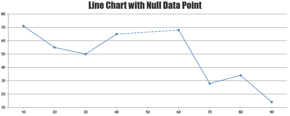
Please take a look at this updated JSFiddle for complete code.—
Vishwas R
Team CanvasJSAs zero value is not supported in logarithmic axis, you can set the value to null by parsing through the datapoints before rendering. Please find the code-snippet below.
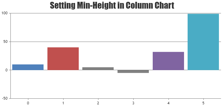
function parseZeroValue() {
  var data = chart.options.data;
  for(var i = 0; i < data.length; i++) {
    for(var j =0; j < data[i].dataPoints.length; j++) {
    var yValue = data[i].dataPoints[j].y;
      if(yValue === 0) {
        data[i].dataPoints[j].y = null; //Set this to some value like 0.01, if you like to show column
        data[i].dataPoints[j].toolTipContent = ("{x}: " + yValue);
      }
    }
  }
}
Please take a look at this JSFiddle for complete code. Also refer to this JSFiddle which shows how to set minimum height in column chart.
—
Vishwas R
Team CanvasJSA logarithmic axis can only plot positive values. There simply is no way to put negative values or zero on a logarithmic axis.
Fundamental: If 10L = Z, then L is the logarithm (base 10) of Z. If L is a negative value, then Z is a positive fraction less than 1.0. If L is zero, then Z equals 1.0. If L is greater than 0, then Z is greater than 1.0. Note that there no value of L will result in a value of Z that is zero or negative. Logarithms are simply not defined for zero or negative numbers.
—
Vishwas R
Team CanvasJSCanvasJS commercial version doesn’t carry any watermark or credit link. You can purchase commercial version from the pricing page.
For further queries, please contact sales@canvasjs.com.
—
Vishwas R
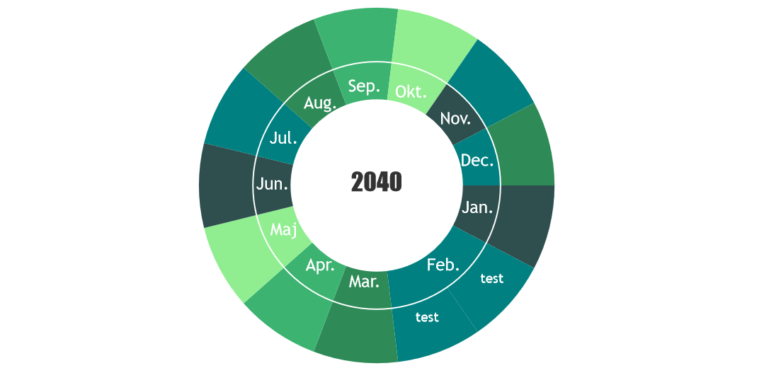
Team CanvasJSPadding or offset in indexlabel is not available as of now. However, by adding unicode space / braille pattern dots-0 in the beginning / end, you can adjust indexlabel to be shown within the slice of doughnut. Please take a look at this updated JSFiddle for working example.
—
Vishwas R
Team CanvasJSThere is no changes made related to stripline in recent releases. However, I observe that the JSFiddle provided in the other forum thread seems to be working fine. Also the color property is not set to transparent in the JSFiddle that you have shared. Setting it to transparent (
currStripline.set("color", "transparent");) seems to be working fine. Please take a look at this updated JSFiddle for complete working code.
—
Vishwas R
Team CanvasJSYou can update datapoints & re-render chart at every 10 seconds with the help of setInterval. Please refer to this forum thread for more information & examples.
—
Vishwas R
Team CanvasJSThe code will work with trial version – which is fully-featured & can be used to evaluate for upto 30 days. You can check out license page for license-related queries or contact sales@canvasjs.com.
—
Vishwas R
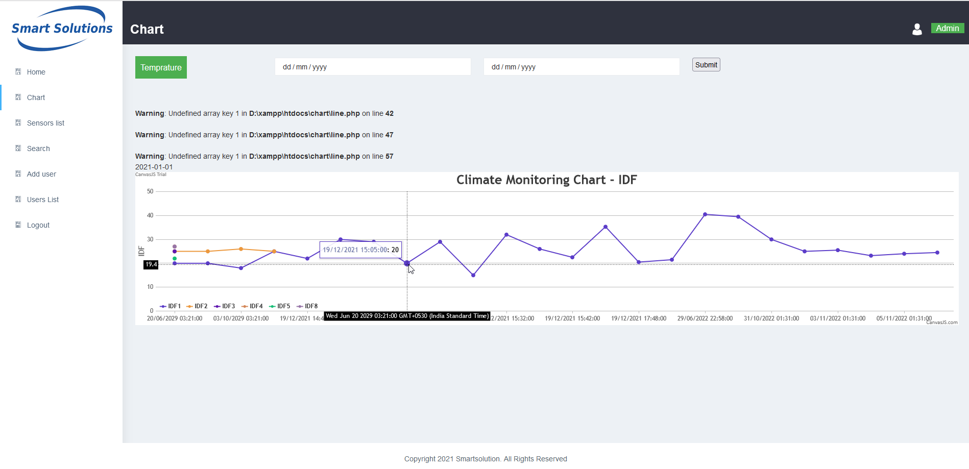
Team CanvasJSIn the sample project that you have shared, there are couple issues in parsing the data that you are fetching from database. Parsing the response-data properly seems to be working fine. Please take a look at this updated sample project.
—
Vishwas R
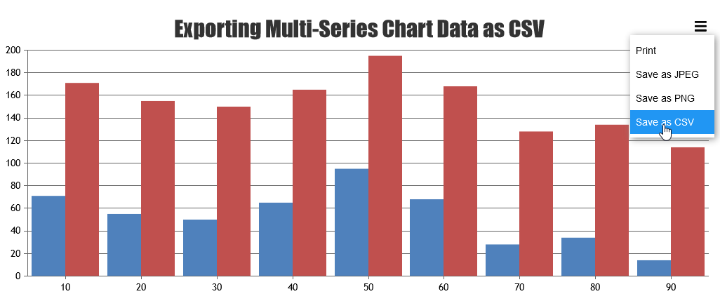
Team CanvasJSThanks for reporting the use-case. There was a minor issue with the object reference in the external code added for exporting the chart data as CSV. We have updated the same, please take a look at updated JSFiddle.
—
Vishwas R
Team CanvasJSThe sample shared seems to have some dependency issues & is not working locally. Please refer to the screenshot below.
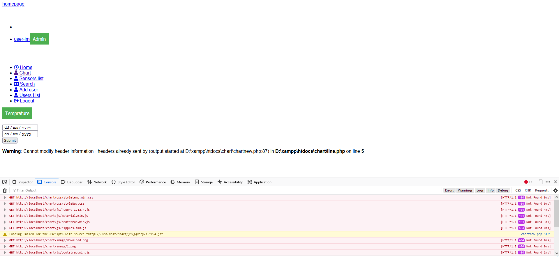
Can you kindly share working sample along with all the dependencies so that we can run it locally, understand the scenario better and help you out?
—
Vishwas R
Team CanvasJS