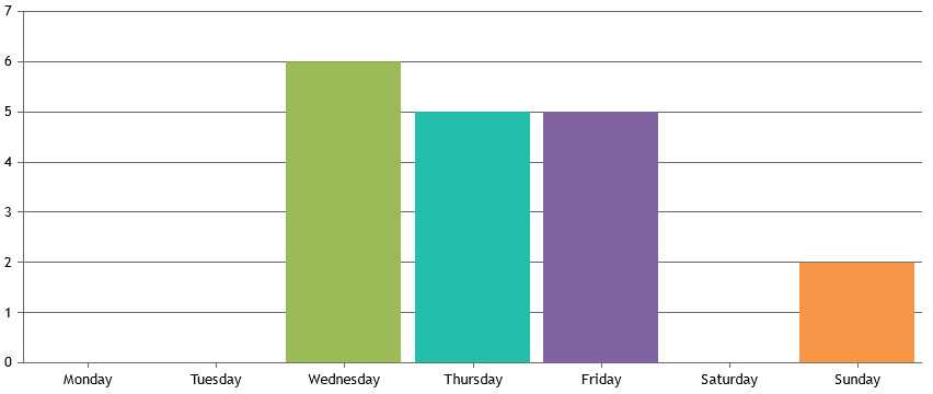
Login to Ask a Question or Reply
Forum Replies Created by Vishwas R
-
Generally JavaScript code will function in the head before code in the body. The head section is usually used to contain information about the page that you don’t necessarily see like the meta keywords meta description or title of a page.
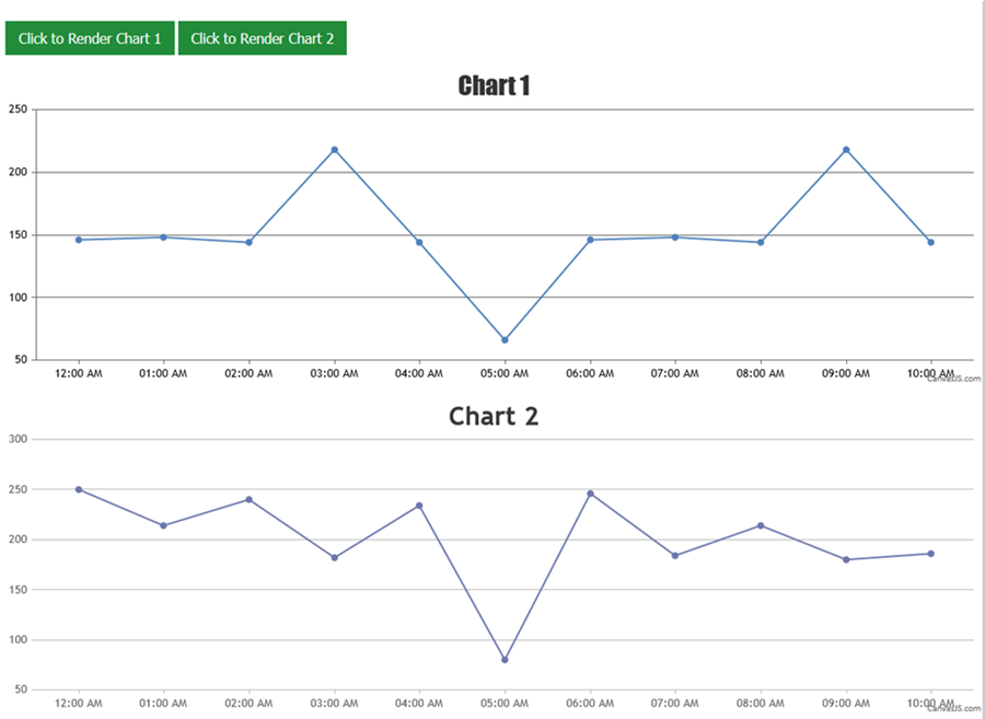
Here in your case, Buttons with id ‘chart1’ and ‘chart2’ are created after script is run, but where it fails to fetch buttons with those ids. You can move script tag to body so that it works fine. Here is your working code.
Refer these links for more info on placement of JavaScript code.
TutorialPoints
W3Schools
Stackoverflow—-
Vishwas R
Team CanvasJS-
This reply was modified 9 years, 10 months ago by
Vishwas R.
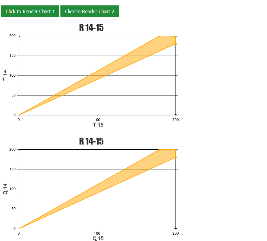
Kindly check the example from the fiddle. Here is the screenshot of the working fiddle.
You can load data from multiple external CSV files using AJAX request. Please take a look at this documentation page for step-to-step tutorial on rendering chart with data from CSV file. Also refer to this JSFiddle for an example on rendering single chart with data from multiple CSV files.
—
Vishwas R
Team CanvasJSYou can remove dps.shift from the example to avoid shifting. Check this example.
And you can remove setInterval to avoid update of charge based on time-basis and you can manually push y-value to dataPoints and render chart whenever you get y-value.
We checked and observed that fontSize is working fine across all browsers including Edge. Here is the screenshot with fontSize set to 30.
Callam,
Earlier we had come across a similar issue with Chrome when Canvas is GPU accelerated (default). Google fixed the issue after sometime.
Please try disabling GPU accelerated rendering in Chrome and see if it helps.
—
Vishwas R
Team CanvasJSCallam,
We observed that the JSFiddle you have created seems to be working fine across all browsers.
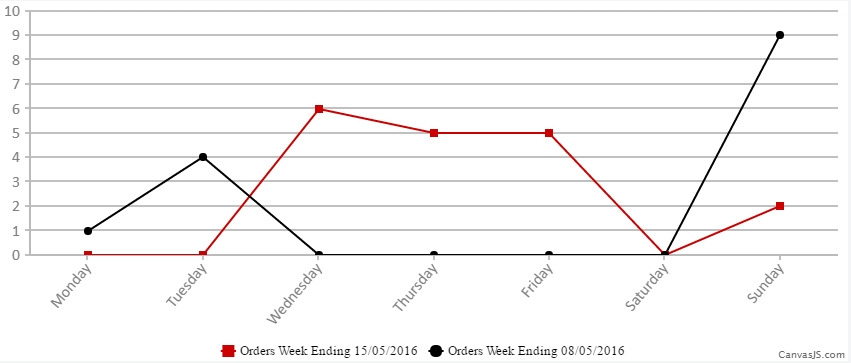
If the issue persists, kindly share the OS details along with chrome version you are using so that we can test it, understand the scenario better and help you out.
—
Vishwas R
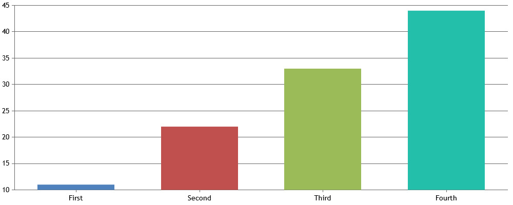
Team CanvasJSYou can build datapoints JSON as shown below.
$.each(data, function (i, item) {
    dps.push({label: item.ProfileName, y: item.TotalCustomer});
});
Please take a look at this JSFiddle for an example.
—
Vishwas R
Team CanvasJSMitul,
JQuery is loaded in the example provided. In JSFiddle, under JavaScript section, you can include libraries like JQuery, AngularJS directly.
Check this Screenshot.
Mitul,
We checked both the examples in desktop as well as in android and found its working fine. It would help us to resolve the issue if you could create a fiddle of the issue you are facing.
[update]
We have just released v1.9.6 Beta with Methods & Properties, which allows you to programmatically export chart as image, print chart, access internally calculated values, etc. Please refer to the release blog for more information.
Mitul,
You can hide ‘save as PNG’ using CSS. Here is an example.
You can also have a button/link outside chart to export it as JPEG, using dataURL. Here is an example.
Michael,
You can parse the JSON data and pass dataPoints to respective dataSeries in chart options as shown below
$.ajax({
  type: 'GET',
  url: 'https://api.npoint.io/191c62a905159a49256e',
  dataType: 'json',
  success: function(field) {
    for (var i = 0; i < field.length; i++) {
      dataPointsA.push({
        x: field[i].time,
        y: field[i].xxx
      });
      dataPointsB.push({
        x: field[i].time,
        y: field[i].yyy
      });
    }

    var chart = new CanvasJS.Chart("chartContainer", {
      title: {
        text: "JSON from External File"
      },
      exportEnabled: true,
      data: [{
        type: "line",
        name: "line1",
        xValueType: "dateTime",
        dataPoints: dataPointsA
      }, {
        type: "line",
        name: "line2",
        xValueType: "dateTime",
        dataPoints: dataPointsB
      }, ]
    });

    chart.render();

  }
});
Here is an example for loading JSON data from external source using AJAX.
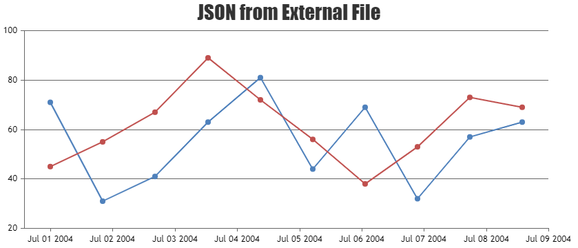
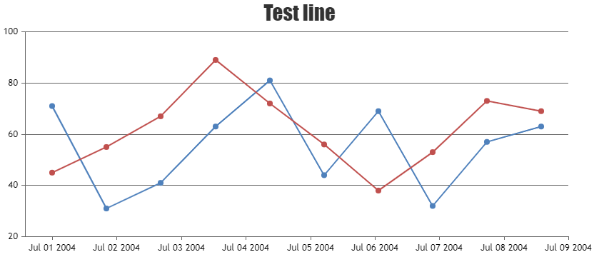
You can also refer loading data from external JSON in this example.
—-
Vishwas R
Team CanvasJSYou can customize & style the tooltip to fit in your requirements using properties like borderColor, fontColor and backgroundColor.
toolTip: {
	borderColor: "#000000",
	backgroundColor: "#F4D5A6",
	fontColor: "#FAC003"
}
—
Vishwas R
Team CanvasJS -
This reply was modified 9 years, 10 months ago by
