Login to Ask a Question or Reply
Forum Replies Created by Thangaraj Raman
-
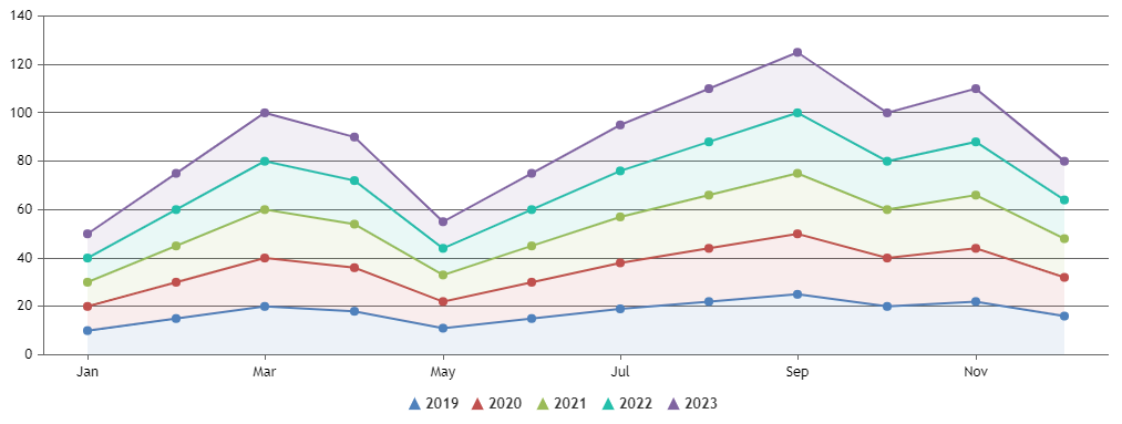
To display data by month for multiple years in the form of a stack you can use a stackedArea chart and set the fillOpacity for each dataseries to 0 if you just want to render the lines and not the shaded region below. In case you want to want to render both the line and the shaded area below with lesser transparency, you can set fillOpacity to a minute value like 0.1 or 0.2. We suggest you to use labels for the months instead of passing date-time values to x-value.
Please check this JSFiddle for a working example.
—
Thangaraj Raman
Team CanvasJSApril 25, 2023 at 11:07 pm in reply to: Customizing the Zoom functionality in the Mouse wheel event. #42543You can zoom the chart using mousewheel by attaching wheel event to the chart. Please find the code snippet below.
document.getElementsByClassName("canvasjs-chart-canvas")[1].addEventListener("wheel", function(e){
  e.preventDefault();

  if(e.clientX < chart.plotArea.x1 || e.clientX > chart.plotArea.x2 || e.clientY < chart.plotArea.y1 || e.clientY > chart.plotArea.y2)
  	return;

  var axisX = chart.axisX[0];
  var viewportMin = axisX.get("viewportMinimum"),
      viewportMax = axisX.get("viewportMaximum"),
      interval = axisX.get("minimum");

  var newViewportMin, newViewportMax;

  if (e.deltaY < 0) {
    newViewportMin = viewportMin + interval;
    newViewportMax = viewportMax - interval;
  }
  else if (e.deltaY > 0) {
    newViewportMin = viewportMin - interval;
    newViewportMax = viewportMax + interval;
  }

  if(newViewportMin >= chart.axisX[0].get("minimum") && newViewportMax <= chart.axisX[0].get("maximum") && (newViewportMax - newViewportMin) > (2 * interval)){
    chart.axisX[0].set("viewportMinimum", newViewportMin, false);
    chart.axisX[0].set("viewportMaximum", newViewportMax);
  }

});
Please take a look at this JSFiddle for a working example.
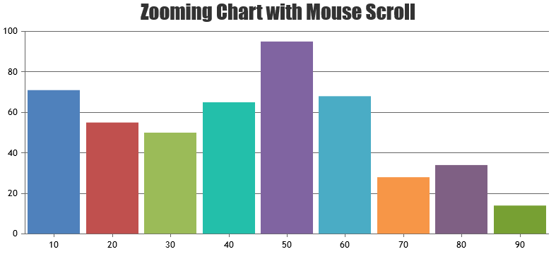
—
Thangaraj Raman
Team CanvasJSPlease check this documentation page for an example on using the
yValueFormatStringproperty and the different formatting options supported. Also, please take a look at this gallery page example of a pie chart with percentage values in the tooltip as well as indexlabel.In your case you can set
yValueFormatString: "{y}%"if you want to show the value in percentage oryValueFormatString: "{y}'%'"if you want to add % symbol along with the current y-value.—
Thangaraj Raman
Team CanvasJSYou seem to be using undocumented methods and properties.
addThemeis an internal property with certain functionality and might not apply font-size as defined across all the elements in the chart. We suggest you usechart.optionsto set the labelFontSize in this case since it will apply the font-size based on the defined value.—
Thangaraj Raman
Team CanvasJSOnly one label will be shown for a stripline, as of now. However, you can add 2 additional striplines, one at the startValue position and the other at the endValue position, and use their individual labels to achieve your requirement.
Please check this JSFiddle for a working example.
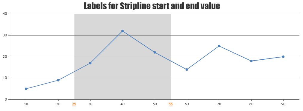
—
Thangaraj Raman
Team CanvasJSThe click event is fired only within the area of the marker as of now. However, you can set markerBorderThickness to a value greater than 0 and markerBorderColor to transparent to increase the area in which the click event is fired without changing the size of the marker.
Please check this JSFiddle for a working example.
—
Thangaraj Raman
Team CanvasJSShowing fewer datapoints based on the screen size of the device is not available as an inbuilt feature as of now. However, you can achieve the same with a few lines of code. Please check the code snippet below.
var screenWidth = jQuery(window).width();
var dpsCount = 6;            //no. of datapoints to be displayed on phone
var dps = [];

if(screenWidth <= 768 ) {
  for(var i = 0; i < dpsCount; i++) {
     dps.push(chart.options.data[0].dataPoints[i]);
  }
  chart.options.data[0].dataPoints = dps;
  chart.render();
}
Please check this JSFiddle for a working example.
—
Thangaraj Raman
Team CanvasJSChart elements may look blurred on changing the zoom level within the display setting of the browser or windows. Resetting the zoom level to 100% should work fine in this case.
—
Thangaraj Raman
Team CanvasJSWe are unable to reproduce the issue at our end, the chart seems to be proper & not blurry. Can you kindly provide more information like the version of CanvasJS & the browser that you are using so that we can try reproducing with the same environment?
—
Thangaraj Raman
Team CanvasJSShashi,
For your case, we suggest you to use separate variables for each chart instance or to keep all the chart instances in an array as shown below.
var chartsArray = [];
chartsArray.push(new CanvasJS.Chart("chartContainer1", { //Chart 1  Options }));
chartsArray.push(new CanvasJS.Chart("chartContainer2", { //Chart 2 Options }));
for(var i = 0; i < chartsArray.length; i++) {
    chartsArray[i].render();
}
—
Thangaraj Raman
Team CanvasJS.March 2, 2023 at 5:04 pm in reply to: Help with X-Axis time range being diesplayed in case of 1 day range #42291@avb,
The JSFiddle that you have shared seems to be broken. Could you please share an updated JSFiddle with working code so that we can look into the code/chart options being used, understand the scenario better, and help you out?
Also, we are unable to understand what you mean by center the chart data with a blank space on the right instead of filling till the end. Could you please brief us further with a pictorial representation or an example with the steps to understand your requirement so that we can suggest an appropriate solution?
—
Thangaraj Raman
Team CanvasJSChanging the cursor while hovering over the underlying area of an area chart is not possible as of now.
—
Thangaraj Raman
Team CanvasJSYou can bind mouse events to the chart container and get mouse coordinates in pixels, which can be converted to corresponding values along the axis using convertPixelToValue as shown in this documentation page. Please take a look at the code snippet below:
jQuery(".canvasjs-chart-canvas").last().on("click",
    function(e){
	var parentOffset = $(this).parent().offset();
	var relX = e.pageX - parentOffset.left;
	var xValue = Math.round(chart.axisX[0].convertPixelToValue(relX));
	console.log(xValue);
});
—
Thangaraj Raman
Team CanvasJS