Login to Ask a Question or Reply
Forum Replies Created by Suyash Singh
-
Tanguy,
Kindly have a look at this jsfiddle. And also we have removed your hastebin links as requested.
___
Suyash Singh
Team CanvasJS@Suyash,
Can you kindly share your code and CSV file, so that we can look into it and help you out better.
___
Suyash Singh
Team CanvasJSCan you please share your OS details and Chromium version?
It looks like you are using an older version of CanvasJS. You can download the latest version of CanvasJS from here or use this CDN: https://cdn.canvasjs.com/canvasjs.min.js
Also, you forgot to render the chart in your jsfiddle.
___
Suyash Singh
Team CanvasJSYou can achieve this by adding a dataSeries with at least one empty dataPoint.
___
Suyash Singh
Team CanvasJSJuly 20, 2017 at 10:06 am in reply to: How to make y-axis centered rather staying in the left #15605You may be encountering that the datapoints are not visible but axis is visible if you have enabled animation. This happens because when animation is enabled, you may be exporting the chart even when it’s still animating. Exporting chart after the animation gets completed should work fine in such cases. You can add some delay before exporting the chart to resolve this. Please take a look at this updated JSFiddle for working code.
___
Suyash Singh
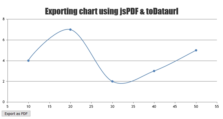
Team CanvasJSWe don’t have exporting chart as pdf as an inbuilt feature as of now. However with couple of lines of code you can export chart as pdf using jsPDF. Please find the code-snippet below.
var pdf = new jsPDF();
pdf.addImage(dataURL, 'JPEG', 0, 0);
pdf.save("download.pdf");
Please take a look at this JSFiddle for complete code.

___
Suyash Singh
Team CanvasJSCristi,
As of now, visible property is applicable only at dataSeries level. However, in pie and doughnut charts, the legends are shown for individual dataPoints rather than dataSeries. In your fiddle, you are hiding the entire dataSeries of pie chart, so the entire chart gets hidden.
Instead, on legend click, you can manipulate the dataPoints and render the chart as per your requirement.
___
Suyash Singh
Team CavasJSindexLabelFormatter works fine for both static and dynamic data.
___
Suyash Singh
Team CanvasJSYou can use indexLabelFormatter for achieving this. Please take a look at this jsfiddle.
___
Suyash Singh
Team CanvasJSYou need to parse the values that you get from the SQL Query to a format supported by CanvasJS.
Also please go through this thread on creating charts from SQL database.
___
Suyash Singh
Team CanvasJSYou can achieve this by attaching stackedColumn series to different axis. Please have a look at this work-around.
—
Suyash Singh
Team CanvasJSWhen you change the viewport range by either zooming, panning or reset rangeChanging and rangeChanged events are fired. rangeChanging event is fired just before the current viewports are updated and the rangeChanged is fired on updation of the current viewports i.e. after zooming, panning or reset. An event parameter is passed to the event handler that you assign to the rangeChanging/rangeChanged event.This parameter contains current viewportMinimum, viewportMaximum and other properties.
You can use the viewportMinimum and viewportMaximum to check in which range of the axis you have zoomed into.
Please have a look at this jsfiddle in which all the dataPoints in the current zoomed range is displayed in the browser console.
Also please refer the following jsfiddle which shows the viewports on zooming/panning.
—
Suyash Singh
Team CanvasJSWe are looking into the issue and will get back to you at the earliest.
___
Suyash Singh
Team CanvasJSGiven that the features you are looking for is already present in CanvasJS Charts, you can create using our library itself. Please, take a look at this documentation page for creating pie charts in few line of codes. You can also create doughnut charts and many other charts using our library.
___
Suyash Singh
Team CanvasJS