Login to Ask a Question or Reply
Forum Replies Created by Shashi Ranjan
-
The startValue and endValue of stripLine should be numbers. Kindly check if the
ylineAandylineBthat you are passing are numbers if not typecasting it to number should work fine. If you are still facing the issue, can you please share the sample project reproducing the same over Google Drive/One Drive so that we can look into the code, understand it better and help you out.—
Shashi Ranjan
Team CanvasJSIdeally, the code snippet shared above should loop through the variable
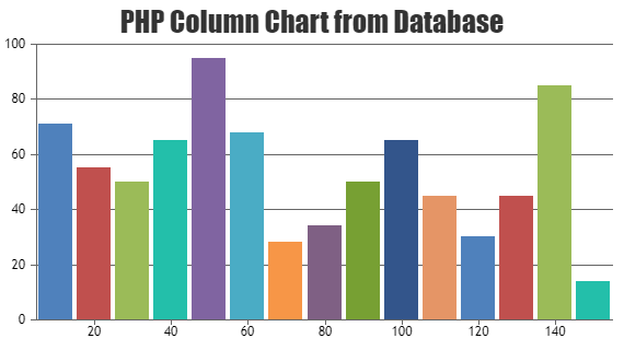
uservalues in the$usersarray. As we are not knowing the exact length of the$usersarray, can you kindly create a sample project reproducing the issue you are facing and share it with us over Google-Drive or Onedrive so that we can run the sample locally at our end to understand the scenario better and help you out?You can also refer to this gallery page for an example on creating a chart using data from the database in PHP.
—
Shashi Ranjan
Team CanvasJSThe script is directly linked from CanvasJS website so the file is not present locally in the project/sample. Please refer to this article, for more information on adding an external script to the page.
—
Shashi Ranjan
Team CanvasJSThe behavior of shared toolTip is designed so that the toolTip shows information of all the dataPoints present on that x-value, irrespective of its visibility. However, we will reconsider this behavior in future releases.
—
Shashi Ranjan
Team CanvasJSWhen x-value is null it cannot be represented over a mathematical scale and as a result, the dataPoints won’t be rendered in the chart. In this case, using labels without x-values for all the dataPoints should work fine.
If this doesn’t fulfill your requirements, kindly create JSFiddle with your use-case and share it with us so that we can understand it better and help you out.
—
Shashi Ranjan
Team CanvasJSThe above requirement can be achieved by editing the source code of CanvasJS. You can purchase a license from our license page to get access to the source code. Once you have purchased the license please let us know and we will help you out with a solution.
____
Shashi Ranjan
Team CanvasJSMarch 14, 2019 at 11:28 pm in reply to: Hii, I want to know that how to generate multiple number of charts dynamically #24658The minimum and maximum of the axisY are auto-calculated. When all the dataPoints provided are positive(greater than zero) the axisY minimum will be 0. However, you can override this behavior by setting the includeZero to false (which is true by default) as shown in this updated JSFiddle.
____
Shashi Ranjan
Team CanvasJSYou can achieve the above requirement with the help of rangeChanged event and by performing data-filtering i.e. add dataPoints on zooming-in and remove dataPoints on zoom out. Please take a look at this JSFiddle for the same.
____
Shashi Ranjan
Team CanvasJSWe will recommend you to use the latest version of CanvasJS v2.3.1 as we have further optimized the library to work with the latest iOS.
____
Shashi Ranjan
Team CanvasJS