Login to Ask a Question or Reply
Forum Replies Created by Sachin Bisht
-
October 27, 2023 at 7:33 pm in reply to: In CanvasJs for Angular, .render() does not apply new color for data, bug ? #43977
It seems to be working fine, please take a look at this Stackblitz for working code.
If you are still facing issue, kindly create a sample project reproducing the issue and share it with us over Google-Drive or Onedrive (or update the code in shared Stackblitz, fork it and share with us) so that we can look into the code, understand the scenario better and help you out.
__
Sachin Bisht
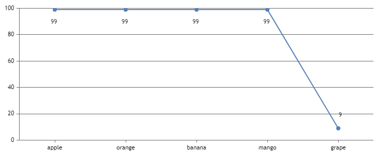
Team CanvasJSOctober 26, 2023 at 7:26 pm in reply to: Border color of the colored cells – same as gridlines color #43966You can move indexlabels away from the datapoint by adding unicode spaces and line-break characters to it. You can align them to the center of the datapoint by setting indexLabelTextAlign property to ‘center’.
Please take a look at this JSFiddle for an example on the same.
__
Sachin Bisht
Team CanvasJSYou can create a semi-doughnut chart using doughnut chart by adding a datapoint with y value equivalent to sum of y values of datapoints and set it’s color to “transparent”. Please take a look at the code snippet below for the same.
function convertToHalfDoughnut(chart){
    var sum = 0;
    var dataPoints = chart.options.data[0].dataPoints;

    for(var i = 0; i < dataPoints.length; i++){
        sum += dataPoints[i].y;
    }

    dataPoints.splice(0, 0, {y: sum, color: "transparent", toolTipContent: null});
}
Also, check out this JSFiddle for complete working code.
You can also refer to this thread for detailed explanation
__
Sachin Bisht
Team CanvasJSSeptember 19, 2023 at 6:23 pm in reply to: Uncaught TypeError: charts[i2].axisX[0].crosshair.showAt is not a function #43775We are unable to reproduce the issue at our end. Can you kindly create a sample project reproducing the issue you are facing over Google-drive/One-drive, so that we can run it locally at our end, understand the scenario better and help you out.
__
Sachin Bisht
Team CanvasJSWe don’t have CanvasJS React Charts TypeScript definition as of now. However, charts seems to work fine with React TypeScript as-well. You can ignore the corresponding error in Stackblitz by adding
// @ts-ignoreabove the import statement as shown in the code-snippet below.// @ts-ignore import CanvasJSReact from '@canvasjs/react-charts';__
Sachin Bisht
Team CanvasJS@n-osenni,
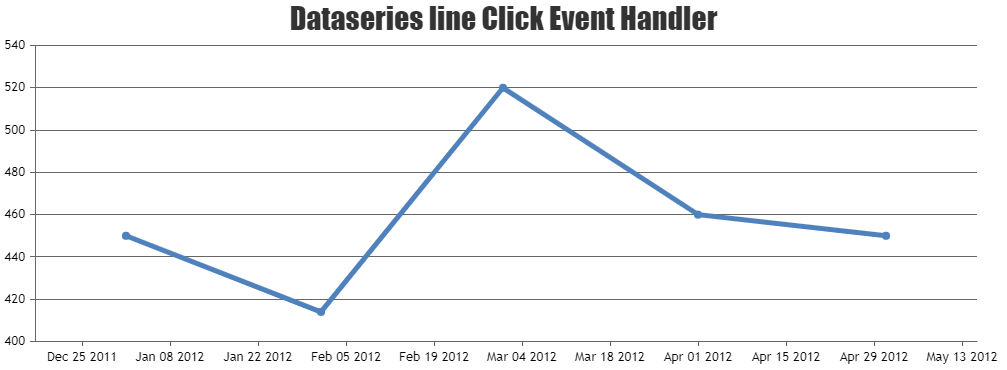
CanvasJS click event is fired only when you click on datapoint (marker) & not when you click on line as of now. However, with a few lines of code you can achieve to detect if the click has happened on the line. To do so, you can bind click event to the chart canvas & with the help of point on the line formula, you can determine whether the click happened on the line connecting two datapoints.
Please take a look at this JSFiddle for a working example.
__
Sachin Bisht
Team CanvasJSAugust 10, 2023 at 7:16 pm in reply to: Bar Chart not plotting for x: 200 and y:1688551280204000 dataPoints #43517When I am using 3 (or less) dataPoints the chart is not plotting for the smaller values. But when I am using 4 or more dataPoints the chart is plotting correctly. (Jsfiddle Sample 1)
In this case, you can use customBreaks to add a break to remove unnecessary region manually. Please take a look at this JSFiddle for an working example on the same.
2) Not able to set viewportMaximum when using scaleBreaks. (Jsfiddle Sample 2)
Setting viewportMaximum seems to be working in the JSFiddle that you have shared. It’s setting viewportMaximum to 1000, which lies inside the scalebreak.
__
Sachin Bisht
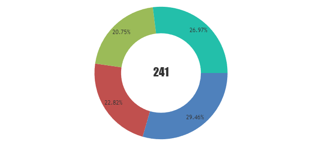
Team CanvasJSAugust 9, 2023 at 6:58 pm in reply to: Total Percentage of Data in Center of Doughnut Chart ? #43508You can add title with the desired value and place it to the center of the chart by setting verticalAlign to “center”. Please refer to this JSFiddle for an example on showing total at the center of the chart.
__
Sachin Bisht
Team CanvasJSy value in datapoint object only accepts numeric value as of now. We suggest you to replace NaN value with null or 0 as shown in the code snippet below:
for(var i = 0; i < chart.options.data[0].dataPoints.length; i++){
  if(isNaN(chart.options.data[0].dataPoints[i].y)){
    chart.options.data[0].dataPoints[i].y = null;
  }
}
__
Sachin Bisht
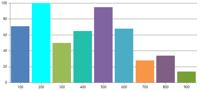
Team CanvasJSAugust 3, 2023 at 9:30 am in reply to: Bar Chart not plotting for x: 200 and y:1688551280204000 dataPoints #43471Thanks for reporting the use-case, we will investigate it further. Meanwhile, removing maximum seems to be working fine. Also, you can use scalebreaks to collapse the unnecessary region to make it better.
axisY: {
  includeZero: true,
  minimum: 0,
  maximum: 100,
  scaleBreaks: {
    autoCalculate: true
  }
},
Kindly refer to this JSFiddle for the working example on the same.
__
Sachin Bisht
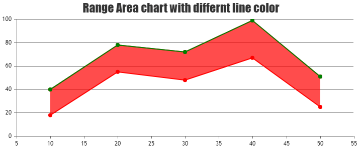
Team CanvasJSYou can add one more dataseries with type set to ‘line‘ with the ‘y’ values same as one of the range values in range area chart.
Kindly look at this JSFiddle for the working example for the same.
__
Sachin Bisht
Team CanvasJSNon-linear interval is not possible as of now. To meet your requirements you can use scalebreaks to collapse the region that you doesn’t like to show and you can use striplines to add gridlines & corresponding labels.
Please take a look at this JSFiddle for an working example.
__
Sachin Bisht
Team CanvasJS