Login to Ask a Question or Reply
Forum Replies Created by Priyanka M S
-
Glad that it’s working fine now.
Instead of CDN, you can serve CanvasJS script from https://cdn.canvasjs.com/canvasjs.min.js
__
Priyanka M S
Team CanvasJSCan you kindly share a jsfiddle with sample data, so that we can look at your code, understand and help you out?
We recommend you to use latest version of CanvasJS.__
Priyanka M S
Team CanvasJSSushil,
The starting label depends on minimum, maximum and interval, which are depended on dataPoints. Can you kindly create a jsfiddle with sample data, so that we can understand your scenario better and help you out?
__
Priyanka M S
Team CanvasJSTo display the chart containing datetime value in PHP, you need to first convert datetime string to PHP timestamp using strtotime(). Later convert PHP timestamp value to javascript timestamp and assign that value to dataPoint x-value along with setting xValueType to ‘dateTime’. Please take a look below code snippet for the same.
array_push($dataPoints, array("x"=> strtotime($row->x) * 1000, "y"=> $row->y));__
Priyanka M S
Team CanvasJSYou can achieve this with the help of labelFormatter and formatDate().
Please take a look at this updated jsfiddle
__
Priyanka M S
Team CanvasJSThanks for reporting the issue. We will look into the issue and fix it in future releases.
__
Priyanka M S
Team CanvasJSCan you please share a static HTML page over onedrive or Google drive, so that we can take a look at the chart options you are using, understand your scenario better and help you out?
__
Priyanka M S
Team CanvasJSThanks for reporting. We are looking into it and will get back to you at the earliest.
__
Priyanka MS
Team CanvasJSCan you kindly share a sample project along with sample data over Google-drive or Onedrive so that we understand your scenario better and help you out?
__
Priyanka M S
Team CanvasJS@can,
Sorry this feature is not available as of now. But with few lines of code you can draw arrow on top of chart. Please take a look at this jsfiddle.
If this doesn’t solve your requirement, please share a pictorial representation of your requirement so that we can understand it better and help you out.
__
Priyanka M S
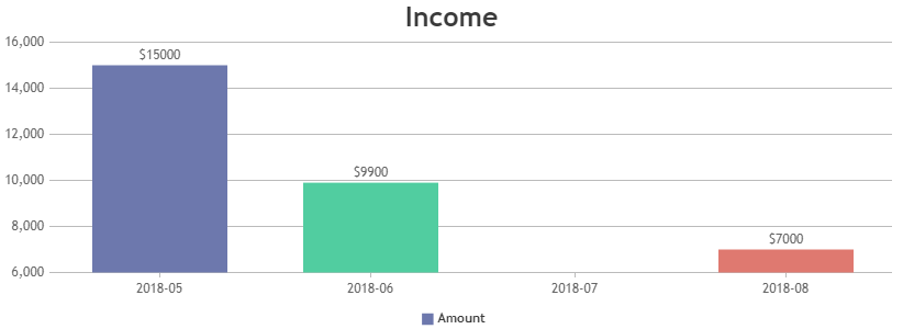
Team CanvasJSIf the month “2018-05” is occupying some space on chart, you can use scaleBreaks to remove the occupied space.
If this doesn’t solve your requirement, can you kindly create and share JSFiddle with sample data so that we can understand your requirement better and help you out.
__
Priyanka M S
Team CanvasJS