Login to Ask a Question or Reply
Forum Replies Created by Manoj Mohan
-
June 6, 2023 at 7:16 pm in reply to: How do I convert mouse click coordinate to canvas coordinates? #42971
Gibran,
You need to subtract the offset of the chart container from e.pageX/e.pageY to get the coordinate value of the click with respective to canvas as shown in this documentation page.
—-
Manoj Mohan
Team CanvasJSThe JSFiddle shared above seems to be working fine with the temperature.txt file which contains the data shared by you.
If you are still facing the issue, kindly share sample data you are using for temperature.txt so that we can reproduce the issue at our end, understand the scenario better and help you out.
—-
Manoj Mohan
Team CanvasJSYou can use multi-series chart to display the information about multiple departments. You can loop through each department information and parse it in dataPoint format accepted by CanvasJS to each dataseries of chart.
If you are still facing the issue, kindly create JSFiddle reproducing the issue you are facing and share it with us so that we can reproduce the issue at our end, understand the scenario better and help you out.
—
Manoj Mohan
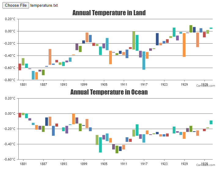
Team CanvasJShow about if theres TWO different data in one text and I want to create a separate graph output in one page?
Example:Mean Surface Air Temperature over Ocean or Land Areas (C)
Annual Mean Anomalies with respect to 1951-1980You can create multiple charts in a single page by providing separate container and options for each chart as shown in this documentation page. In order to use single text file to render multiple charts, you need to parse the data from text file to the format accepted by CanvasJS. Please take a look at the code snippet below for the same.
function handleFiles() {
  var fileList = this.files;
  var reader = new FileReader();

  reader.readAsText(fileList[0]);
  reader.onload = function() {
    renderChart(reader);
  }

}

function renderChart(reader) {
  var dpsList = reader.result;
  var dataPoint;

  dpsList = dpsList.split("\n");

  for(var i = 1; i < dpsList.length; i++) {
    var separateData = dpsList[i].split(" ");
    yValLand = [parseFloat(separateData[1]), parseFloat(separateData[2])];
    yValOcean = [parseFloat(separateData[4]), parseFloat(separateData[5])];
    xVal = new Date(parseInt(separateData[0]), parseInt(separateData[1]));

    landTempChart.options.data[0].dataPoints.push({x: xVal, y: yValLand})
    oceanTempChart.options.data[0].dataPoints.push({x: xVal, y: yValOcean})
  }

  landTempChart.render();
  oceanTempChart.render();
}
Also, check out this JSFiddle for complete working code.
OR if the tx data is this?
Seasonal cycle from MERRA2 using base period 1980-2015
Year Anomaly
1880.04 -2.6
1880.13 -2.4
1880.21 -1.57
1880.29 -0.64….Can you kindly brief us further more about your requirement so that we can understand your scenario better and help you out?
—–
Manoj Mohan
Team CanvasJSYou can create multiple charts in a single page by providing separate container and options for each chart as shown in this documentation page. In order to use single text file to render multiple charts, you need to parse the data from text file to the format accepted by CanvasJS. Please take a look at the code snippet below for the same.
function handleFiles() {
  var fileList = this.files;
  var reader = new FileReader();

  reader.readAsText(fileList[0]);
  reader.onload = function() {
    renderChart(reader);
  }

}

function renderChart(reader) {
  var dpsList = reader.result;
  var dataPoint;

  dpsList = dpsList.split("\n");

  for(var i = 1; i < dpsList.length; i++) {
    var separateData = dpsList[i].split(" ");
    yValLand = [parseFloat(separateData[1]), parseFloat(separateData[2])];
    yValOcean = [parseFloat(separateData[4]), parseFloat(separateData[5])];
    xVal = new Date(parseInt(separateData[0]), parseInt(separateData[1]));

    landTempChart.options.data[0].dataPoints.push({x: xVal, y: yValLand})
    oceanTempChart.options.data[0].dataPoints.push({x: xVal, y: yValOcean})
  }

  landTempChart.render();
  oceanTempChart.render();
}
Also, check out this JSFiddle for complete working code.

—-
Manoj Mohan
Team CanvasJSYou can store json file in static folder and load it in view as data = open(dir_path + “/static/
.json”).read(). You can then parse the JSON data in format accepted by CanvasJS Chart. —-
Manoj Mohan
Team CanvasJSSetting
valueFormatString: "#,##0.0"should show values in this case. Please refer to valueFormatString documentation page to know more about the format options available.—-
Manoj Mohan
Team CanvasJSCan you kindly create a sample project reproducing the issue you are facing and share it with us over Google-Drive or Onedrive along with sample data so that we can look into your code, run it locally at our end to understand the scenario better and help you out?
—-
Manoj Mohan
Team CanvasJSThanks for bringing this issue to our notice. We will look into this in future releases.
—-
Manoj Mohan
Team CanvasJSCan you kindly create JSFiddle reproducing the issue you are facing and share it with us so that we can reproduce the issue at our end, understand the scenario better and help you out?
—
Manoj Mohan
Team CanvasJSSorry, it is not possible to visualize tree data structure as of now.
—-
Manoj Mohan
Team CanvasJSApril 10, 2023 at 6:29 pm in reply to: Series/Tooltip toggle works in JSFiddle, but not my site? #42462It seems like you are using older version of CanvasJS Charts. We have updated the behaviour of tooltip to show content only for the dataseries that are visible in CanvasJS Charts v3.7. JSFiddle shared above uses the latest version of CanvasJS because of which tooltip shows the content of dataseries which are visible. Updating CanvasJS Chart version to latest will resolve the issue you are facing.
—-
Manoj Mohan
Team CanvasJS@ali136m,
To overcome the issue you are facing, you can hide the dataseries which are outside of the viewport range by setting visible property to ‘false’ in rangeChanging event handler. Please take a look at the code snippet below for the same.
rangeChanging: function(e) {
  if(e.stockChart.charts[0].data.length > 1) {
    var chart = e.stockChart.charts[0];
    for(i=1; i<chart.data.length; i++) {
      if(chart.options.data[i].minMaxXValue[0] > e.maximum || chart.options.data[i].minMaxXValue[1] < e.minimum)
        chart.data[i].get('visible') && chart.data[i].set('visible', false, false);
      else
        !chart.data[i].get('visible') && chart.data[i].set('visible', true, false);
    }
  }
}
Also, check out this updated JSFiddle for complete working code.
—-
Manoj Mohan
Team CanvasJS