Login to Ask a Question or Reply
Forum Replies Created by Manoj Mohan
-
Can you kindly share an example and brief us more about your requirements so that we can understand your scenario better and help you out?
—-
Manoj Mohan
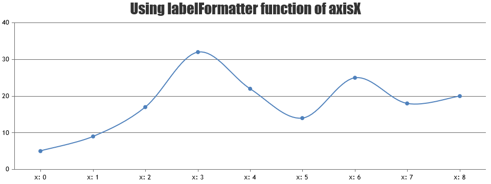
Team CanvasJSYou can achieve the above requirement by formatting the labels of axisX2 using labelFormatter.
—-
Manoj Mohan
Team CanvasJSCan you kindly create a JSFiddle reproducing the issue you are facing and share it with us so that we can look it into your code, understand the scenario better and help you out?
—-
Manoj Mohan
Team CanvasJSPlease take a look at this documentation page for information on rendering a dynamic chart.
Adding date and time to axis Y is not available as of now. However, you can take a look at this workaround to achieve the same.

___________
Manoj Mohan
Team CanvasJSThe download sample seems to be working fine. Providing proper relative path for
canvasjs.react.jsfile should work fine in your case.—-
Manoj Mohan
Team CanvasJSCould you explain how these width and height values are used by your algorithm ie. how is it that this fixes the problem? I have to cope with varying screen sizes in this application so I will need to understand exactly how to dynamically derive those values to be ones that work. Understanding what it is about those values that makes the labels display correctly will help.
To make the chart responsive, the chart is re-rendered when the window is resized with the updated size of the container. And upon resize of the chart, labels/indexLabels of the chart are readjusted to avoid overlapping.
Actually your proposed workaround works for this specific chart but not for others. In the following example, your setting of width 50% and height 300px still results in label display issues. I need a solution that will reliably work regardless of the pie chart size and screen size – the data varies, so the screen layout varies.
Sorry, we are unable to reproduce the issue at our end. Can you kindly share steps to reproduce the issue? Meanwhile you can try re-rendering the chart on changing the view to fullscreen, which might fix the issue in this case.
—-
Manoj Mohan
Team CanvasJSNovember 11, 2019 at 8:30 pm in reply to: Crosshair Render Entering Infinite Loop in generateValueFormatString Function #27365Sorry, we are unable to reproduce the issue at our end. Can you kindly create a sample project reproducing the issue along with sample data and share it over Google-Drive or One Drive so that we can look into your code, understand your scenario better and help you out?
—-
Manoj Mohan
Team CanvasJSThe image shared above seems to be broken. Can you kindly share a pictorial representation(with a live link) and brief us further about your exact requirement so that we can understand your scenario better and help you out?
—-
Manoj Mohan
Team CanvasJSAlex,
Setting the width and height of the chart-container-left (div) should work fine in your case. Please take a look at this updated project.
—-
Manoj Mohan
Team CanvasJShan
Team CanvasJSCan you kindly share a sample project reproducing the issue along with sample data over Google-Drive or Onedrive so that we can look into the code, run it locally to understand the scenario better and help you resolve?
—
Manoj Mohan
Team CanvasJSCan you please brief us further about your requirements along with some example or pictorial representation so that we can understand your scenario better and help you out?
—-
Manoj Mohan
Team CanvasJSDomenic,
Can you kindly share a sample project reproducing the issue over google-drive or one-drive so that we can look into the code, understand the scenario better and help you out?
—–
Manoj Mohan
Team CanvasJSPlease take a look at this sample project for integrating CanvasJS with React. You can also checkout our React Gallery for more examples.
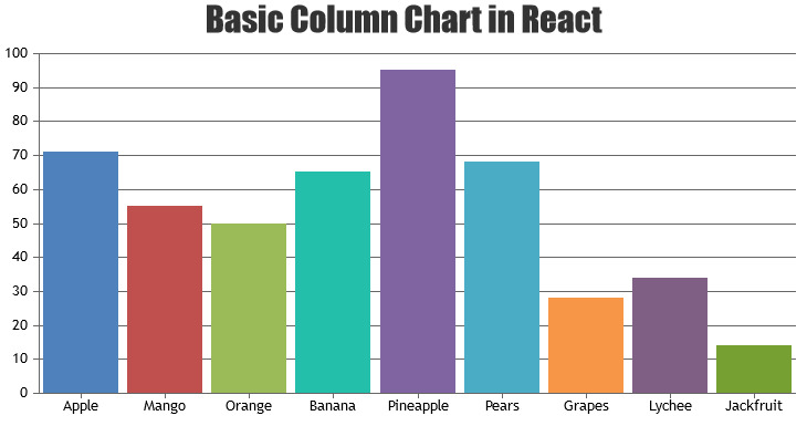
If you are still facing the issue, kindly share a sample project reproducing the issue over google-drive or one-drive so that we can look into the code, understand the scenario better and help you out.
—–
Manoj Mohan
Team CanvasJSOctober 25, 2019 at 8:48 pm in reply to: Removing vertical lines and keeping x-axis and y-axis only #27246You can remove vertical and horizontal axis lines by setting lineThickness, gridThickness and tickLength to 0 for axisX and axisY as shown in the below code snippet.
axisX:{
	lineThickness: 0,
	tickThickness: 0
},
axisY:{
	lineThickness: 0,
	gridThickness: 0,
	tickLength: 0
}
To make chart background as transparent, you can set backgroundColor property to transparent. Please take a look this JSFiddle for an example on chart with transparent background and without horizontal and vertical axis lines.
—-
Manoj Mohan
Team CanvasJS