Login to Ask a Question or Reply
Forum Replies Created by Manoj Mohan
-
Nicolas,
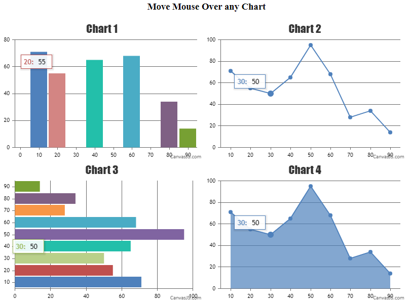
We achieve the tooltip syncing using updated event and showAtX method of tooltip. Whenever tooltip of any chart is updated, the updated event of tooltip for that respective chart is called and we use e.entries[0].xValue i.e. dataPoint x value to display tooltip at respective x value on every chart. In the example you have shared, the chart 2 there is no dataPoint between 10 and 60 because of which updated event passes x value as 10 or 60 to display other charts based on mouse movement.
—-
Manoj Mohan
Team CanvasJSMay 4, 2021 at 6:42 pm in reply to: Start animation on reaching viewport or scrolling down the page #34223Chart animates on initial / 1st call of render only as of now. In the reference JSFiddle example, the chart gets animated when the section of the chart container comes within the viewport. The example that you have shared above contains the chart container within the initial viewport itself because of which chart will render instantly when the page is loaded.
—-
Manoj Mohan
Team CanvasJSApril 29, 2021 at 7:25 pm in reply to: I want to show tooltip upon Legend and Axis Label also. #34175Sorry, it is not possible to show tooltip for axis label as of now. However you can show tooltip for legend with the help of itemmouseover and itemmouseout event of legends as shown in this code snippet.
.
.
.
legend: {
    cursor:"pointer",
    fontSize: 15,
    itemmouseover: function(e){
      showLegendToolTip(e.x, e.y, e.dataSeries.legendLongText);
    },
    itemmouseout: function(e) {
      hideLegendToolTip();
    }
}
.
.
.
for(var i=0; i<chart.options.data.length; i++) {
  chart.options.data[i].legendLongText = chart.options.data[i].legendText;
  chart.options.data[i].legendText = chart.options.data[i].legendLongText.slice(0, 10);
}

chart.render();
jQuery("#chartContainer").append("<div class='custom-legend-tooltip'></div>");
var customToolTipLegend = jQuery(".custom-legend-tooltip");

jQuery(".custom-legend-tooltip").on("mouseout", hideLegendToolTip);

function showLegendToolTip(x, y, text) {
  customToolTipLegend.text(text);
  customToolTipLegend.css({left: x, top: y})
  customToolTipLegend.removeClass("hide");
}

function hideLegendToolTip() {
  customToolTipLegend.addClass("hide");
}
Please take a look at this JSFiddle for complete working code on the same.
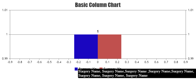
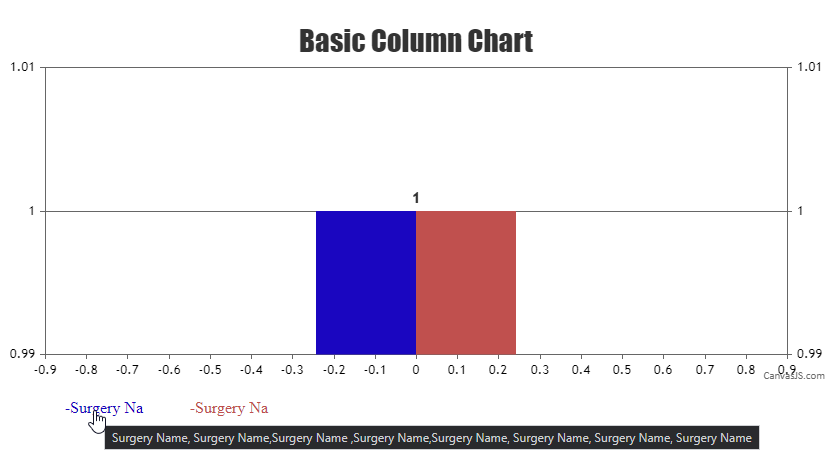
Also, you can show tooltip for legend by creating custom legends (DOM) and add title attribute to it. Please check out the code snippet below.
//Add custom-legends as list and attach click event to that
var legendListId = document.getElementById("legendList");
customLegends(chart,legendListId);
chart.render();

function customLegends(chart, legendListId){
  for(var i=0; i < chart.options.data.length; i++){
    var li = document.createElement("li");
    li.appendChild(document.createTextNode(chart.options.data[i].legendText.slice(0, 10)));
    li.title = chart.options.data[i].legendText;
    legendListId.appendChild(li);
    chart.options.data[i].showInLegend = false;
    li.style.color = chart.options.data[i].color ? chart.options.data[i].color : chart.get("selectedColorSet")[i];
    $('li').each(function (i) {
      $(this).attr('id', (i));
    });
  }

  //Add click event to Custom-Legends being clicked
  $('li').click(function (event) {
    var index = $(this).index();
    var x = document.getElementById(index);
    if (typeof (chart.options.data[index].visible) === "undefined" || chart.options.data[index].visible) {
      chart.options.data[index].visible = false;
    } else {
      chart.options.data[index].visible = true;
    }
    chart.render();
  });
}
Check out this JSFiddle for complete working code.
—-
Manoj Mohan
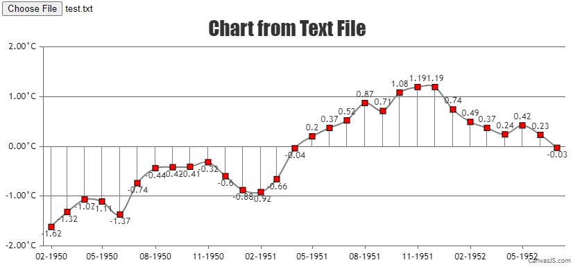
Team CanvasJSYou need to parse the text file to the format accepted by CanvasJS. Please take a look at this below code snippet for the same.
function handleFiles() {
  var fileList = this.files;
  var reader = new FileReader();

  reader.readAsText(fileList[0]);
  reader.onload = function() {
    renderChart(reader);
  }

}

function renderChart(reader) {
  var dpsList = reader.result;
  var dataPoint;
  var dps1= [], dps2 = [], dps3 = [];

  dpsList = dpsList.split("\n");

  for(var i = 1; i < dpsList.length; i++) {
  	var separateData = dpsList[i].split(" ");
  	yVal = parseFloat(separateData[4]);
        xVal = new Date(parseInt(separateData[0]), parseInt(separateData[1]));

    chart.options.data[0].dataPoints.push({x: xVal, y: yVal});
    chart.options.data[1].dataPoints.push({x: xVal, y: yVal});
  }

  chart.render();
}
Also, check out this JSFiddle for complete working code.
—-
Manoj Mohan
Team CanvasJSApril 28, 2021 at 6:29 pm in reply to: Two servers, same code, same database, different outcome #34157Can you kindly create sample project reproducing the issue you are facing and share it with us over Google-Drive or Onedrive along with sample data so that we can run it locally at our end to understand the scenario better, try out in different servers and help you out? Also, can you brief us about server details in which you are facing the issue?
—-
Manoj Mohan
Team CanvasJSApril 27, 2021 at 6:37 pm in reply to: Two servers, same code, same database, different outcome #34139Charts seems to be working fine with bootstrap cards as shown in this JSFiddle. If you are still facing the issue, kindly create sample project reproducing the issue you are facing and share it with us over Google-Drive or Onedrive along with sample database so that we can run it locally at our end to understand the scenario better and help you out.
—-
Manoj Mohan
Team CanvasJSApril 26, 2021 at 6:47 pm in reply to: Sync ToolTip problem when not the same X axis datapoints #34120Nicolas,
tooltip.showAt() shows the tooltip for specified x value passed as parameter not to nearest x value. In order to show tooltip to nearest x value, you can find the nearest x value and pass it in showAt method to display it. Please take a look at below code snippet for showing tooltip for nearest x value.
function getNearestXValues(xVal, dps1) {

	return [].concat(dps1).sort(function(a, b) {
    var diffA = Math.abs(xVal - a.x);
    var diffB = Math.abs(xVal - b.x);
    return diffA - diffB; // sort a before b when the distance is smaller
	})[0].x;

}

function showTooltip(e) {
  for( var i = 0; i < charts.length; i++){
    if(charts[i] != e.chart) {
    	charts[i].toolTip.showAtX(getNearestXValues(e.entries[0].xValue, charts[i].data[0].dataPoints));
    }

  }
}
Also, check out this JSFiddle for complete working code.
—-
Manoj Mohan
Team CanvasJSSorry, adding line break to axis labels is not possible as of now.
—-
Manoj Mohan
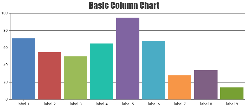
Team CanvasJSDisplaying labels at a specific position(say every midnight) on the axes depends upon the very first label that is rendered, subsequent labels are just rendered at a defined interval(auto-calculated/user-defined) from there. As of now, we do not have control over the starting label on the axes. However in your case, you can show axis labels by passing the year as numeric value instead of datetime as shown in this code snippet.
dataPoints: [
  { x: 2020, y: 71, label: "label 1" },
  { x: 2021, y: 55, label: "label 2" },
  { x: 2022, y: 50, label: "label 3" },
  { x: 2023, y: 65, label: "label 4" },
  { x: 2024, y: 95, label: "label 5" },
  { x: 2025, y: 68, label: "label 6" },
  { x: 2026, y: 28, label: "label 7" },
  { x: 2027, y: 34, label: "label 8" },
  { x: 2028, y: 14, label: "label 9" }
]
Also, take a look at this JSFiddle for an updated example.
—-
Manoj Mohan
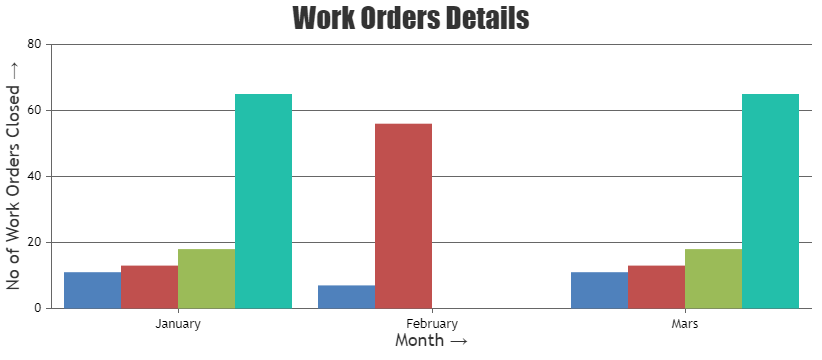
Team CanvasJSYou can categorize your data based on month and add an index for corresponding month to each datapoints. Please take a look at the code snippet below.
for(var i=0; i<csvData.length; i++) {
  var csvLines = csvData[i];
  if(!technicianData[csvLines.label]) {
    technicianData[csvLines.label] = [];
  }

  if(typeof months[csvLines.month] === "undefined") {
    months[csvLines.month] = monthIndex;
    monthIndex += 1;
  }
  technicianData[csvLines.label].push({ "label" : csvLines.month, y: csvLines.y, x: months[csvLines.month]});
}

var data = [];

for (var technician in technicianData ) {
  if (!technicianData.hasOwnProperty(technician)) continue;
  data.push({"name": technician, dataPoints: technicianData[technician]})
}
Also, check out this JSFiddle for complete working code.
—-
Manoj Mohan
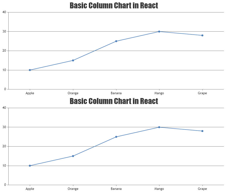
Team CanvasJSYou can render the second chart on clicking datapoints from the first chart using conditional rendering and react state. Please take a look at the code snippet below.
{this.state.clicked && <CanvasJSChart
  options={options}
/>}
Also, check out this StackBlitz for an example with complete code.
Considering this thread as duplicate of React itemClick with Boolean (JSFiddle given) and hence closing the same.
—-
Manoj Mohan
Team CanvasJSYou can render the second chart on clicking datapoints from the first chart using conditional rendering and react state. Please take a look at the code snippet below.
{this.state.clicked && <CanvasJSChart
  options={options}
/>}
Also, check out this StackBlitz for an example with complete code.

—-
Manoj Mohan
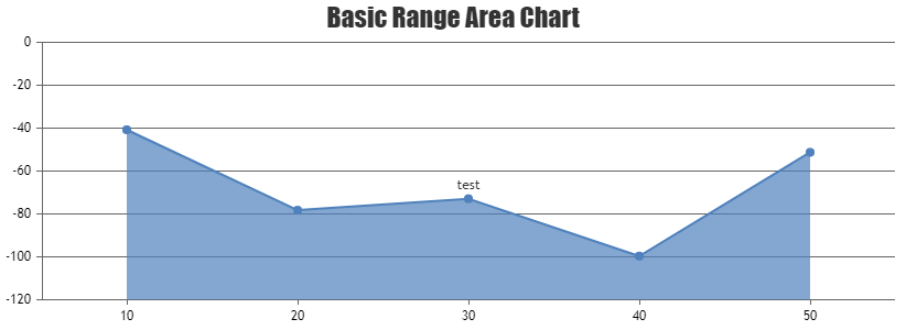
Team CanvasJSTo display indexLabel only for specific index value (in your case 1), you can check the index of the indexLabel in indexLabelFormatter function and display the same. Please take a look at the code snippet below.
indexLabelFormatter: function ( e ) {
          if(e.index === 1 && e.dataPoint.dataPointLabel)
            return e.dataPoint.dataPointLabel;
          else
            return " ";
        }
Also, take a look at this JSFiddle for complete code.
—-
Manoj Mohan
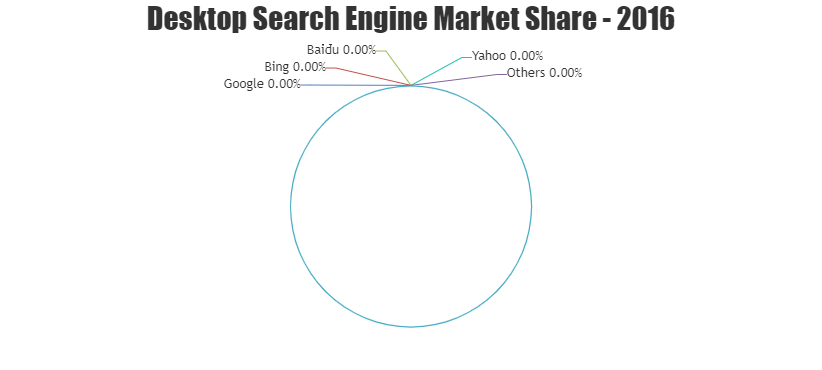
Team CanvasJSIt is not possible to show pie slices when all the dataPoints has 0 value as of now. However, you can achieve similar functionality by changing chart type to doughnut, pushing one extra dataPoint with non-zero y-value and setting innerRadius to 99% as shown in the code snippet below
function checkForZeroDps(chart) {
  var isDpsZero = false;
  for(var i = 0; i < chart.options.data[0].dataPoints.length; i++) {
    if(chart.options.data[0].dataPoints[i].y === 0) {
      isDpsZero = true;
    }
  }
  if(isDpsZero) {
    chart.options.data[0].type = "doughnut";
    chart.options.data[0].innerRadius = "99%";
    chart.options.data[0].dataPoints.push({
      y: 0.000001,
      indexLabel: " ",
      indexLabelLineThickness: 0,
      toolTipContent: null
    });
  }
}
Please take a look at this JSFiddle for complete code.
—-
Manoj Mohan
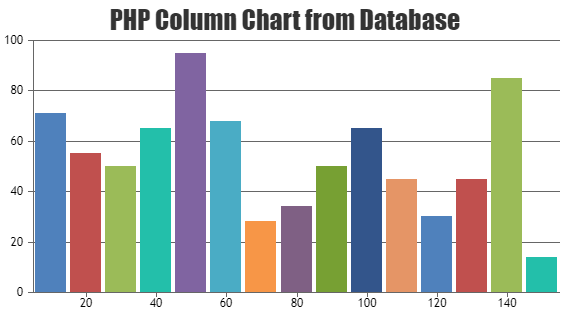
Team CanvasJSPlease take a look at this gallery page for an example on rendering PHP Chart with data from database.
If you are still facing issue, kindly create sample project reproducing the issue you are facing and share it with us over Google-Drive or Onedrive along with sample database so that we can run it locally at our end to understand the scenario better and help you out.
—-
Manoj Mohan
Team CanvasJS