Login to Ask a Question or Reply
Forum Replies Created by Manoj Mohan
-
Neha Mahanjan,
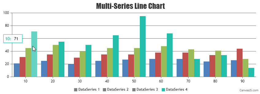
Highlighting legend on hover over chart series is not available as an inbuilt as of now. However you can achieve this functionality by updating legendMarkerColor within mousemove & mouseout events of dataseries as shown in this below codesnippet
for(var i=0; i<chart.options.data.length; i++) {
    chart.options.data[i].mouseover =  highlightLegend;
    chart.options.data[i].mouseout =  dimLegend;
  }

  chart.render();

  function highlightLegend(e) {
    for(var i=0; i<e.chart.options.data.length; i++) {
      if(i !== e.dataSeriesIndex)
        e.chart.options.data[i].legendMarkerColor = "grey";
    }

    e.chart.render();
  }
  function dimLegend(e) {
    for(var i=0; i<e.chart.options.data.length; i++) {
      e.chart.options.data[i].legendMarkerColor = undefined;
    }
    e.chart.render();
  }
Also, check out this JSFiddle for complete working code.
—
Manoj Mohan
Team CanvasJSAugust 5, 2021 at 1:30 pm in reply to: iOS | chart not display with warning maximum limit (224 MB). #35049We are sorry for the inconvenience caused, we will address this issue in our future releases as currently we are working on some important features. However, if interactivity is not required in your use-case you can extract the image of chart, destroy the chart and use the image in place of chart. Please take a look at this JSFiddle for an example.
—-
Manoj Mohan
Team CanvasJSChart seems to be working fine across different browsers like Chrome, Safari, Edge, Firefox, etc.
In order to reproduce the issue at our end, can you kindly create a sample project and share it with us over Google-Drive or OneDrive along with sample data so that we can run it locally, understand the scenario better and help you out?
—-
Manoj Mohan
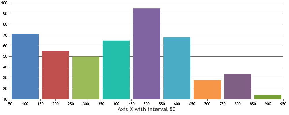
Team CanvasJSYou can set the interval of the axis based on your dataset to fix number of graduations of axis. Please check out this documentation page for more information on setting interval of axisX.
—-
Manoj Mohan
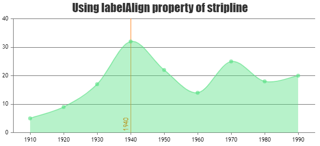
Team CanvasJSWolfgang,
It is not possible to show/position stripline label on the right side of the line as of now. However, you can place stripline label to near, far and center from axis line using labelAlign property.
—-
Manoj Mohan
Team CanvasJSAs of now, CanvasJS doesn’t have the option to add equations / technical indicators as an inbuilt feature. However, you can generate datapoints as per the equation & add a spline dataseries to the chart with few lines of code. Please take a look at this JSFiddle for an example on the same.
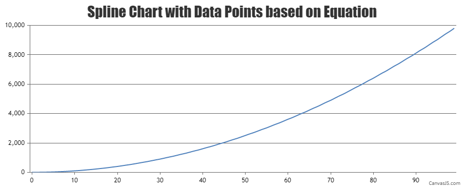
Also, you can check out this forum thread for more info on adding technical indicators (SMA & EMA).
—-
Manoj Mohan
Team CanvasJSYou can use unicode characters to show icons in subtitles. Please check out this JSFiddle for an example on adding unicode characters in subtitles. Also, refer to this Wikipedia page for list of unicode characters.
—-
Manoj Mohan
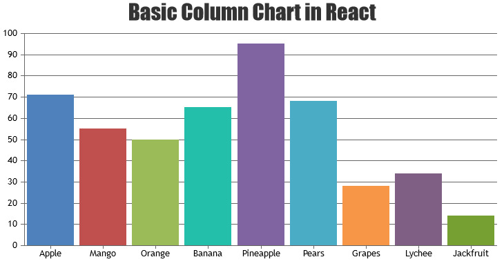
Team CanvasJSPlease take a look at documentation page for step by step tutorial on using CanvasJS React component.
If this doesn’t fulfill your requirements or still facing issue, can you kindly brief us further along with an example so that we can understand your scenario better and help you out?
—-
Manoj Mohan
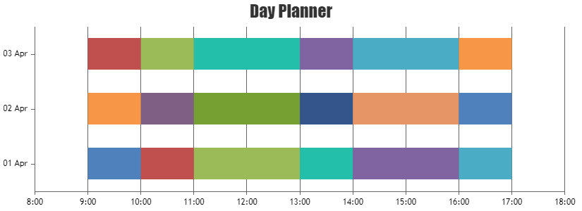
Team CanvasJSYou can use range-bar chart to plot for day planner. Please take a look at this JSFiddle for an example on the same.
—-
Manoj Mohan
Team CanvasJSMike,
You can format the date time in php using date function and pass it as label as shown in this code snippet
$dataPoints[] = array("label" => date("d-m-Y H:i:s",strtotime($row[0])), "y" => $row[1]*1);—-
Manoj Mohan
Team CanvasJSMike,
axisX:{
valueFormatString: “DD-MM-YY HH:mm:ss”,
intervalType: “hour”,
interval: 24
},Axis Labels are rendered at every interval based on the value of intervalType. Since you are setting the interval as 24 hours, axis labels will be shown for every 24 hours.
What I’d really like is for each of the data points to have the timestamp on the x-axis. you can see what I mean with the long downward slope in the middle this is where there is no data in the DB for that time period.
You can pass label instead of x values to dataPoints for displaying timestamp for each dataPoints.
—-
Manoj Mohan
Team CanvasJSMike,
Can you kindly create sample project reproducing the issue you are facing and share it with us over Google-Drive or Onedrive along with sample data so that we can run it locally at our end to understand the scenario better and help you out?
—-
Manoj Mohan
Team CanvasJSJune 16, 2021 at 10:43 am in reply to: function to change the color of the triangle based on the dataPoint color. #34645Can you kindly share an example and brief us further about the requirement so that we can understand your scenario better and help you out?
—-
Manoj Mohan
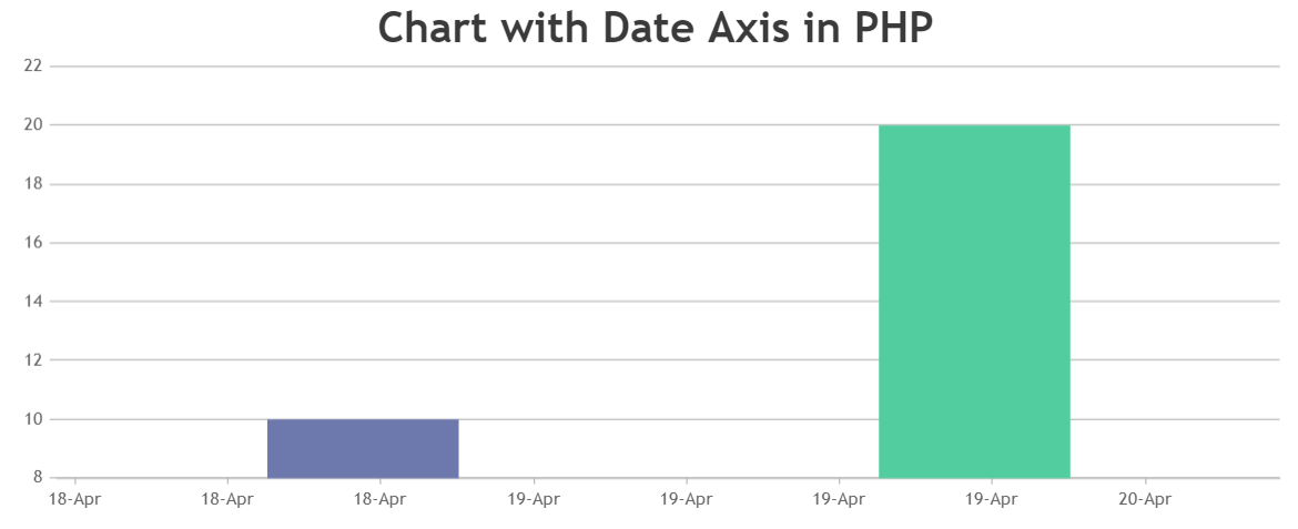
Team CanvasJSIt seems like you are passing the date-time string to dataPoints. To display the chart containing date-time value in PHP, you need to first convert date-time string to PHP timestamp using strtotime(). Later convert PHP timestamp value to javascript timestamp and assign that value to dataPoint x-value in the following format –
[x]=> (strtotime(“2021-06-11 15:51:38”)*1000)
Please take a look at this sample project for an example on rendering the chart in PHP using date-time values data from database.
—-
Manoj Mohan
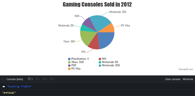
Team CanvasJSJune 10, 2021 at 7:05 pm in reply to: How to get the color/color code of the legend icon which is assigned to charts. #34580manoj kumar,
You can get the color of legend by using selectedColorset property of chart and index of dataPoint as shown in the code snippet below
indexLabelFormatter: function (e) {
  var dpIndex = getDataPointIndex(e.dataSeries, e.dataPoint);
  var selectedColorSet = chart.get("selectedColorSet");
  var legendColor = e.dataPoint.legendMarkerColor ? e.dataPoint.legendMarkerColor : (e.dataPoint.color ? e.dataPoint.color : selectedColorSet[dpIndex % (selectedColorSet.length-1)]);
  console.log(legendColor);
}
.
.
.
function getDataPointIndex(dataSeries, dataPoint) {
  return dataSeries.dataPoints.findIndex(dp => dp === dataPoint);
}
Also, please take at this updated JSFiddle for complete working code.
—-
Manoj Mohan
Team CanvasJS