Login to Ask a Question or Reply
Forum Replies Created by Manoj Mohan
-
December 9, 2022 at 9:56 am in reply to: How to All range button set as selected in rangeChanged event #41380
You can set selectedRangeButtonIndex property to e.index value in rangeChanged event handler to highlight the button selected after manipulating with data. Please take a below code snippet for the same.
stockChart.rangeSelector.set("selectedRangeButtonIndex", e.index)Also, checkout this updated JSFiddle for complete working code.
—-
Manoj Mohan
Team CanvasJSDecember 9, 2022 at 9:53 am in reply to: Range Select Buttons not highlighted if rangeChanging option used #41379@avb,
We are looking into your query and will get back to you at the earliest.
—-
Manoj Mohan
Team CanvasJSThe only remaining detail is that zooming can’t be winded back with buttom
and zoomning works slightly different in the four graphs.Please take a look at this updated JSFiddle which fixes the issue related to zooming.
One further question is how to get different high graphs
Can you kindly fork the JSFiddle and share it with us along with brief description about your requirement so that we can help you with an appropriate solution?
—-
Manoj Mohan
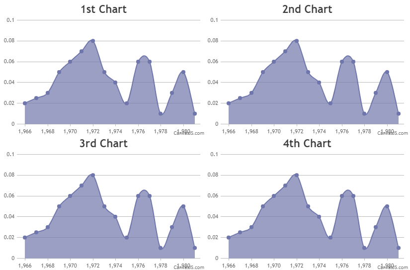
Team CanvasJSPassing datapoints as an array of objects to chart options should work fine in your case. Please find the code-snippet given below.
var chartOptions1 = {
    animationEnabled: true,
    theme: "light2",
    title:{
      text: "1st Chart"
    },
    data: [{
      type: "splineArea",
      dataPoints: [
        { x: 1966 , y: 0.020},
        { x: 1967 , y: 0.025},
        { x: 1968 , y: 0.030},
        { x: 1969 , y: 0.050},
        { x: 1970 , y: 0.060},
        { x: 1971 , y: 0.070},
        { x: 1972 , y: 0.080},
        { x: 1973 , y: 0.050},
        { x: 1974 , y: 0.040},
        { x: 1975 , y: 0.020},
        { x: 1976 , y: 0.060},
        { x: 1977 , y: 0.060},
        { x: 1978 , y: 0.010},
        { x: 1979 , y: 0.030},
        { x: 1980 , y: 0.050},
        { x: 1981 , y: 0.010}
      ]
    }]
  };
.
.
.
Also, check out this JSFiddle for complete working code.
—-
Manoj Mohan
Team CanvasJSYou can control the max-width of datapoint by setting dataPointMaxWidth property.
Considering this thread as a duplicate of Datapoints overlapping and hence closing the same.
—-
Manoj Mohan
Team CanvasJSYou can control the max-width of datapoint by setting dataPointMaxWidth property. If you are still facing the issue, kindly share JSFiddle reproducing the issue so that we can understand your scenario better and help you with an appropriate solution.
—-
Manoj Mohan
Team CanvasJSYou can show indexlabels to the top most dataseries of each stacked column by setting indexLabelPlacement property to “outside”. Please take a look at this updated JSFiddle for a working example.
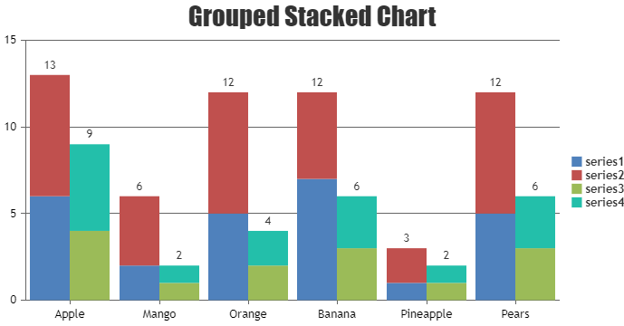
If this doesn’t fulfill your requirements, can you kindly brief us more along with an example or a pictorial representation of your requirements so that we can understand it better and help you out?
—-
Manoj Mohan
Team CanvasJSIndexlabels gets positioned based on the value coordinate and seems to be working fine. Having a JSFiddle along with the chart options and the data that you are using will help us understand the actual scenario better and guide you with an appropriate solution.
From what we have observed, sometimes things get delayed mostly when we are not able to reproduce the issue or not able to understand the exact requirements.
Having a JSFiddle helps us in figuring out the issue and many a times we can just edit your code on JSFiddle to fix the issue right-away.
—-
Manoj Mohan
Team CanvasJSCan you kindly create JSFiddle reproducing the issue you are facing & share it with us so that we can look into the chart-options being used, understand the scenario better and help you out?
—-
Manoj Mohan
Team CanvasJSTo pass date as x-value using PHP, you need to first convert PHP date to PHP timestamp using strtotime and then convert PHP timestamp to JavaScript timestamp by multiplying PHP timestamp by 1000. Along with passing the timestamp as x value, you need to set xValueType option to ‘dateTime’ in dataseries.
foreach($result as $row){
  array_push($dataPoints, array("x"=> strtotime($row['created_at']) * 1000, "y"=> $row['responseTime']));
}
—-
Manoj Mohan
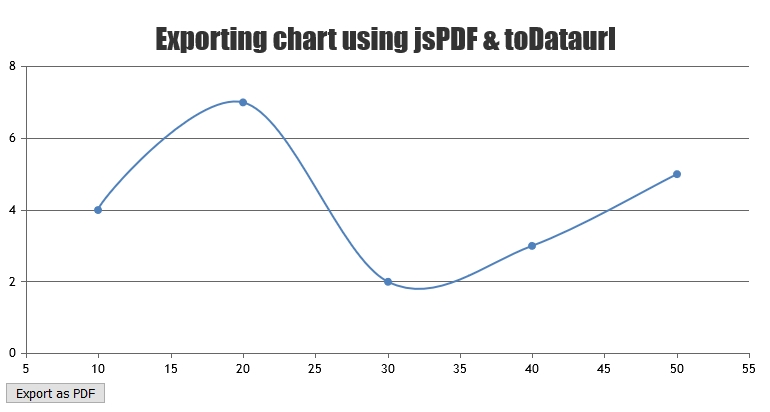
Team CanvasJSWe don’t have exporting chart in pdf as an inbuilt feature as of now. However with few lines of code, you can export the chart in PDF using jsPDF. Please check out the code-snippet below.
var pdf = new jsPDF();
pdf.addImage(dataURL, 'JPEG', 0, 0);
pdf.save("download.pdf");
Also, have a look at this JSFiddle for complete code. You can refer to the jsPDF documentation for more information about the methods available in jsPDF library.
—-
Manoj Mohan
Team CanvasJSSorry for the inconvenience caused to you because of this behavior. This behavior is by design & we would revisit the same in future.
—-
Manoj Mohan
Team CanvasJSThis behaviour is as per design and it’s not possible to keep zoom selection active on moving cursor of the chart area.
—-
Manoj Mohan
Team CanvasJS