Login to Ask a Question or Reply
Forum Replies Created by Indranil
-
March 21, 2018 at 10:43 am in reply to: updating graph from csv file which recieve data from a sensor #20009
Please take a look at this example to create dynamic charts. In the example, the chart is getting updated through JSON you can do the same for CSV.
___________
Indranil Deo,
Team CanvasJSWe currently have plans for building and publishing npm package but no definite timeline yet. However, CanvasJS can be easily imported as a module to any of the front-end frameworks like React, Angular, Vuejs, etc. Below are the steps to import CanvasJS Chart / StockChart.
1. Save canvasjs.min.js (canvasjs.stock.min.js incase of StockChart) within source-folder of your application.
2. Import the library into your app.
For Chart:import * as CanvasJS from './canvasjs.min';
For StockChart:import * as CanvasJS from './canvasjs.stock.min';Once it’s imported, you are ready to go. Now you can create Chart / StockChart, pass options & render them.
In case you are integrating CanvasJS in React you can check this documentation page for step to step instructions on the integration process.

__________
Indrail Deo
Team CanvasJSHow the YAxis intervals are auto-calculated for a linear graph without includeZero set?
How the YAxis intervals are auto-calculated for a logarithmic graph with a hard minimum of 1 and a range of values that go up to 1million. Sometimes we’re seeing the logarithmic graph leave out many ticks that we’d like, and we haven’t figured out how to avoid this.Interval depends on the range and the number of ticks that could be shown for the width of the chart. Please take a look at this jsfiddle to add number of ticks based on your requirement.
____________
Indranil Deo,
Team CanvasJSCan you please create a jsfiddle reproducing the issue you are facing so that we can understand your requirement better and help you out.
___________
Indranil Deo,
Team CanvasJSshift() removes the elements from the beginning of the array. i.e. As you are shifting dataPoints after every 30minutes, it just means you are removing all dataPoints except last 30minutes. Because of this, you will not be able to zoom/pan to the region where there are no dataPoints.
___________
Indranil Deo,
Team CanvasJSThanks for the suggestion we will reconsider this feature in future releases. Please take a look at this jsfiddle.
__________
Indranil Deo,
Team CanvasJSMichael,
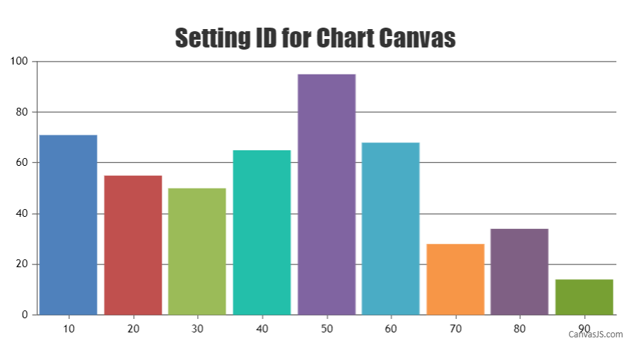
Yes, you can set ID for individual chart-canvas using
chart.canvas.setAttribute("id", "chartCanvas"). Please take a look at this JSFiddle for complete code.
___________
Indranil Deo
Team CanvasJSSetting color to dataSeries will apply color to line, legend-marker, toolTip. So setting color instead of lineColor should work fine in this case.
Please take a look at this updated jsfiddle.
___________
Indranil Deo,
Team CanvasJS-
This reply was modified 7 years, 11 months ago by
Indranil.
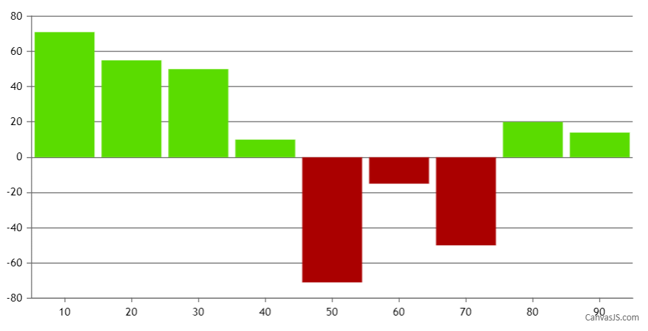
March 16, 2018 at 9:53 am in reply to: Seems like converttopixel is giving wrong axisY &axisY2 values #19950Yes, column/bar chart should work fine without introducing new dataPoint in this scenario. However, you need to set dataPoint color based on its value, whether negative or positive as shown in the below code snippet –
function setColor(chart){
	for(var i = 0; i < chart.options.data.length; i++) {
  	dataSeries = chart.options.data[i];
  	for(var j = 0; j < dataSeries.dataPoints.length; j++){
    	if(dataSeries.dataPoints[j].y <= 0)
      	dataSeries.dataPoints[j].color = 'rgb(170, 0, 0)';
    }
  }
}
Please take a look at this JSFiddle for a working example.

___________
Indranil Deo
Team CanvasJSMarch 14, 2018 at 8:09 pm in reply to: multi-series within multi-chart and together control zoom. #19921Luis,
about 1. is ok, but when the mouse on second chart,the first chart is not work.
You can try triggering event for the first chart based on the event fired in the second chart. That should work fine in your case.
about 2. my mean is to calculate the difference by selecting the two dataPoints.
Please take a look at this jsfiddle.
___________
Indranil Deo,
Team CanvasJSCan you please create a jsfiddle reproducing the issue so that we can look into your code and help you out.
___________
Indranil Deo,
Team CanvasJSSetting the lineThickness to 1 will work fine in your case.
___________
Indranil Deo,
Team CanvasJS -
This reply was modified 7 years, 11 months ago by