Home › forums › Chart Support › Conditional area color?
I have a spline area chart that has the y value 0 in the middle of the y axis. I want to show a red area for negative values and a green area for positive values. How do I do this?
@netpresent,
You can achieve this by setting the color property for individual dataSeries and splitting the dataSeries based on positive or negative. Please take a look at this jsfiddle.
___________ Indranil Deo, Team CanvasJS
Thanks for the fast answer! That’s an interesting trick, but a bit clumsy, and the results are unusable in most situations: look at the gaps when the points around the pos/neg flips are not close to zero:
http://jsfiddle.net/pxj4ab9y/
Beats the purpose of a spline. I have many situations where just 1 or 2 data points are below zero (and the x axis has dates), so I cannot just invent some x values with y=0 around those points.
I think a commercial product like CanvasJS should have a built-in solution for a trivial use case like this.
You can introduce extra dataPoints at the beginning and at the end of the dataSeries with y-value 0 and x-value between the last dataPoint of previous dataSeries and first dataPoint of the next dataSeries.
Please take a look at this updated jsfiddle.
Not really. I cannot invent A new date between two adjacent dates can I? And even if I could, it would be even more clumsy. Should be an standard feature I think. Is it easier if I use bars instead of splines?
Cheers, JH
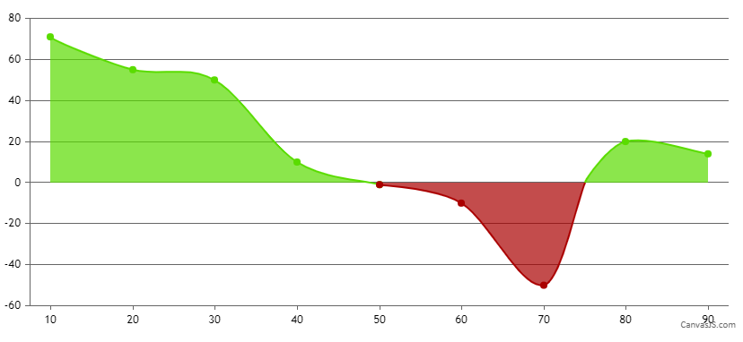
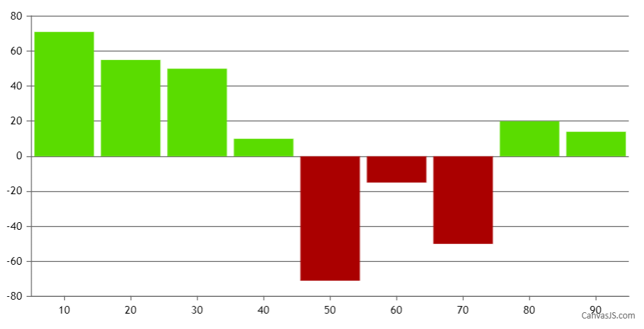
Yes, column/bar chart should work fine without introducing new dataPoint in this scenario. However, you need to set dataPoint color based on its value, whether negative or positive. Please take a look at this jsfiddle.
You must be logged in to reply to this topic.