Login to Ask a Question or Reply
Forum Replies Created by Indranil
-
We are looking into your query and will get back to you at the earliest.
___________
Indranil Deo,
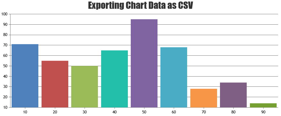
Team CanvasJSFebruary 22, 2019 at 12:05 am in reply to: Export chart to excel and edit data in excel to see changes in chart in excel? #24428It is possible to export the chart data in CSV format, but rendering and updating the chart within excel is not possible as of now. Please check the below code snippet to convert chart data into comma-separated CSV –
function convertChartDataToCSV(args) {
  var result, ctr, keys, columnDelimiter, lineDelimiter, data;

  data = args.data || null;
  if (data == null || !data.length) {
    return null;
  }

  columnDelimiter = args.columnDelimiter || ',';
  lineDelimiter = args.lineDelimiter || '\n';

  keys = Object.keys(data[0]);

  result = '';
  result += keys.join(columnDelimiter);
  result += lineDelimiter;

  data.forEach(function(item) {
    ctr = 0;
    keys.forEach(function(key) {
      if (ctr > 0) result += columnDelimiter;
      result += item[key];
      ctr++;
    });
    result += lineDelimiter;
  });
  return result;
}
Kindly take a look at this JSFiddle for a fully functional example on exporting chart data as CSV. Also take a look at this plugin, which does the same.
___________
Indranil Deo
Team CanvasJSLegend marker is shown in the center of the Legend. It can be a “circle”, “square”, “cross” and “triangle” and it seems to be working fine at our end. Can you please create a jsfiddle reproducing the issue so that we can look into your code understand it better and help you out.
___________
Indranil Deo,
Team CanvasJS1. I want to get the data of selected slices , please give me the code for it.
You can use the click event handler to get the data of the selected dataPoints on a chart.
2. I want to set some selected pie slices by default on page load,
You can achieve the above requirement by setting the exploded property to true for the dataPoints you would like to highlight.
___________
Indranil Deo,
Team CanvasJSTejal,
Thanks for the information. Our representative will contact you over the above mentioned emails.
___________
Indranil Deo,
Team CanvasJSYou can download the working JSP sample from the download page and try it out locally, which will work in Eclipse Kepler.
___________
Indranil Deo,
Team CanvasJSTejal,
Thanks for the confirmation. One of our team members will get in touch with you soon over email.
___________
Indranil Deo,
Team CanvasJSGlad that you figured out a way to make it work :)
___________
Indranil Deo,
Team CanvasJS@fliptscript, @lolaona12, @lumaluis,
We have released v2.3 with the above modification. Please refer to the release blog for more information. Do download the latest version from our download page and let us know your feedback.
___________
Indranil Deo,
Team CanvasJSThanks for your patience. We are working on some important update at this point. Hoverever, we have added your request to our list and will be fixing it in our future releases.
___________
Indranil Deo,
Team CanvasJSThere is a typo in your code
xValueType: "dataTime",. Please change dataTime to dateTime and it should work fine. You can also refer to this documentation page for more information.In case it doesn’t help you out, can you please create a sample project with a sample database and share it over Google-Drive or Onedrive so that we can look into your code understand it better and help you out?
___________
Indranil Deo,
Team CanvasJSIf the height allocated to the chart is pretty less, some elements might get truncated in order to accommodate the rest of the chart elements. However to work around this issue you can check this jsffidle.
___________
Indranil Deo,
Team CanvasJSJanuary 23, 2019 at 10:32 pm in reply to: Cannot set a string array to x-axis in a responsive chart #24077Since the difference in the consecutive timestamp is in terms of milliseconds, the corresponding labels displayed on the Axis X are in milliseconds. Setting the valueFormatString of the Axis X to “MMM DD YYYY hh:mm:ss” will work fine in your case.
Please take a look at this updated jsfiddle.
___________
Indranil Deo,
Team CanvasJS