Login to Ask a Question or Reply
Forum Replies Created by Indranil
-
Sandeep,
You can modify the content of the toolTip with the help of contentFormatter. Please take a look at this JSFiddle for an example.
___________
Indranil Deo
Team CanvasJSIt seems to be working fine at our end. The side navigation menu comes up over all other body elements on clicking the menu icon because of which it is not resizing the content of the body element itself, as a result, the chart is not getting resized.
___________
Indranil Deo
Team CanvasJSApril 10, 2020 at 9:01 pm in reply to: Is there a work around for firing an click event axis label #28900@Sudheer,
Sorry, adding click event to axis label is not possible as of now.
___________
Indranil Deo
Team CanvasJSPlease take a look at this JSFiddle for an example on creating multiple dynamic charts.
___________
Indranil Deo
Team CanvasJSCan you please let us know the technology being used by you and brief us further about your requirement so that we can understand your scenario better and help you out.
___________
Indranil Deo
Team CanvasJSRamsy,
In order to render chart on the server side you would require a headless browser like PhantomJS. Here is an article which might help.
Please take a look at this sample PhantomJS project, that captures the chart image from web page and saves it to a particular location. Please refer to instructions.txt file for clear understanding.___________
Indranil Deo
Team CanvasJSApril 7, 2020 at 9:40 pm in reply to: How can I get data out using my external Json file on a pie chart #28862Please take a look at this documentation page for step by step tutorial on rendering a chart from an external JSON data.
___________
Indranil Deo
Team CanvasJSSince the interval is set to 1 the chart will render all corresponding labels which will result in overlapping. Removing the interval option will allow library to calculate the interval automatically and prevent it from overlapping.
___________
Indranil Deo
Team CanvasJSCan you kindly create JSFiddle with a sample JSON and share it with us so that we can look into the code, understand the scenario better and help you out?
From what we have observed, sometimes things get delayed mostly when we are not able to reproduce the issue or not able to understand the exact requirements or the solution that we provide may not work properly due to the variation in chart-options being used by you and us.
Having a JSFiddle helps us in figuring out the issue and many a time we can just edit your code on JSFiddle to fix the issue right away.
___________
Indranil Deo
Team CanvasJSPlease take a look at this gallery page for an example on rendering a chart with date-time axis.
In case this doesn’t fit your requirements kindly create a sample project with your use-case and share it with us over Google-Drive or Onedrive along with sample data so that we can run it locally to understand the scenario better and help you out.
___________
Indranil Deo
Team CanvasJSSergio,
Combining column with stackedColumn chart will lead to overlapping. However, you can achieve the above requirement by assigning one of the stackedColumn dataSeries to secondary Y Axis. Please take a look at this JSFiddle.
___________
Indranil Deo
Team CanvasJSwhen i created stackedbar/stackedcoloumn chart with many bars(data) then it shows alternate lable how i overcome this issue
Alternate labels are skipped to avoid overlapping of labels, which can be customized to show all the labels by setting the interval property to the desired value.
second point is when use stackbar that time how use scroll for too many data(bars)
Can you kindly create and share a JSFiddle and brief us further about your requirement so that we can understand your scenario better and help you out with an appropriate solution.
___________
Indranil Deo
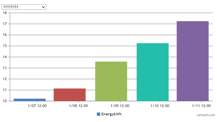
Team CanvasJSChart animates only on the first/initial render, as of now. To animate at every subsequent selection, you can destroy and re-create the chart as shown in the code snippet below –
$( ".dropdown" ).change(function() {
  chart.destroy();
  chart = new CanvasJS.Chart("chartContainer",chartOptions);
  chart.options.data[0].dataPoints = [];
  selectDataSeries();
});

function selectDataSeries(){
  var selected = element.options[element.selectedIndex].value;
  dps = jsonData[selected];
  for(var i in dps) {
    var xVal = dps[i].x;
    chart.options.data[0].dataPoints.push({x: new Date(xVal), y: dps[i].y});
  }
  chart.render();
}
Please take a look at this JSFiddle for a working example.

___________
Indranil Deo
Team CanvasJS