Login to Ask a Question or Reply
Forum Replies Created by Anjali
-
Hi,
Yes, you can only read colors when you set them explicitly. Default colors are not exposed yet.
But we do have a workaround where you can assign a custom colorSet and determine dataPoint’s color from it – dataPoints are assigned color in a sequential order. Checkout this example.
Hi,
You can read the used colors which are explicitly given to data. By default color retrieved from the colorSet cant be read as of now.Hi,
Can you please post the JSON Response. So that I can help you more efficiently.Hi,
Yes, It is possible to put a column and line chart on the same graph. You can go through the combination charts section in our documentation which makes more clear the combinations of charts per dataSeries.
I have created a simple example for you which will be helpful.Hi,
Yes, you can plot the chart as mentioned in the link. Because charts just get drawn inside any container you provide, it’s more about designing the container itself. Just design/place the container according to your requirement and pass its id to CanvasJS and chart should get plotted inside the same.
Here is simple example that I’ve created. You can style it according to your requirements.
Hi,
In case you are going to use toDataUrl, then I just want to let you know that you need to convert first canvas element present inside the container.
Regards,
AnjaliHi
Can you please give us some link / screenshot that depicts the kinda widget that you want to create?
Hi,
“Navigation” or “Vertical marker(crosshair)” will be released in v1.6 of canvasJs with in coming 4-6 weeks.
“when you put the mouse over data a vertical marker is showed displaying x axis value instead specific point value” for displaying the specific point value, Tooltip property can help you. Here is the example how to use tooltip
Please let me know if it works for you.
Hi,
You can set axisY’s includeZero property to false in these cases in order to keep axis minimum closer to given y values. Here is the example on how to use includeZero
Please let me know if this works for you.
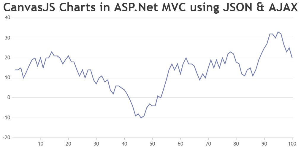
You basically need to loop through the JSON data and parse it to the format accepted by CanvasJS before passing it to the chart options. Please check the below code snippet –
var dataPoints =[];
$.getJSON("/Dashboard/GetData/",function(data) {
  for(var i=0; i<=data.length-1; i++) {
    dataPoints.push({label:data[i].Title,y:parseInt(data[i].Credits)});
  }
  var chart = new CanvasJS.Chart("chartContainer", {
    theme: "theme2",
    title: {
      text: "CanvasJS Charts in ASP.Net MVC using AJAX & JSON"
    },
    data: [
      {
        type: "column",
        dataPoints: dataPoints
      }
    ]
  });
  chart.render();
});
[Update]
Now we have a Tutorial on Creating Charts from JSON Data in ASP.NET MVC.
Can you please post the JSON Response, so that we can figure out where exactly is the problem.
jsPDF seems like the best option according to us. May I know what you mean by process is more manual?
i am able to get network packet count from all the machines and display the stats
Sorry, but we are not able to understand how we can help you if you are already able to render the data.
Raghavendra,
I think this thread should be of help for you.
Can you please describe your requirement in detail with some relevant links so that we can suggest you on how to go with the same?