Login to Ask a Question or Reply
Forum Replies Created by Vishwas R
-
July 17, 2019 at 5:47 pm in reply to: Tooltip for all the points across different graph should be shown together #25938
You can add dummy stripline with transparent color and position it below the actual stripline as shown in this JSFiddle.
In order to help us in understanding the issue, please have a reproducible demo of your chart.
This one step can assure you a speedy response. Fork out our template JSFiddle and reproduce the chart at your end. Try to keep it to the bare minimum by removing unnecessary code.
From what we have observed, sometimes things get delayed mostly when we are not able to reproduce the issue or not able to understand the exact requirements or the solution that we provide may not work properly due to the variation in chart-options being used by you and us.
Having a JSFiddle helps us in figuring out the issue and many a times we can just edit your code on JSFiddle to fix the issue right-away.
—
Vishwas R
Team CanvasJSCan you kindly create JSFiddle reproducing the issue you are facing and share it with us so that we can look into the code, understand the scenario better and help you out?
—
Vishwas R
Team CanvasJSPlease take a look at this Sample Project which shows rendering column chart in JSP with data from Oracle Database.
—
Vishwas R
Team CanvasJSColumn charts are rectangular bars with lengths proportional to the values that they represent – which are vertical whereas bar charts are horizontal. Column and Bar charts have different orientations which can’t be changed.
—
Vishwas R
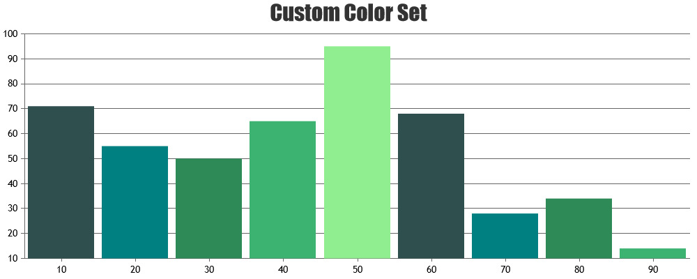
Team CanvasJSColors in the colorset is mapped with the datapoints i.e., 1st color will be applied for 1st datapoint, 2nd color to the 2nd datapoint, and so on. Updating colorset before every re-render will change the colors of datapoints on re-render of the chart.
—
Vishwas R
Team CanvasJSJuly 12, 2019 at 5:42 pm in reply to: Different Labels share x value when using multiple plots #25871When dataseries gets hidden the corresponding labels of the datapoint also gets hidden because of which it starts showing the x-values of that datapoint.
—
Vishwas R
Team CanvasJSYou can change the color of any datapoint by setting color property. Please refer documentation for more information along with live example.
You can also have custom color-set in the chart, please refer documentation for more information.
—
Vishwas R
Team CanvasJSJuly 12, 2019 at 11:26 am in reply to: Need a Assistance to fetch and connect Bubble chart to mysql via PHP #25865In gallery example, it accepts x and y-values from database and pass it to chart options as
array_push($dataPoints, array("x"=> $row->x, "y"=> $row->y));. Changing it to accept z-valuesarray_push($dataPoints, array("x"=> $row->x, "y"=> $row->y, "z"=> $row->z));and changing type to “bubble” should work fine for you.If you are still facing issue, kindly create sample project reproducing the issue you are facing and share it with us along with sample database over Google-Drive or Onedrive so that we can run it locally at our end, understand the scenario better and help you resolve.
—
Vishwas R
Team CanvasJSSorry, combination of line and horizontal bar (bar chart) is not possible as of now. However you can combine vertical bar (column chart) and line chart, please take a look at this example.
—
Vishwas R
Team CanvasJSRendering charts (that are hidden initially) after onClick should work fine in this case.
If you are still facing the issue, kindly create JSFiddle reproducing the issue you are facing and share it with us so that we can look into the code, understand the scenario better and help you out.
—
Vishwas R
Team CanvasJSJuly 12, 2019 at 10:37 am in reply to: Need a Assistance to fetch and connect Bubble chart to mysql via PHP #25861Please take a look at this Gallery Demo for an example on rendering chart with data from database. You can also download PHP Samples from our download page and try it locally.
—
Vishwas R
Team CanvasJSJuly 11, 2019 at 6:33 pm in reply to: How can I show only "Date & Month" in X axis in area spine chart? #25853Setting valueFormatString to “DD MMMM” will show date and month in axis labels. Please refer documentation page for more customization options.
If this doesn’t fulfill your requirement, kindly create JSFiddle with sample data and share it with us so that we can look into the code, understand the scenario better and help you out.
—
Vishwas R
Team CanvasJSScott,
[update]
We have just released v3.11.0 Beta 1 with axisY labelPadding. Please refer the release blog for more information. Do download the latest version from our download page and let us know your feedback.
Sorry, there is no property to add padding between axis title and labels as of now. However you can achieve this by adding stripLine with transparent label as shown in this JSFiddle.
—
Vishwas R
Team CanvasJS