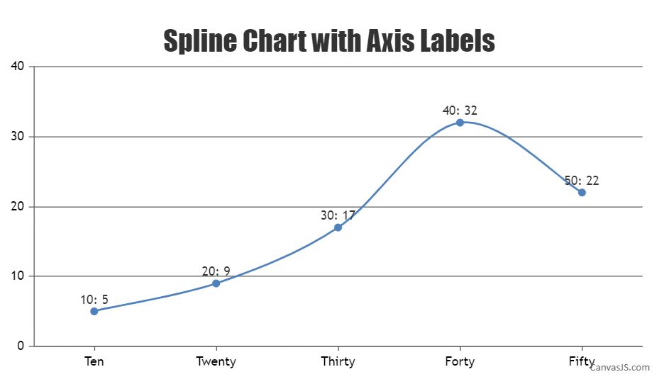
Changing the labels of the X-axis
- This topic has 5 replies, 2 voices, and was last updated 6 years, 11 months ago by
.
Viewing 6 posts - 1 through 6 (of 6 total)
Viewing 6 posts - 1 through 6 (of 6 total)
You must be logged in to reply to this topic.