Login to Ask a Question or Reply
Forum Replies Created by Vishwas R
-
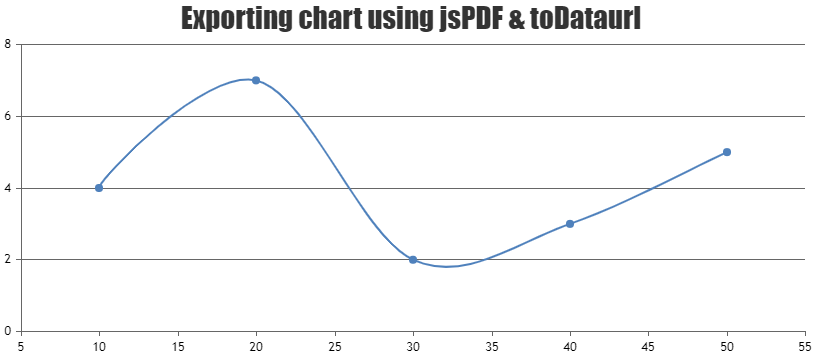
jsPDF doesn’t support exporting canvas to pdf directly, please refer to this Stackoverflow thread for more information. Instead you can add chart image to PDF using addImage method of jsPDF. Please find the code-snippet below.
var canvas = $("#chartContainer .canvasjs-chart-canvas").get(0);
var dataURL = canvas.toDataURL();

var pdf = new jsPDF();
pdf.addImage(dataURL, 'JPEG', 0, 0);
pdf.save("download.pdf");
Please take a look at this JSFiddle for complete code.
—
Vishwas R
Team CanvasJSThe code shared in JSFiddle seems to be working fine. Can you kindly create sample project in PHP, upload it to Google-Drive or Onedrive & share the link with us so that we can look into the code, run it locally to understand the scenario better and help you out?
—
Vishwas R
Team CanvasJSYou can rotate the axis-labels by setting labelAngle property. In your case, you can set
labelAngle: -90to keep it vertical. Please refer to the documentation for complete list of available chart-options along with live-examples.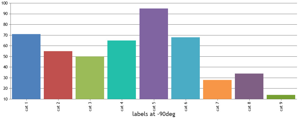
—
Vishwas R
Team CanvasJSCharles,
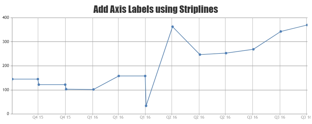
Thanks for your valuable feedback. It’s not possible to control first & last label in axis as of now. We will reconsider this behavior for future versions. Meanwhile, you can workaround this by removing all axis labels & use striplines to show labels from viewportMinimum to viewportMaximum. Please take look at this JSFiddle for an example on the same.
—
Vishwas R
Team CanvasJSPlease check out this forum thread for more information on rendering dynamic chart for ECG along with an example.
If you are still facing issue, can you kindly create JSFiddle & share it with us so that we can look into the code, understand the scenario better & help you out?
—
Vishwas R
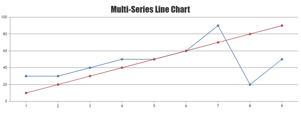
Team CanvasJSJanuary 21, 2022 at 6:31 pm in reply to: Displaying multiline chart with label with some data points have no data #36723You can loop through datapoints and add the missing datapoint before rendering the chart. Please find the code-snippet below.
for(i=0; i<chart.options.data.length; i++) {
  var dps = chart.options.data[i].dataPoints;
  for(var j = 1; j < dps.length; j++) {
    if(dps[j].x > (j+1))
      dps.splice(j, 0, {x: j+1, y: dps[j-1].y});
  }
}
Please take a look at this JSFiddle for complete code.
—
Vishwas R
Team CanvasJSBen,
You can achieve this by using striplines. You can dynamically add stripline on clicking anywhere on the chart using addTo method. Also, you can make them draggable using mouse-events as shown in the below code-snippet.
$(".canvasjs-chart-canvas").last().on("mousedown", function(e) {
  // Get the selected stripLine & change the cursor
  var parentOffset = $(this).parent().offset();
  var relX = e.pageX - parentOffset.left;
  var relY = e.pageY - parentOffset.top;
  var snapDistance = 10;

  for(var i = 0; i < chart.options.axisX[0].stripLines.length; i++) {
    if(relX > chart.axisX[0].stripLines[i].get("bounds").x1 - snapDistance && relX < chart.axisX[0].stripLines[i].get("bounds").x2 + snapDistance && relY > chart.axisX[0].stripLines[i].get("bounds").y1 && relY < chart.axisX[0].stripLines[i].get("bounds").y2) {
      selected = i;
      $(this).css("cursor","pointer");
    }
  }
});

$(".canvasjs-chart-canvas").last().on("mousemove", function(e) {
  // Move the selected stripLine
  if(selected !== -1) {
    var parentOffset = $(this).parent().offset();
    var relX = e.pageX - parentOffset.left;
    chart.options.axisX[0].stripLines[selected].value = chart.axisX[0].convertPixelToValue(relX);
    chart.render();
  }
});

$(".canvasjs-chart-canvas").last().on("mouseup", function(e) {
  // Clear Selection and change the cursor
  selected = -1;
  $(this).css("cursor","default");
});
Please take a look at this JSFiddle for working code.
—
Vishwas R
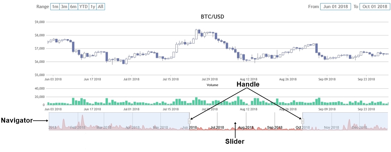
Team CanvasJSBen,
You can use navigator to select a range of data to be shown in chart. If this doesn’t fulfill your requirements, can you kindly brief us more along with an example or a pictorial representation of your requirements so that we can understand it better and help you out?
—
Vishwas R
Team CanvasJSYou can get source-code of the products with Developer license, which you can edit at your end. This enables you to add additional functionality to the product or customize it the way you want.
—
Vishwas R
Team CanvasJSRendering multiple charts in a page seems to be working fine. Please refer to this tutorial for step-to-step instructions on rendering multiple charts in a page.
If you are still facing issue, can you kindly create JSFiddle reproducing the issue you are facing & share it with us so that we can look into the code / chart-options being used, understand the scenario better and help you resolve?
—
Vishwas R
Team CanvasJSDecember 1, 2021 at 6:32 pm in reply to: Chart data not showing correctly for new data points #36406Considering this as duplicate of Entire chart is not showing after data points are updated in react, hence closing the same.
—
Vishwas R
Team CanvasJSDecember 1, 2021 at 6:32 pm in reply to: Entire chart is not showing after data points are updated in react #36405Can you kindly share sample project reproducing the issue you are facing over Google-Drive or Onedrive so that we can look into the code, run it locally at our end to understand the scenario better & help you resolve?
From what we have observed, sometimes things get delayed mostly when we are not able to reproduce the issue or not able to understand the exact requirements or the solution that we provide may not work properly due to the variation in chart-options being used by you and us.
Having a sample project helps us in figuring out the issue and suggesting an appropriate solution accordingly.
—
Vishwas R
Team CanvasJSexportChart method exports the entire chart, irrespective of whether the chart is within the viewport or not.
Can you kindly create JSFiddle with your use-case, so that we can look into the code / chart-options that you are using, understand the scenario better & help you out?
From what we have observed, sometimes things get delayed mostly when we are not able to reproduce the issue or not able to understand the exact requirements or the solution that we provide may not work properly due to the variation in chart-options being used by you and us.
Having a JSFiddle helps us in figuring out the issue and suggesting an appropriate solution accordingly.
—
Vishwas R
Team CanvasJSCanvasJS is a JavaScript library that render charts on the client-side. To capture image of chart on server-side, you will have to run it in a headless browser & capture screenshot. Please take a look at this sample project which uses puppeteer to do so.
—
Vishwas R
Team CanvasJSYou seem to be using trial version of CanvasJS that’s downloaded from Download Page. Kindly download commercial version of CanvasJS from My Account page. After downloading the commercial version, please replace the CanvasJS Trial Version source file in your application with the Commercial Version and make sure to clear the browser cache.
If it’s shown as expired in My Account, your subscription would have expired & you will need to renew subscription to get latest updates.
—
Vishwas R
Team CanvasJS