Login to Ask a Question or Reply
You must be logged in to post your query.
Home › Forums › Chart Support › combining candlestick chart and line chart (moving average line)
combining candlestick chart and line chart (moving average line)
- This topic has 42 replies, 4 voices, and was last updated 8 years, 3 months ago by
Vineet Deodhar.
Tagged: candlestick chart
-
January 31, 2018 at 10:24 am #19196February 1, 2018 at 12:43 pm #19236
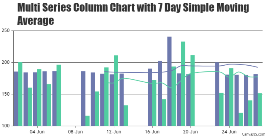
Can’t we have two dataset and two moving average for each data? I need two lines for two different data but I dont know how to get data for that line?
February 2, 2018 at 11:36 am #19285You can loop through each of the column series and create a corresponding series representing the Simple Moving Average as shown in the code snippet below –
// Pass all the data-series to render SMA
for(var i = 0; i < numberOfDataSeries; i++) {
    renderSimpleMovingAverage(chart.options.data[i], 7);
}

chart.render();

function renderSimpleMovingAverage(dataSeries, smaPeriod) {
    if(dataSeries.dataPoints.length <= smaPeriod) return;
    else {
    	// Add a new line series for Moving Averages
	chart.options.data.push({
            type: "spline",
            markerSize: 0,
	    color: dataSeries.color,
	    name: dataSeries.name + " SMA",
	    yValueFormatString: "#,##0.00",
	    dataPoints: []
	});

	var total;
	for(var i = smaPeriod; i < dataSeries.dataPoints.length; i++) {
	    total = 0;
	    for(var j = (i - smaPeriod); j < i; j++) {
	    total += dataSeries.dataPoints[j].y;
	    }
	    chart.options.data[chart.options.data.length - 1].dataPoints.push({
	    	x: dataSeries.dataPoints[i].x,
		y: total / smaPeriod
	    });
	}
    }
}
Please take a look at this JSFiddle.
___
Suyash Singh
Team CanvasJSFebruary 2, 2018 at 1:02 pm #19289Thank you so much.
February 6, 2018 at 12:08 pm #19329How can we display exact decimal in Moving Average Calculation. Currently it is showing either .50 or 1. How can I show exact calculation like 1.82 if my calculation is 1.82 in moving average label.
Also, How can I set left hand side point starting 0, 0.2, 0.4,0.6,0.8,1.0,1.2 etc. Normally it comes automatically but is there way to set it by code.
Please help
February 6, 2018 at 12:11 pm #19330How can we display exact decimal in Moving Average Calculation. Currently it is showing either .50 or 1. How can I show exact calculation like 1.82 if my calculation is 1.82 in moving average Tool Tip.
Also, How can I set left hand side Label point starting 0, 0.2, 0.4,0.6,0.8,1.0,1.2 etc. Normally it comes automatically but is there way to set it by code.
Please help
February 6, 2018 at 2:11 pm #19331Please take a look at yValueFormatString for formatting y-values in the toolTip. Also, kindly refer axisX.minimum for setting a minimum value and axisX.interval for customizing the interval at which the axis labels are shown.
___
Suyash Singh
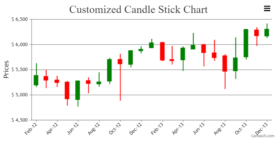
Team CanvasJSApril 1, 2018 at 11:15 am #20185In this candlestick chart, How do I change the colours of candles (e.g. blue for up-candles, red for down candles).
Thanks.April 2, 2018 at 9:46 am #20188You can set the color, risingColor, and fallingColor to change the color in Candlestick Chart as per your requirement.
___________
Indranil Deo
Team CanvasJSApril 2, 2018 at 7:22 pm #20194I could set the risingColor now.
1) Regarding fallingColor, the documentation says that “fallingColor property can only be used with waterfall chart.”.
Is there any workaround for this?2) How do I set the border color for candles? I searched the docs, but could not find it. So request you for help.
-
This reply was modified 8 years, 3 months ago by
April 3, 2018 at 9:43 am #201981) Regarding fallingColor, the documentation says that “fallingColor property can only be used with waterfall chart.”.
Is there any workaround for this?In case of Candlestick Chart, fallingColor can be used to override the default color of those dataPoints whose values are less than the previous dataPoint.
2) How do I set the border color for candles? I searched the docs, but could not find it. So request you for help.
In Candlestick Chart, you can use color to set the default color of the dataPoint and the border of the dataPoint as well.
Please take a look at this JSFiddle for an example.
___________
Indranil Deo
Team CanvasJSApril 3, 2018 at 5:19 pm #20200I have tried as you advised.
Now Up-candle and down-candle colors are done.
The only issue remaining is border color of candlestick.
Pl. refer to this jsfiddle.Since I have specified color: “red”(to get down-candle color), down-candle as well as border color have now become red.
Any suggestion on this (to get rid of border-color)?Thanks.
-
This reply was modified 8 years, 3 months ago by
-
This reply was modified 8 years, 3 months ago by
April 4, 2018 at 9:35 am #20204Assigning color to every dataPoints based on the risingColor or fallingColor will work fine in your case. Please check the below code snippet –
function changeBorderColor(chart){
    var dataSeries;
    for( var i = 0; i < chart.options.data.length; i++){
	dataSeries = chart.options.data[i];
        for(var j = 0; j < dataSeries.dataPoints.length; j++){
            dataSeries.dataPoints[j].color = (dataSeries.dataPoints[j].y[0] <= dataSeries.dataPoints[j].y[3]) ? (dataSeries.risingColor ? dataSeries.risingColor : dataSeries.color) : (dataSeries.fallingColor ? dataSeries.fallingColor : dataSeries.color);
        }
    }
}
Also kindly, take a look at this updated JSFiddle.
___________
Indranil Deo
Team CanvasJSApril 4, 2018 at 9:54 am #20205QDOS.
That’s what I required.
Suggestion:- You may think of including this “changeBorderColor” function into the library of canvasjs so that others can also get benefited.I really appreciate your service support quality.
You surpass my expectation levels.
Pl. keep it up and wish you and your team all the best.Thanks.
-
This reply was modified 8 years, 3 months ago by
April 4, 2018 at 10:22 am #20208 -
This reply was modified 8 years, 3 months ago by
Tagged: candlestick chart
You must be logged in to reply to this topic.