Login to Ask a Question or Reply
Forum Replies Created by Shashi Ranjan
-
January 10, 2019 at 10:25 pm in reply to: CanvasJs React – Cannot assign to read only property 'exports' of object #23985
We are working on some other important updates at this point of time, but we have prioritized this request and we will fix it in our future releases.
____
Shashi Ranjan
Team CanvasJSShare the tooltip with a graphics but if there are no data I want to see the Dataseries Name without value on the tooltip box (I have a lot of data on my server and it’s annoying that the box became larger and smaller)
toolTip won’t be shown in case of null dataPoint. You can achieve the above requirement using toolTip contentFormatter.
As well if I could share the tooltip (or the datapoints info on the side of the legend) between two graphics it would be great!
Yes, you can sync the toolTip across multiple charts. Please take a look at this JSFiddle for the same.
I was able to show the value on the legend Text but just if i am on the dataseries.
By using the mouseover event at dataPoint level you can achieve the above requirement as shown in this JSFiddle.
What I would like as well is to organize the legend, for example the Dataseries on the secondary axes should be on the right of the graphics and the legend on the primary graphic on the left.
Sorry, this feature is not available as of now.
____
Shashi Ranjan
Team CanvasJSYou can use JavaScript Date Object to create a chart with Date and Time Axis.
In order to set the time in axis label as “minutes:seconds,milliseconds” please set the valueFormatString as
valueFormatString: "mm:ss,ff".____
Shashi Ranjan
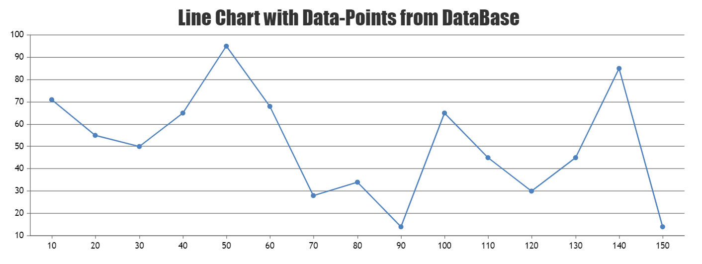
Team CanvasJSYou can easily create chart using data from database in ASP.Net MVC and Webform. Please take a look at this documentation page for a step to step tutorial on creating Charts in ASP.NET MVC with data coming from the Database using Entity Framework.
Further, you can also download the following sample projects for rendering live-updating chart by using data from the database:

—
Shashi Ranjan
Team CanvasJSYou can try editing the
function renderBezier()in the source code with few combinations. We are also trying it at our end, once we get an appropriate solution we will get back to you.__
Shashi Ranjan
Team CanvasJSLabels are not shown for all dataPoints but at every interval. Interval is auto-calculated based on axis range, width of the chart etc., which you can change by setting interval in Axis X. If this doesn’t solve your issue, please create a jsfiddle reproducing the issue so that we can look into it and help you out.
__
Shashi Ranjan
Team CanvasJSJanuary 7, 2019 at 9:21 pm in reply to: Filling area between lines with different color depending on which line is above #23943In the code snippet shared above, you’re using label to display date and time value. Instead, you need to assign the Date Object to x-values and set the axisX valueFormatString as
valueFormatString: "HH:mm"for displaying time in 24-hour format(using “hh” will display time in 12-hour format).Also, please take a look at this JSFiddle for a working example with sample code.

__
Shashi Ranjan
Team CanvasJSJanuary 4, 2019 at 3:30 pm in reply to: Displaying dynamic data in barcharts using django and CanvasJS #23924We are looking into your query and will get back to you at the earliest.
__
Shashi Ranjan
Team CanvasJSPlease take a look at this jsfiddle to render multiple dynamic charts using external JSON data.
__
Shashi Ranjan
Team CanvasJSYes, it is possible to achieve the above requirement by editing the source code. Once you have purchased the license please let us know and we will help you out with editing the source code.
__
Shashi Ranjan
Team CanvasJSYou can achieve the above requirement by setting the interval of Axis X to 1. Please take a look at this updated jsfiddle.
___
Shashi Ranjan
Team CanvasJS