Login to Ask a Question or Reply
Forum Replies Created by Shashi Ranjan
-
February 27, 2020 at 6:56 pm in reply to: Uncaught TypeError: Cannot read property 'getTime' of undefined #28493
Can you kindly create a sample project reproducing the issue and share it with us over Google-Drive or Onedrive along with sample JSON data so that we can look into the code, run it locally to understand the scenario better and help you resolve?
—
Shashi Ranjan
Team CanvasJSCan you kindly create a sample project reproducing the issue and share it over Google-Drive or Onedrive along with sample CSV data so that we can look into the code, run it locally to understand the scenario better and help you resolve?
Considering this as a duplicate of Add data in toolTip hence closing the same.
—
Shashi Ranjan
Team CanvasJSAxis labels and the interval at which they are shown are auto-calculated based on the chart size and the range of the axis. In your scenarios where you want to display dates aligned to the corresponding dataPoints, you can use label instead of x-values as shown in this JSFiddle.
—
Shashi Ranjan
Team CanvasJSCan you kindly create a sample project reproducing the issue and share it over Google-Drive or Onedrive along with sample CSV data so that we can look into the code, run it locally to understand the scenario better and help you resolve?
From what we have observed, sometimes things get delayed mostly when we are not able to reproduce the issue or not able to understand the exact requirements or the solution that we provide may not work properly due to the variation in chart-options being used by you and us.
Having a sample project helps us in figuring out the issue and suggesting an appropriate solution accordingly.
—
Shashi Ranjan
Team CanvasJSCan you kindly share a live example and brief us more about your requirement so that we can understand your scenario better and help you out?
—
Shashi Ranjan
Team CanvasJSFebruary 14, 2020 at 8:49 pm in reply to: Trying to display pie chart and bar chart at one page #28398Please take a look at this documentation page for step by step instruction on rendering multiple charts in a single page.
If you are still facing the issue, kindly create a JSFiddle reproducing the issue you are facing and share it with us so that we can look into the code, understand the scenario better and help you out?
—
Shashi Ranjan
Team CanvasJSPlease take a look at this updated sample project.
Considering this as a duplicate of using json array from php json_encode hence closing the same.
—
Shashi Ranjan
Team CanvasJSThank you for sharing the sample project.
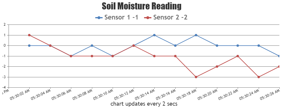
– x axis will be Date value
– y axis will be sensor valueIn order to create a chart with date and time axis, you can parse the x-values are date objects and y-value as a number as shown below:
var sensor1 = <?php echo json_encode($json_sensor1, JSON_NUMERIC_CHECK); ?>;
var sensor2 = <?php echo json_encode($json_sensor2, JSON_NUMERIC_CHECK); ?>;
var dataPoints1 = [], dataPoints2 = [];
for(var i = 0; i < sensor1.length; i++){
	dataPoints1.push({ x: new Date(sensor1[i].Date), y: Number(sensor1[i].sensorValue)});
}
for(var i = 0; i < sensor2.length; i++){
	dataPoints2.push({ x: new Date(sensor2[i].Date), y: Number(sensor2[i].sensorValue)});
}
– plot only the latest 50 data points
– update the graph every 5 seconds and only showing 50 data pointsIf you don’t want the dataPoints to keep getting accumulated, you can remove old values from the beginning of the Array before the chart is rendered. This process of getting new value from sensors and rendering the chart with those can be repeated every 5 seconds as shown below:
setInterval(function(){updateChart()}, updateInterval);

function updateChart() {
  xValue = dataPoints1[dataPoints1.length - 1].x.getTime();
  var deltaY1, deltaY2;
  xValue += updateInterval;
  // adding random value
  yValue1 += Math.round(2 + Math.random() *(-2-2));
  yValue2 += Math.round(2 + Math.random() *(-2-2));

  // pushing the new values
  dataPoints1.push({
    x: new Date(xValue),
    y: yValue1
  });
  sensor2.push({
    x: new Date(xValue),
    y: yValue2
  });

  if(dataPoints1.length > 50){
    dataPoints1.shift();
  }
  if(dataPoints2.length > 50){
    dataPoints2.shift();
  }
  // updating legend text with  updated with y Value
  chart.options.data[0].legendText = "Sensor 1 " + yValue1;
  chart.options.data[1].legendText = " Sensor 2 " + yValue2;
  chart.render();
}
Please take a look at this updated sample project for a working example with sample code.

—
Shashi Ranjan
Team CanvasJSThanks for sharing the use-case, we will reconsider this behavior in future versions.
—
Shashi Ranjan
Team CanvasJS@wid,
Date-Time values over axisY are not supported as of now. However, you can use this workaround to achieve the same.
—
Shashi Ranjan
Team CanvasJSYou can achieve the above requirement by using escape sequences as shown in this JSFiddle.
—
Shashi Ranjan
Team CanvasJSWhen you have a JSON array it is very easy to generate charts from them. Let’s consider you have a JSON array in this format:
[
    [
      1483275269000,
      10
    ],
    [
      1483361668000,
      12
    ],
    [
      1483448068000,
      17
    ],
    [
      1483534467000,
      11
    ],
    [
      1483620867000,
      13
    ],
]
Now, you need to parse the data in the format accepted by CanvasJS to use them as dataPoints and generate a chart. Please refer to the code snippet below for an example:
[
  {
    x: new Date(1483275269000),
    y: 10
  },
  {
    x: new Date(1483275268000),
    y: 12
  },
  {
    x: new Date(1483448068000),
    y: 17
  },
  {
    x: new Date(1483534467000),
    y: 11
  }
]
You can also take a look at this gallery page for an example on creating a chart using JSON data in PHP.

—
Shashi Ranjan
Team CanvasJSthank you, my chart is very extensive maybe you have a fiddle with multiple clickable striplines?
Please take a look at this JSFiddle for creating charts with multiple clickable stripLines.
In addition is there maybe a better way to have one dataseries with date/values (as spline) and show some events from second dataseries (second data series should not be spline, only datapoint should be display as clickable “marker” with tooltip) ?
You can create a combination chart with one of the dataSeries as spline and the other dataSeries as scatter (add click event handler for this dataSeries) to achieve your requirement.
—
Shashi Ranjan
Team CanvasJS