Login to Ask a Question or Reply
Forum Replies Created by Sanjoy
-
Setting the scale option to 100 in browser print dialog panel should work fine in your case. Please refer this article to enable scaling in chrome.
—-
Sanjoy Debnath
Team CanvasJSFebruary 13, 2018 at 9:58 am in reply to: How we can use Stacking for multi series line chart? #19609You can show labels in axisX using label property whereas you can show labels in axisY with the help of labelFormatter method. Please take a look at this jsFiddle for the same.
—–
Sanjoy Debnath
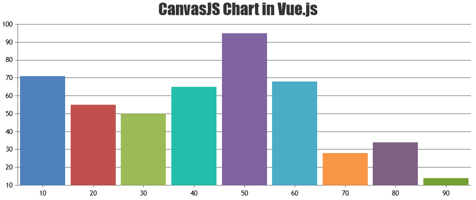
Team CanvasJSPlease checkout this example on using CanvasJS chart in Vue.js. You don’t need to build official CanvasJS library, you can include the CanvasJS script in the head of the HTML.
___
Sanjoy Debnath
Team CanvasJSWe are looking into it and will get back to you at the earliest.
—–
Sanjoy Debnath
Team CanvasJSJanuary 23, 2018 at 11:06 am in reply to: Multi series line chart – get all series value on crosshair move #18924Getting all the data-series on crosshair move is not possible as of now. But, you can get the value of current data-point as a parameter in labelFormatter when snapToDataPoint is true.
Also, mouseover event of data-series can be used to get current data-series that have been hovered.——
Sanjoy Debnath
Team CanvasJSPlease take a look at this jsfiddle.
Also, please refer to this forum thread.For license related queries please email us at sales@canvasjs.com.
——
Sanjoy Debnath,
Team CanvasJSSorry, as of now Pie/Column don’t have any border. And we don’t have any timeline for it yet. Instead, you can look for bevelEnabled property.
Please take a look at this workaround for adding border to Column.—–
Sanjoy Debnath,
Team CanvasJSWe are looking into it and will get back to you at the earliest.
—–
Sanjoy Debnath
Team CanvasJSOne more help in similar case,
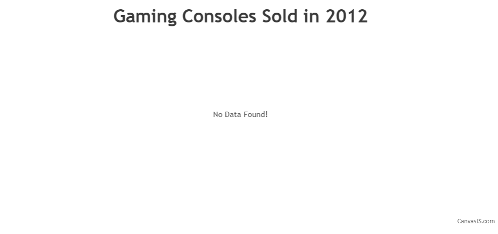
We need to hide legends in this situation as well.You can toggle showInLegend property if you are looking to hide legend for dataPoints with y-values as 0 or null as shown in the code snippet below:
showDefaultText(chart, "No Data Found!");

function showDefaultText(chart, text) {
  var dataPoints = chart.options.data[0].dataPoints;
  var isEmpty = !(dataPoints && dataPoints.length > 0);

  if (!isEmpty) {
    for (var i = 0; i < dataPoints.length; i++) {
      isEmpty = !dataPoints[i].y;
      if (!isEmpty)
        break;
    }
  }

  if (!chart.options.subtitles)
    chart.options.subtitles = [];
  if (isEmpty) {
    chart.options.subtitles.push({
      text: text,
      verticalAlign: 'center',
    });
    chart.options.data[0].showInLegend = false;
  } else {
    chart.options.subtitles = [];
    chart.options.data[0].showInLegend = true;
  }
}
Please take a look at this updated JSFiddle for a working example with sample code.
—
Sanjoy Debnath
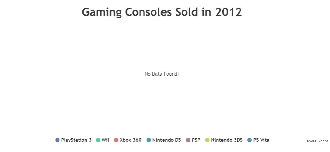
Team CanvasJSIn cases like above in which all the dataPoints have y-values as 0 or null, you can add subtitles to the chart with a message like “No Data Found!” as shown below:
showDefaultText(chart, "No Data Found!");

function showDefaultText(chart, text){
  var dataPoints = chart.options.data[0].dataPoints;
  var isEmpty = !(dataPoints && dataPoints.length > 0);

  if(!isEmpty){
    for(var i = 0; i < dataPoints.length; i++){
      isEmpty = !dataPoints[i].y;
      if(!isEmpty)
        break;
    }
  }

  if(!chart.options.subtitles)
    chart.options.subtitles = [];
  if(isEmpty)
    chart.options.subtitles.push({
      text : text,
      verticalAlign : 'center',
    });
  else
    chart.options.subtitles = [];
}
Please take a look at this JSFiddle for a working example with sample code.
—
Sanjoy Debnath
Team CanvasJS